
Case Study 5:
The Kroger Co.
-V1.jpg)
Kroger Editorial Design & Production
Six Years. Every Quarter. No Margin for Error
The Kroger Co. is the largest supermarket chain in the United States by revenue, operating over 2,600 supermarkets, multi-department stores, fuel centers, and pharmacies across 34 states. At the time of this engagement, Kroger reported annual revenue exceeding $103 billion, ranking it as the country's second-largest general retailer and one of the top five largest retailers in the world. This is a company that operates at extraordinary scale, and its internal communications have to match.
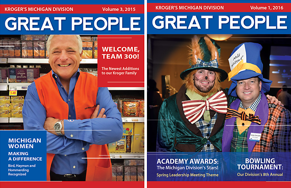
Over a six-year period, I designed and produced the quarterly internal magazine, Great People, for Kroger's Michigan Division — A 40 to 45-page publication that served as the primary storytelling vehicle for the organization's people, programs, and milestones. This was sustained, high-volume editorial work where consistency, precision, and reliability were non-negotiable. Every quarter, on schedule, the publication had to be right.
Kroger Quarterly Magazines: Click an image to view a pdf file of the full magazine layout
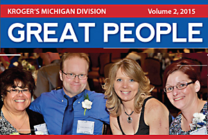
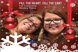
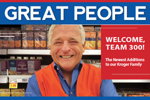
The Kroger Great People Publication
This was a genuine editorial product, not a newsletter or a simple update sheet. Each 40 to 45-page issue covered the full breadth of what a large regional division generates quarter to quarter: Company news and strategic updates, new store openings, employee spotlights and staff features, service milestone recognitions, promotions, retirements, weddings, competitive achievements, charitable giving initiatives, and community events.
The content arrived in varied states of readiness. Some copy was polished and press-ready. Other material came in as rough notes, unretouched photography, or loosely organized information that needed editorial structure before it could become a page.
That editorial organization was handled by the copywriter, Valerie, and she was exceptional at it. Meticulous, thorough, and consistently reliable, she brought real discipline to the content side of the process. What made the collaboration work was that we had built a strong working relationship entirely remotely. We understood each other's process, communicated clearly, and trusted each other's judgment. That kind of creative partnership, where the writer and art director are genuinely in sync, is rare. It made the work faster, cleaner, and better.
Managing that variability across dozens of pages was a shared effort. Getting it to fit was mine. Kroger was specific: the target was 40 pages, with a five-page window of flexibility. When content volume pushed beyond that, it required formal approval from multiple stakeholders, including a check with the printer to confirm they could accommodate the change in scope and timeline. When the extra pages weren't approved, Valerie and her manager would go back through the content and make the editorial calls on what to cut. That was its own discipline, and it required the same care and precision she brought to everything else.
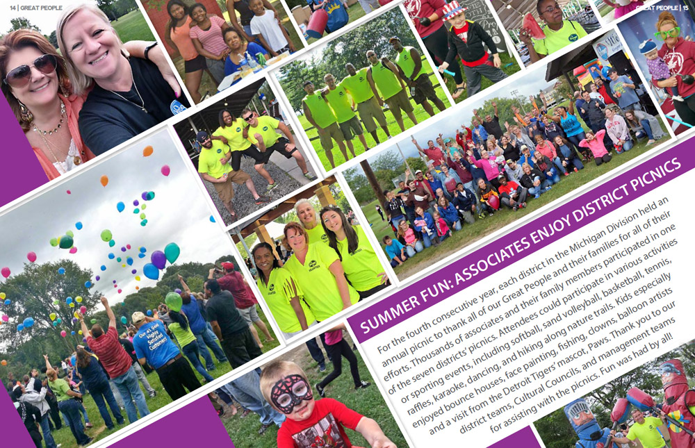
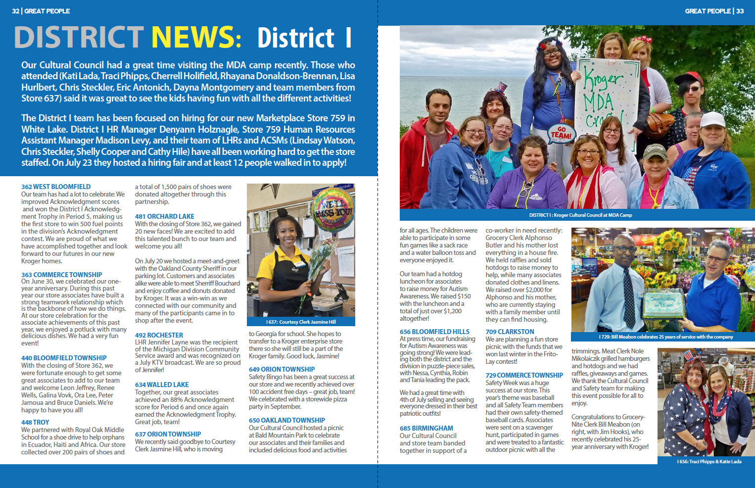
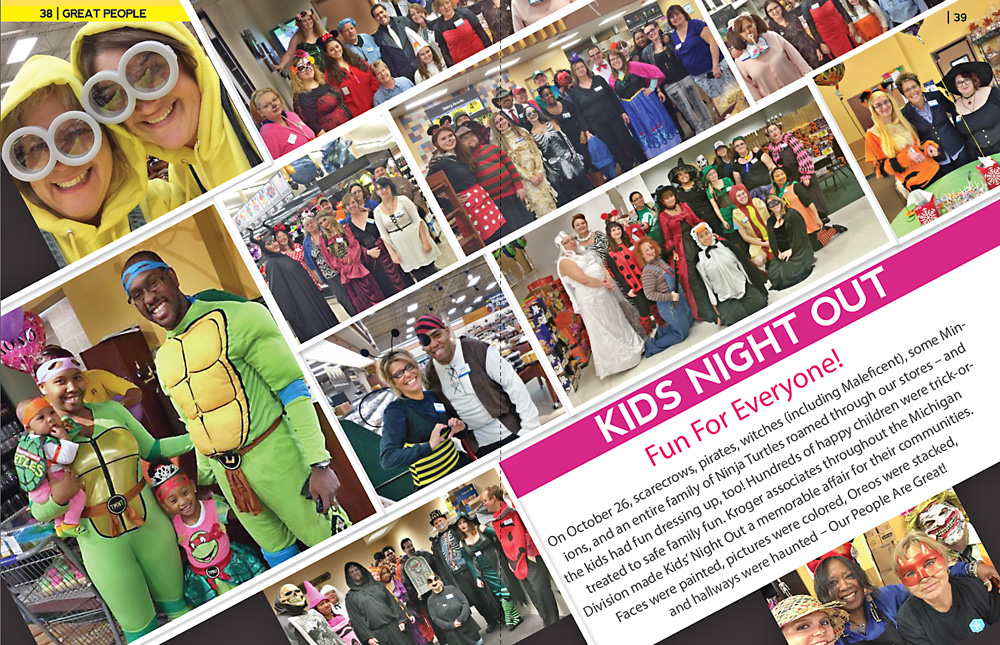
Within those constraints however, I had significant creative latitude. Layout, image placement, typography, color, diagonal compositions that moved across the full spread, image retouching and sizing. Preparing the images for the magazine presented its own type of challenge. As with numerous unretouched photos, they came in varied resolutions, image quality and lighting. Regardless, the work had to be colorful, legible, on time, and on budget. Within those parameters, I made it my own.
For a company of Kroger's size, this publication carried real organizational weight. It was a tool for internal culture, employee recognition, and divisional cohesion. The design had to support all of that while remaining clear, accessible, and visually engaging for an audience of frontline employees, managers, and leadership alike.
The Challenge
Editorial design for a recurring publication is a discipline of its own. The challenge isn't a single creative problem to solve once. It is a system that has to function reliably, issue after issue, across six years and twenty-four quarterly editions. Every issue brought a different volume of content, different photography quality, different story types, and different production pressures. The design system had to absorb all of that variation and still produce something cohesive and polished at the end.
Specific pressures included:
Kroger Quarterly Magazine (2015): Volume 3 - Office News
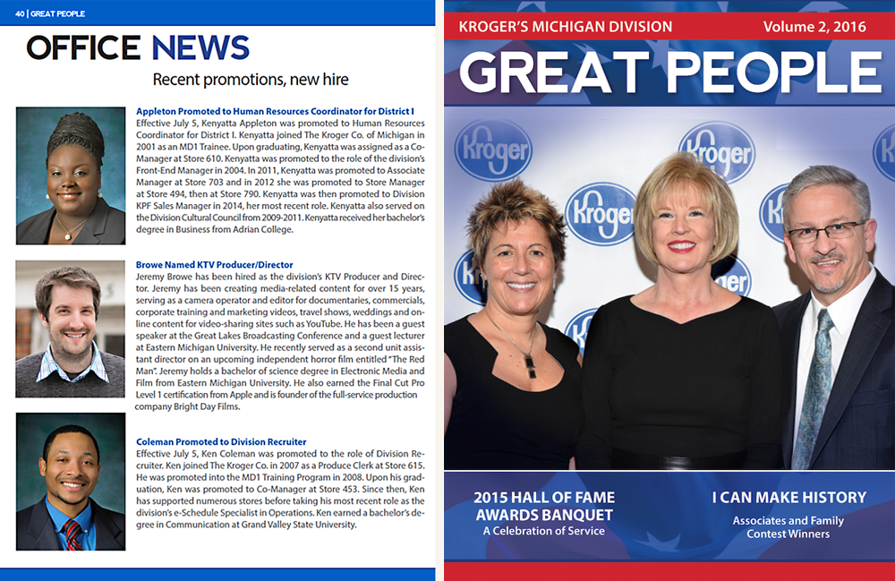
Kroger Quarterly Magazine (2015): Volume 4
My Role
I led layout design and production for every issue across the six-year engagement. That included page design and typographic hierarchy, photo retouching, and image preparation, and close collaboration with the editor to structure and sequence content effectively before a single layout was built. I also designed supporting materials that extended from the publication relationship, including holiday card design for the company and pharmacy-related labels and supporting graphics.
This was a relationship built on trust and reliability. Kroger came back every quarter for six years because the work was consistent, the deadlines were met, and the quality didn't slip. That kind of long-term editorial partnership requires more than design skill. It requires professional dependability and a genuine understanding of what the client values in their communications.
The Approach
Good editorial design is largely invisible. When it's working, the reader moves through the content without thinking about the layout. The typography guides them. The image placement creates rhythm. The hierarchy tells them what matters and in what order. Nothing fights for attention. Everything serves the story.
For the Kroger publication, that meant building a consistent layout system that could accommodate widely varying content types, from full-page employee features to dense news columns to photo-heavy event spreads, without the publication losing its visual identity from section to section. Each issue had its own content mix, and the layout approach had to flex accordingly while the overall character of the publication remained stable.
Key elements of the approach included:
Quarterly Magazine Covers
Interior Editorial Layouts
Employee Features & People Pages
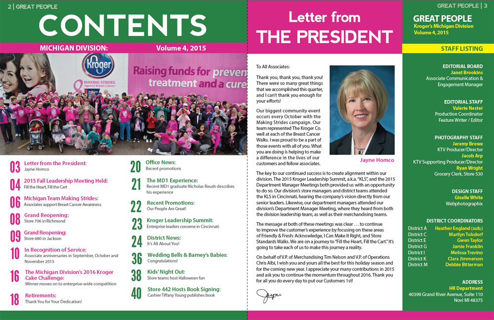
Supporting Work
Beyond the quarterly magazine, the Kroger relationship extended to supporting collateral that required the same attention to detail and brand alignment. Holiday card design for the company brought a different creative challenge: something warm and personal for a massive corporation, executed with the polish Kroger's audience would expect. Pharmacy-related labels and supporting graphics added a layer of precision work, where accuracy and clarity are not just aesthetic values but functional requirements.
These supporting projects reflect what a long-term client relationship looks like in practice. Once trust is established through the primary work, a client brings you into adjacent projects because they know the standard you maintain. Six years of consistent quality is how that kind of trust develops.
Holiday Card Design
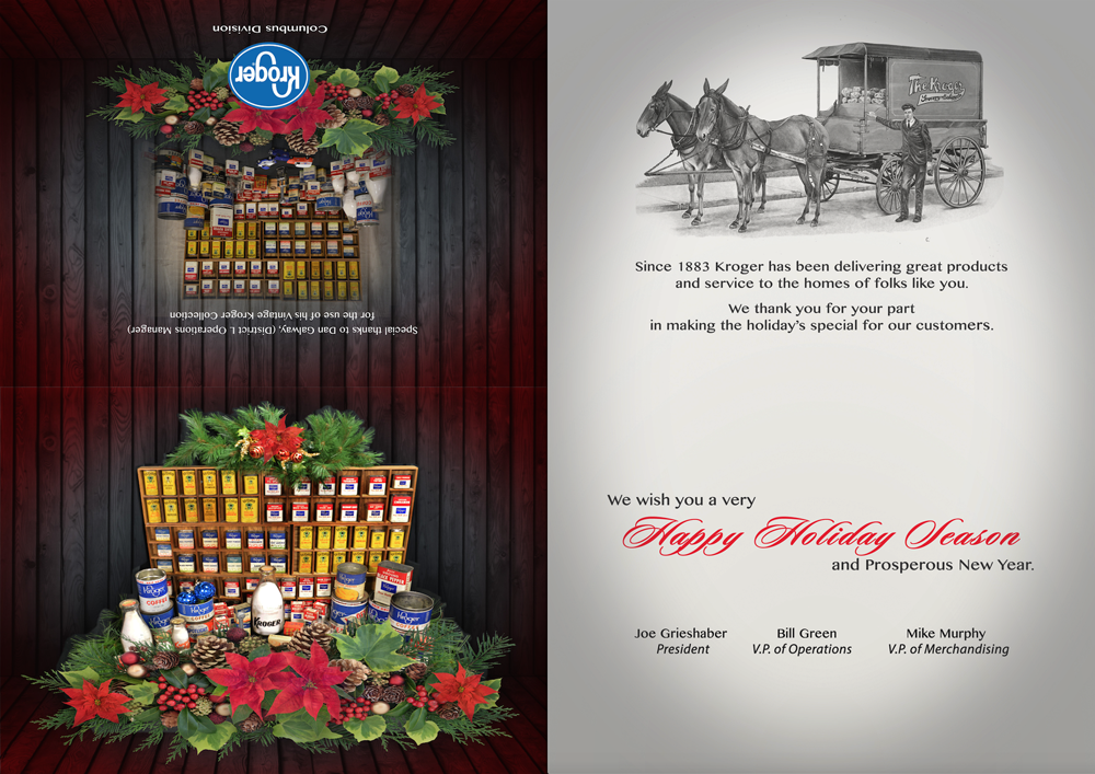
Holiday Card Design
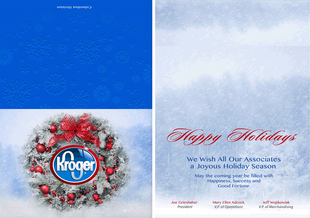
Holiday Card Design
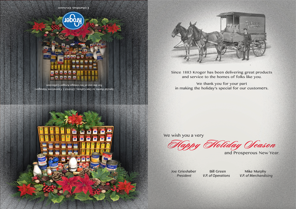
Pharmacy Labels & Supporting Graphics
.jpg)
Pharmacy Labels & Supporting Graphics

What This Work Demonstrates
Sustained Reliability at Scale: Delivering a polished 40 to 45-page publication every quarter for six years without a drop in quality or a missed deadline. That consistency is itself a professional credential.
→Editorial Design discipline: Organizing large, varied volumes of content into clear, readable layouts that serve the reader without calling attention to themselves. Invisible design is often the hardest kind.
→Production Precision: Retouching and preparing photography to a consistent print standard across dozens of issues, and adapting to varying content types and image quality without compromising the final product.
→Long-term Collaborative Partnership: Working closely with an editorial team across six years, earning trust through dependability and quality, and expanding into supporting work as a natural result of that relationship.
The Impact
Over six years of quarterly publication cycles, the magazine became a consistent vehicle for employee recognition, organizational storytelling, and internal communication. The work demonstrates the value of disciplined editorial design in maintaining quality, credibility, and engagement across long-term communications programs.