
Case Study 4:
APDS

Building A Community. Evolving A Brand.
Grounded in Connection, Trust, and Cultural Identity.
Over the course of a twelve-year relationship, I led the development and evolution of a unified visual identity for the Africentric Personal Development Shop (APDS) — a behavioral healthcare organization in Columbus, Ohio, focused on Cognitive Behavioral Therapy (CBT), addiction recovery, domestic violence intervention, and youth enrichment programs.
The work spanned two full branding projects, a signature event identity, and an ongoing stream of promotional collateral. Each phase built on what came before, deepening the visual language and strengthening the organization's presence across every audience touchpoint. It is the kind of long-form brand stewardship that only becomes possible through genuine trust and a shared commitment to the communities being served.
My Role
My role extended far beyond creating individual design pieces. Over the course of a twelve-year relationship with APDS, I served as the organization's primary creative partner, leading two major branding initiatives while supporting a continuous stream of outreach, fundraising, program, event, and marketing materials.
While I was responsible for the visual design itself, much of the value came earlier in the process. APDS often came to me with an objective rather than a creative brief: launching a new program, promoting a community initiative, supporting a grant-funded effort, increasing awareness, or improving how information was presented online. My job was to help translate those goals into communication tools that would connect with the audiences they were trying to reach.
That included advising on messaging, recommending outside copywriting support when needed, helping shape website content and structure, and ensuring that design decisions reflected both the organization's mission and the needs of the communities it serves. Every project required balancing credibility, accessibility, cultural relevance, and clarity.
Over time, the relationship evolved into long-term brand stewardship. Whether I was developing a rebrand, designing a fundraising campaign, creating event materials, updating the website, or producing community outreach collateral, my responsibility remained the same: helping APDS present itself consistently, professionally, and authentically across every touchpoint.
The Challenge
When first engaged, APDS lacked a cohesive visual identity. Existing materials were inconsistent in style, messaging, and presentation, making it difficult for the organization to communicate trust, professionalism, and a clear sense of purpose to the communities it serves.
The brand needed to work hard on multiple levels simultaneously: establishing credibility for a behavioral health provider, connecting authentically with a diverse and underserved audience, and feeling warm and human rather than institutional. That balance is not easy to find. The visuals had to earn trust while remaining genuinely inviting.
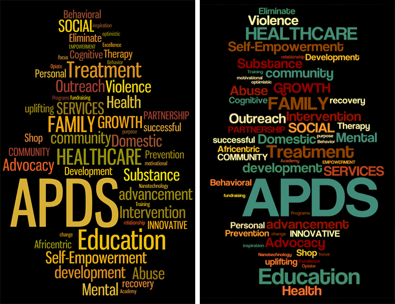
A Brand Built on Four Pillars
APDS Brand Campaign (2014)
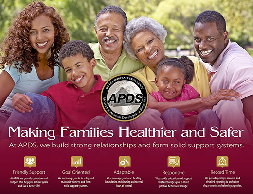
The initial branding engagement called for building a complete corporate identity from the ground up. APDS had a logo, but nothing beyond it. The challenge was to translate the organization's values — restoration, family, community, and cultural pride — into a visual system that could scale from a business card to a trade show banner to a fully responsive website.
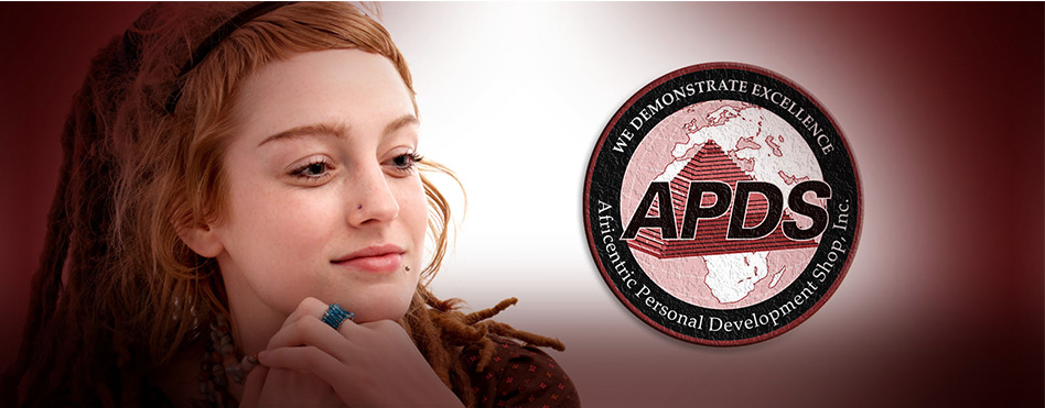
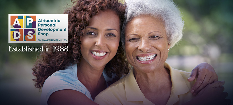
The visual direction centered on warmth and humanity. Photography selection was deliberate: images that reflected real families, real connection, and the genuine dignity of the people APDS serves. Color, typography, and layout all worked together to signal competence without feeling cold, and care without feeling casual.
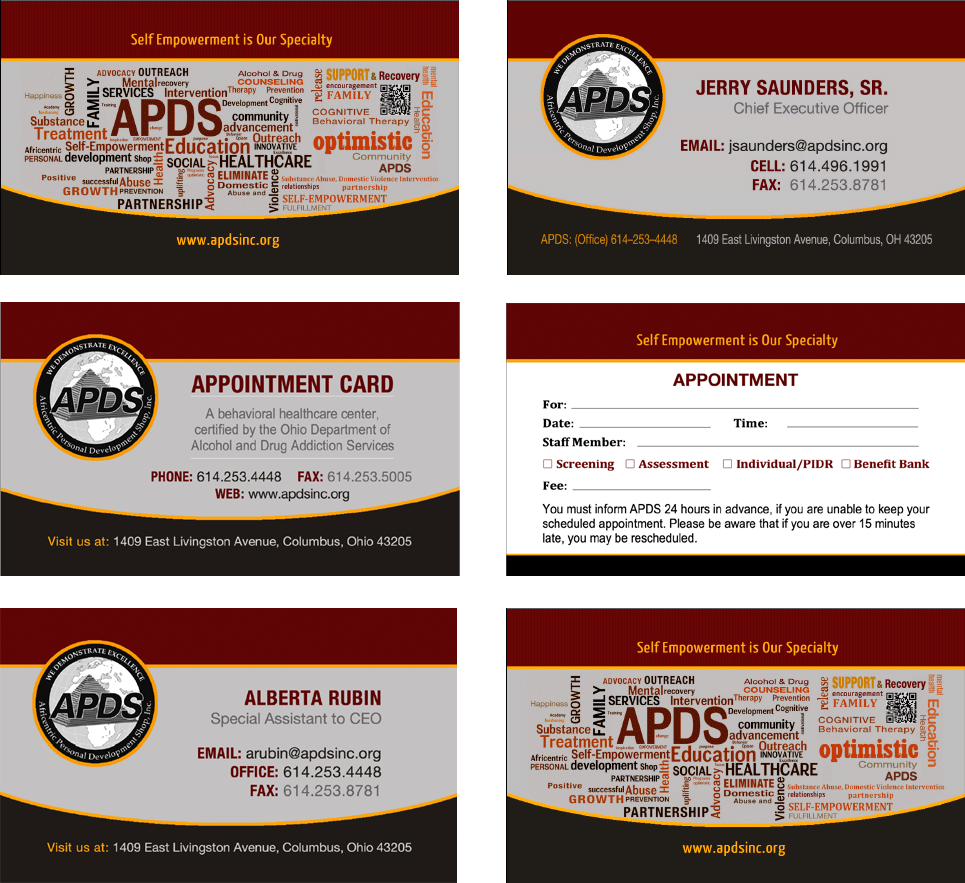
Business Cards and Appointment Card
Stationery Suite
A complete stationery package was developed — letterhead, envelopes, a presentation folder, business cards, and appointment cards — all carrying the new brand consistently. These pieces set the professional standard that every subsequent touchpoint would be measured against.
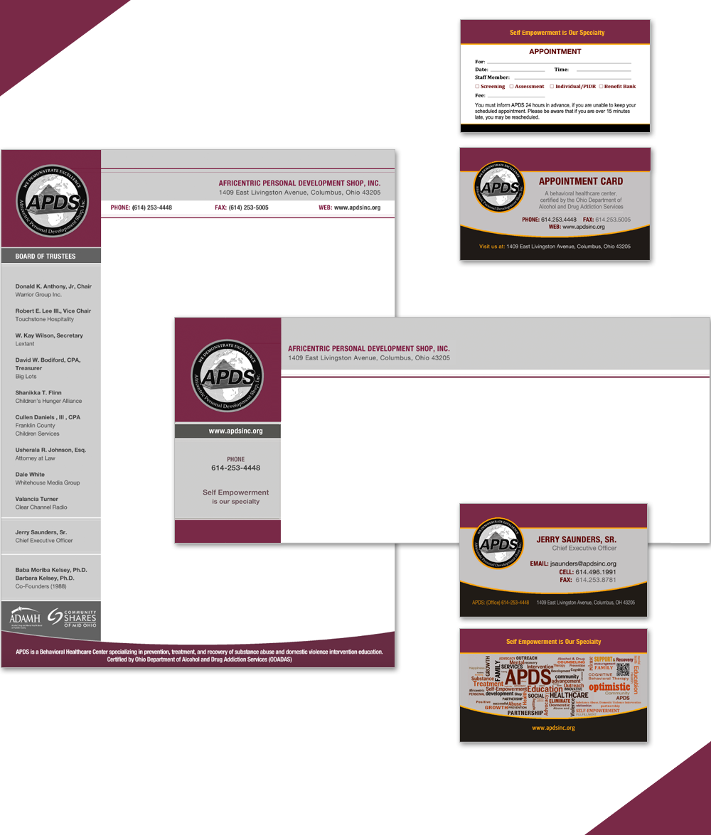
Stationery Suite
Brochures
Two z-fold brochures were produced to support outreach and program awareness. Each one had to work for an audience that ranged from community members seeking help to agency partners and grant stakeholders, so the language and imagery had to do a great deal of work without alienating anyone.
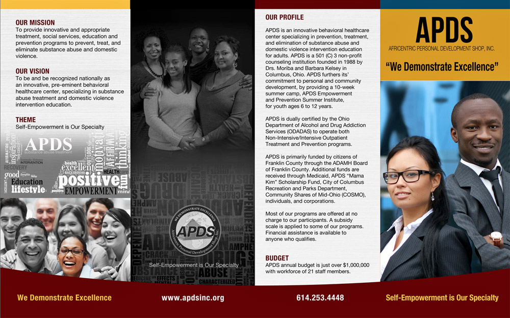
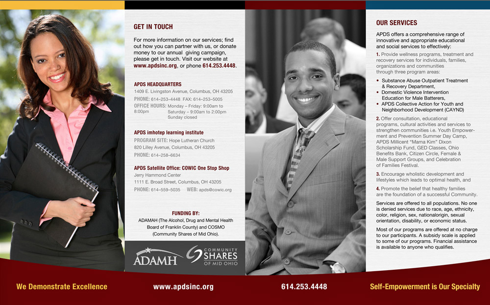
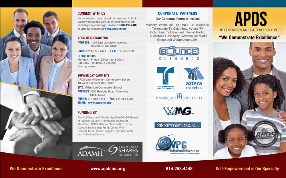
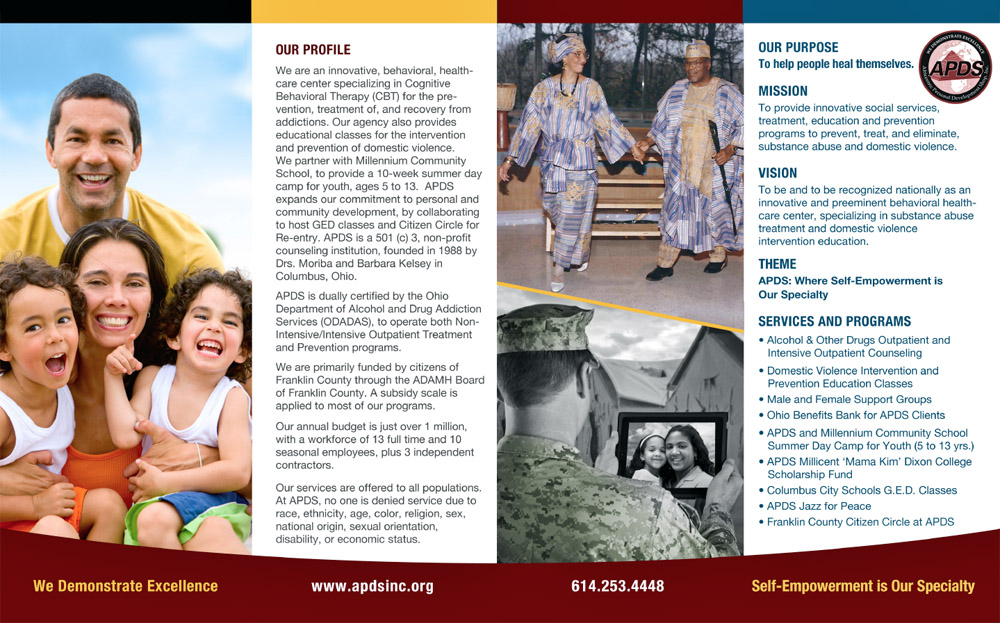
APDS Brochures
Posters and Program Flyers
Men's and women's support group posters were designed to speak directly to each audience — visually distinct in tone and imagery while remaining clearly part of the same brand family.
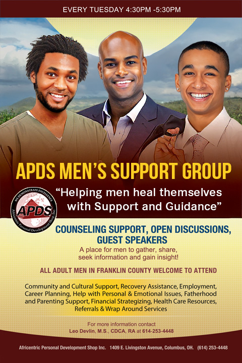
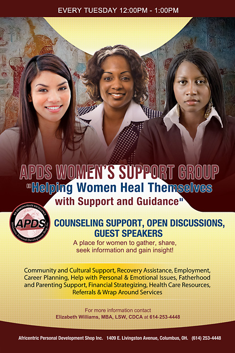
Marketing Flyers
PowerPoint Presentation
A branded PowerPoint presentation was developed for board meetings, grant applications, and conference appearances, giving leadership a tool that looked as polished as the organization's work on the ground.
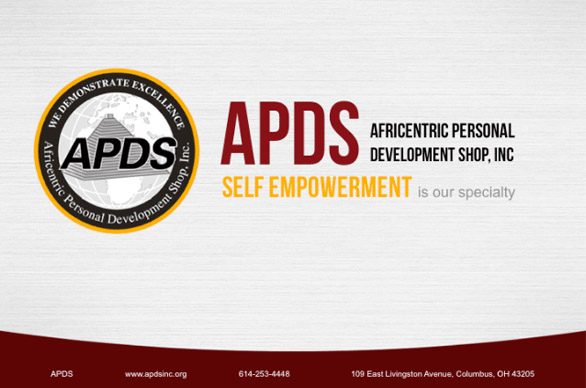
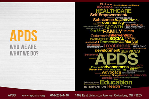
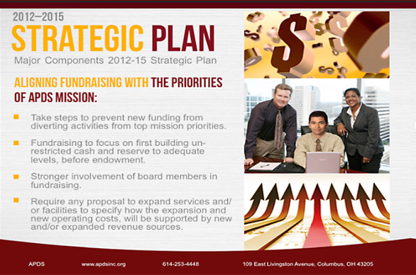
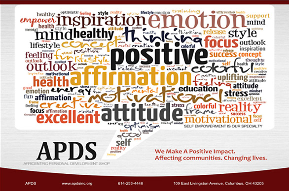
PowerPoint Presentation Slides
Environmental Signage and Banners
Horizontal wall banners and a vertical trade show banner extended the brand into physical spaces — conference halls, lobbies, community events. These pieces needed to communicate quickly, from a distance, and still feel like they belonged to the same visual world as the stationery and brochures.
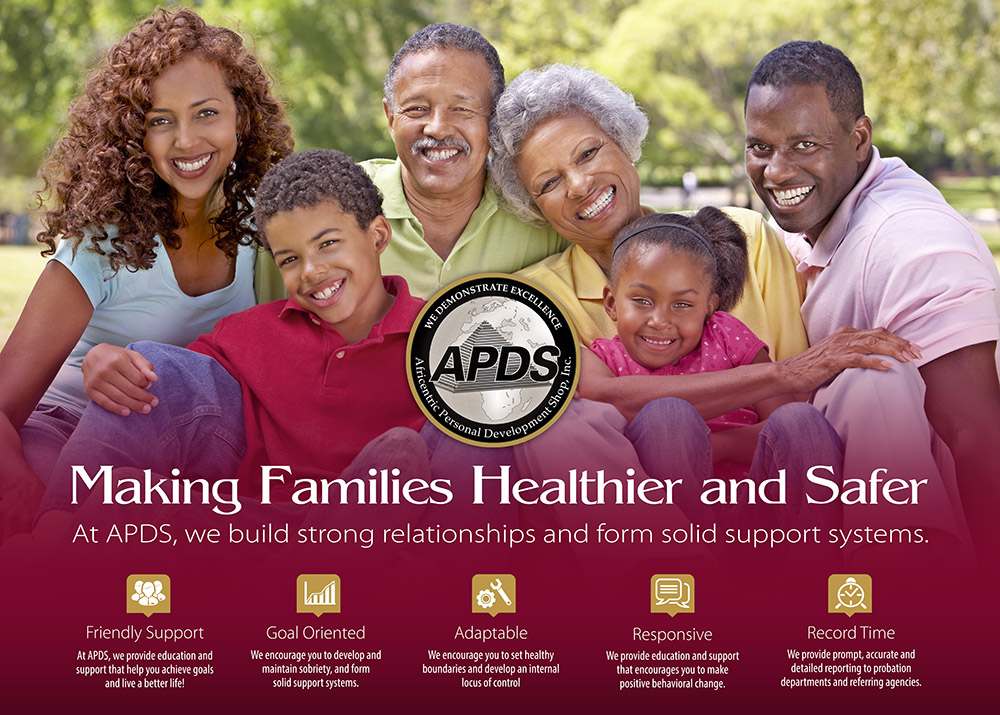
Horizontal Wall Banner
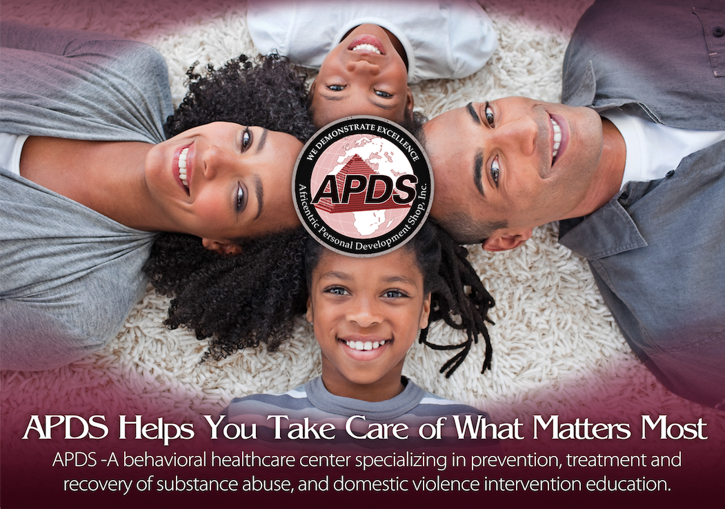
Horizontal Wall Banner
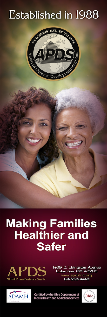
Vertical Trade Show Banner
Presentation Folder
A corporate presentation folder rounded out the stationery package, giving APDS a professional carrier for proposals, program materials, and grant submissions.
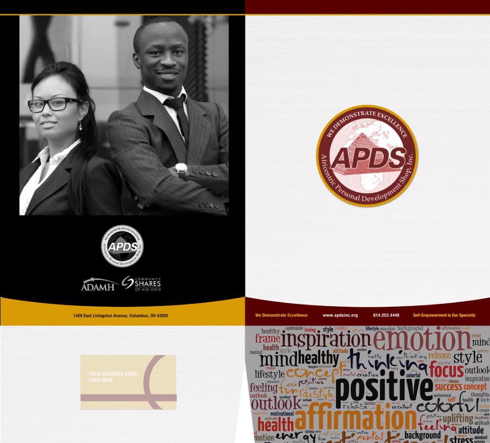
Corporate Presentation Folder
Website
A responsive, multi-page WordPress website with an interactive slideshow, media gallery, and full content management capabilities was designed and developed. The site needed to serve as both a resource for people seeking help and a credibility piece for grant-makers and institutional partners — audiences with very different needs and expectations.
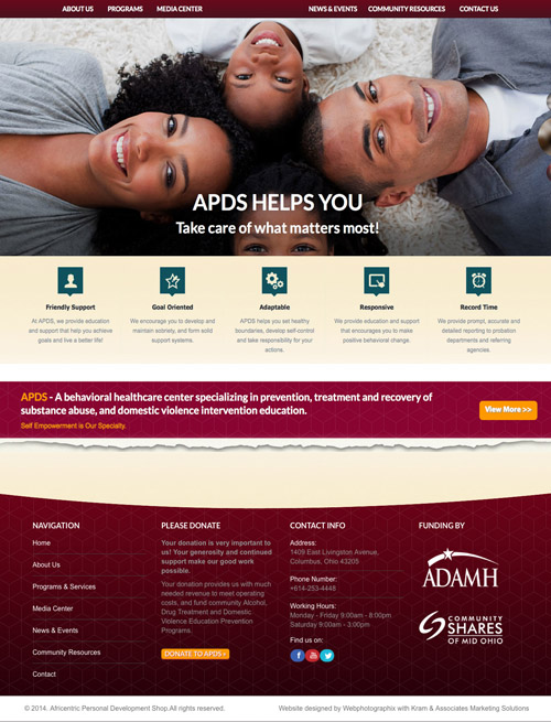
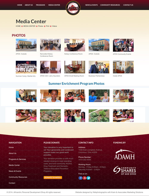
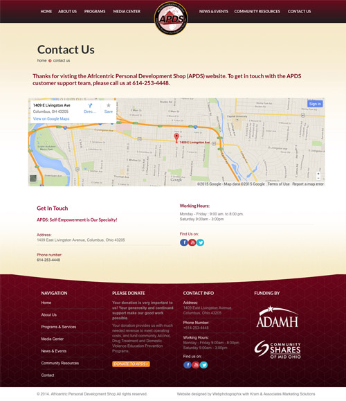
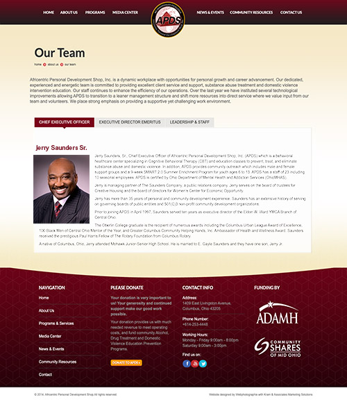
APDS Website – Selected Web Pages
APDS Rebrand Campaign (2023)
Nearly a decade after the initial brand launch, APDS had grown — new programs, a broader audience, and an identity that needed to evolve alongside the organization. The rebrand was not a reinvention. It was a refinement: honoring what the original brand had built while giving it a more contemporary visual language and a deeper cultural resonance.
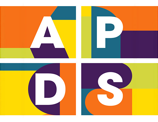
One of the most meaningful additions to the rebrand was the subtle integration of Kente cloth-inspired geometric patterning — a quiet but intentional nod to African heritage and cultural identity. For an organization called the Africentric Personal Development Shop, this kind of visual specificity matters. It tells the communities being served that they are seen.
Corporate Identity Suite
The full corporate identity was refreshed — letterhead, envelope, business card, and presentation folder — with updated typography, a refined color palette, and the new geometric patterning woven in as a unifying visual thread.
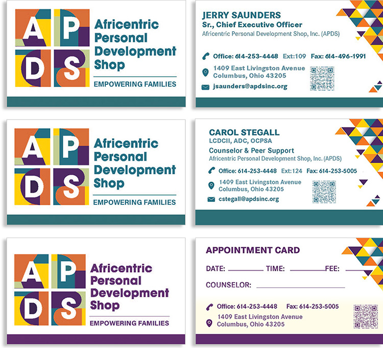
Rebranded Business and Appointment Cards
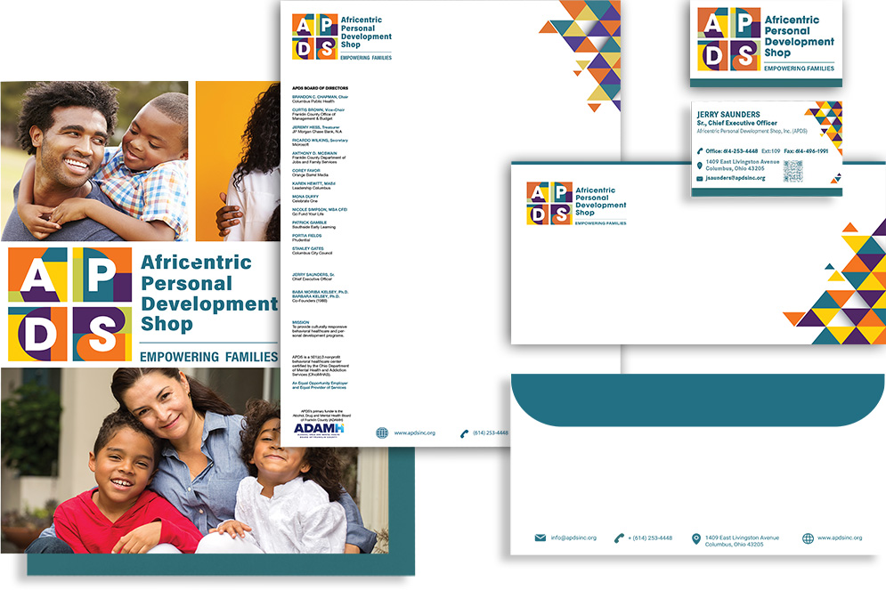
Stationery: Letterhead, Envelope, Business Card and Folder
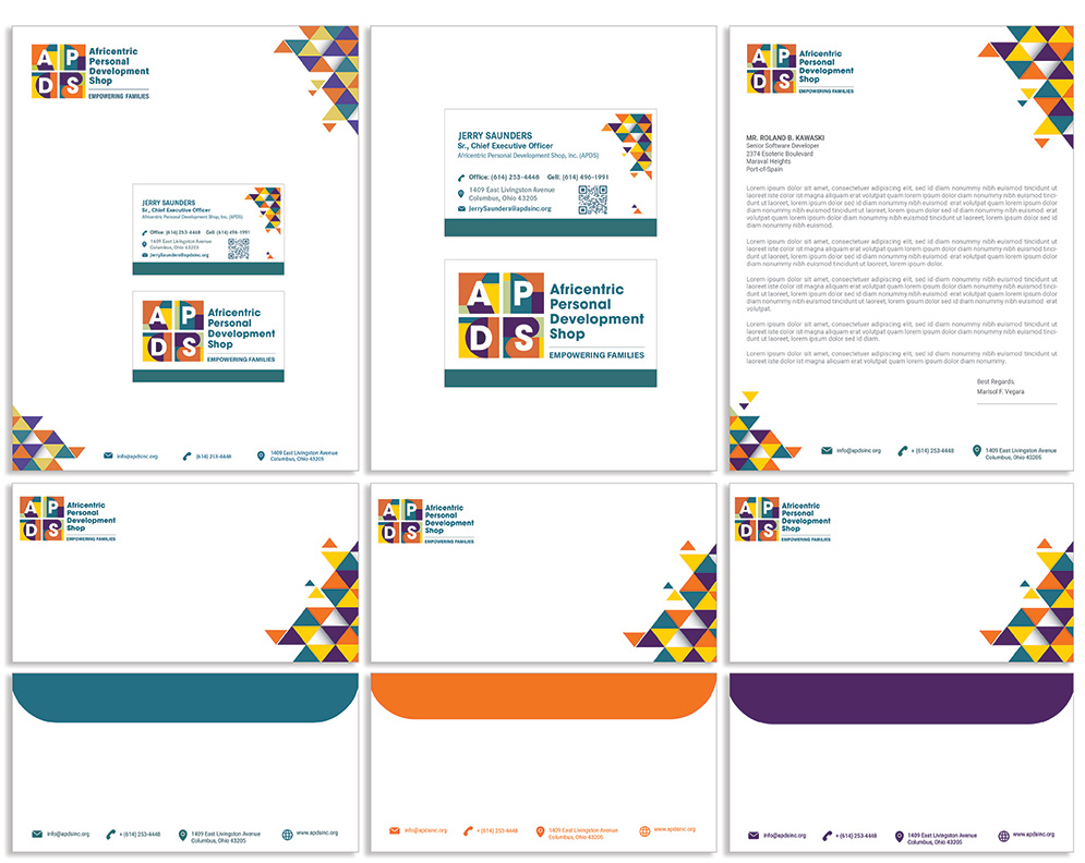
Presentation Folder
The updated folder design carried the refined visual system into the physical spaces where APDS does its most important work — the conference table, the grant meeting, the community presentation.
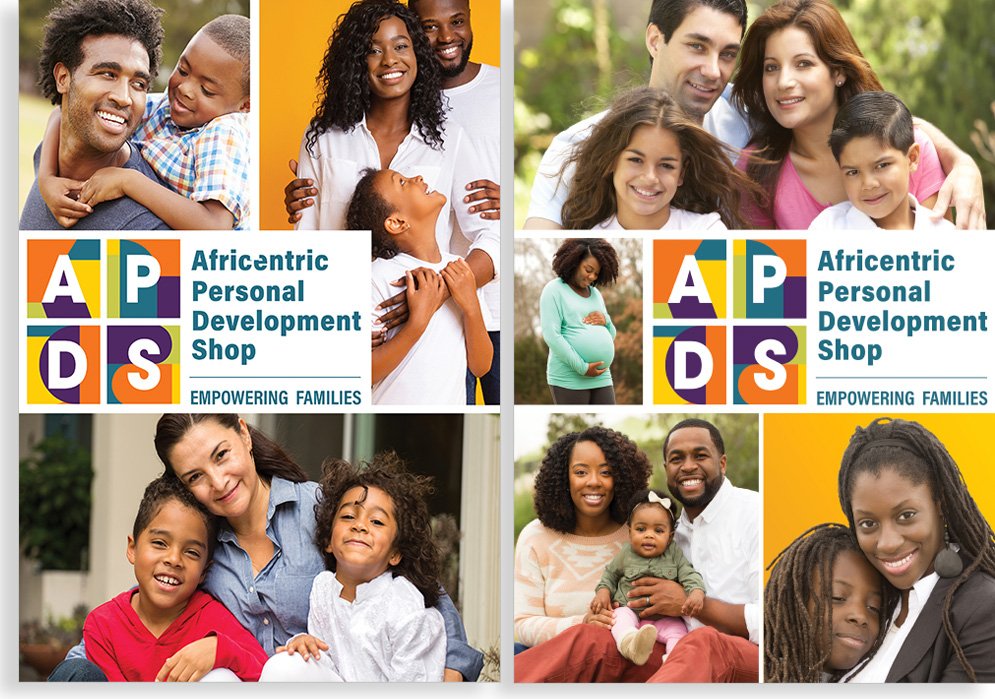
Rebranded Presentation Folder
PowerPoint and Ad Design Templates
A new PowerPoint slide template and advertising design templates gave the APDS team the tools to produce consistent, on-brand communications independently — an important deliverable for an organization with limited internal design resources.
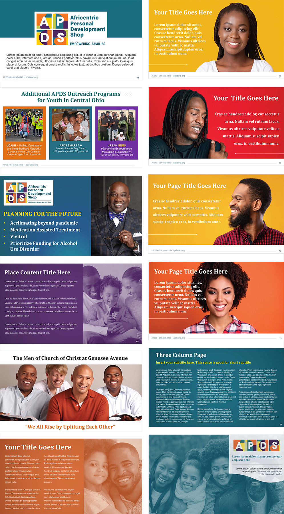
PowerPoint Slide Template and Ad Design Templates
Conference Banners
A set of retractable roll-up conference banners was produced for trade shows and community events. Alongside these, new website hero banners were designed to carry the refreshed brand into the digital environment.
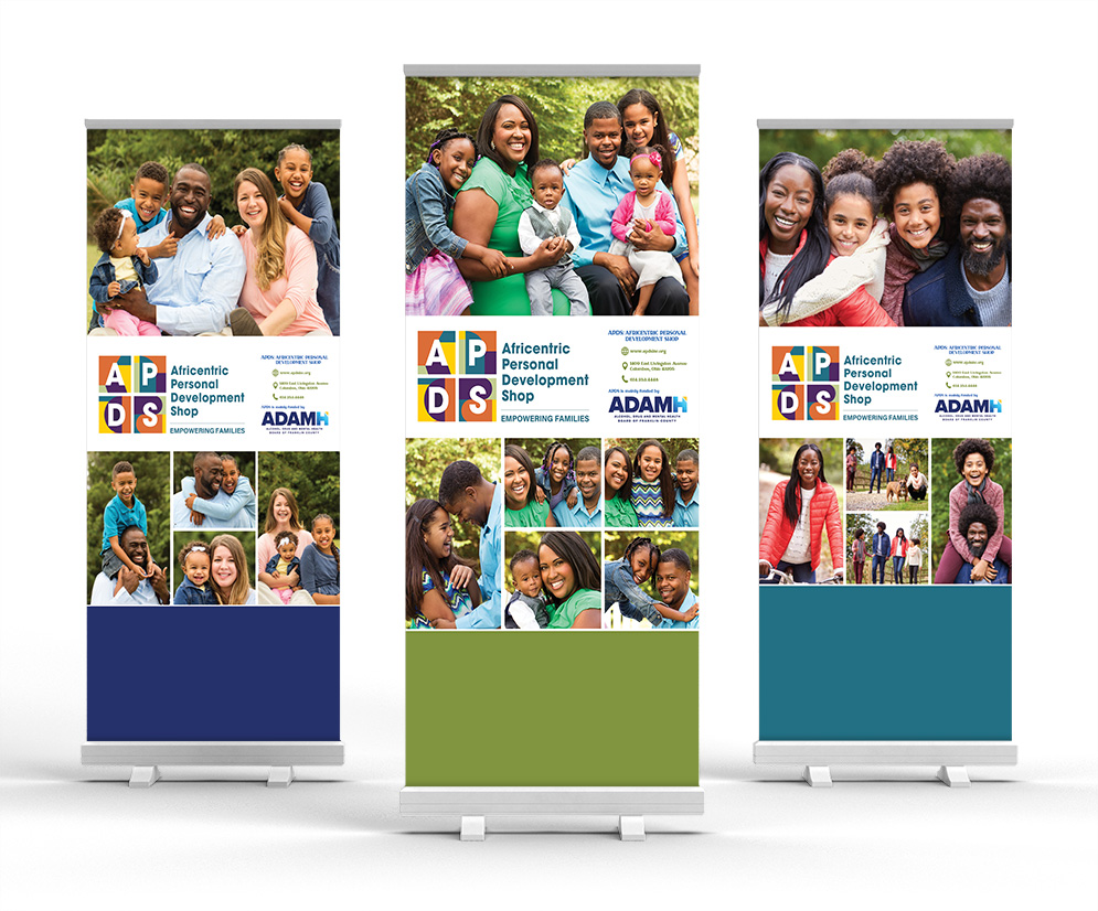
Roll-Up Conference Banners
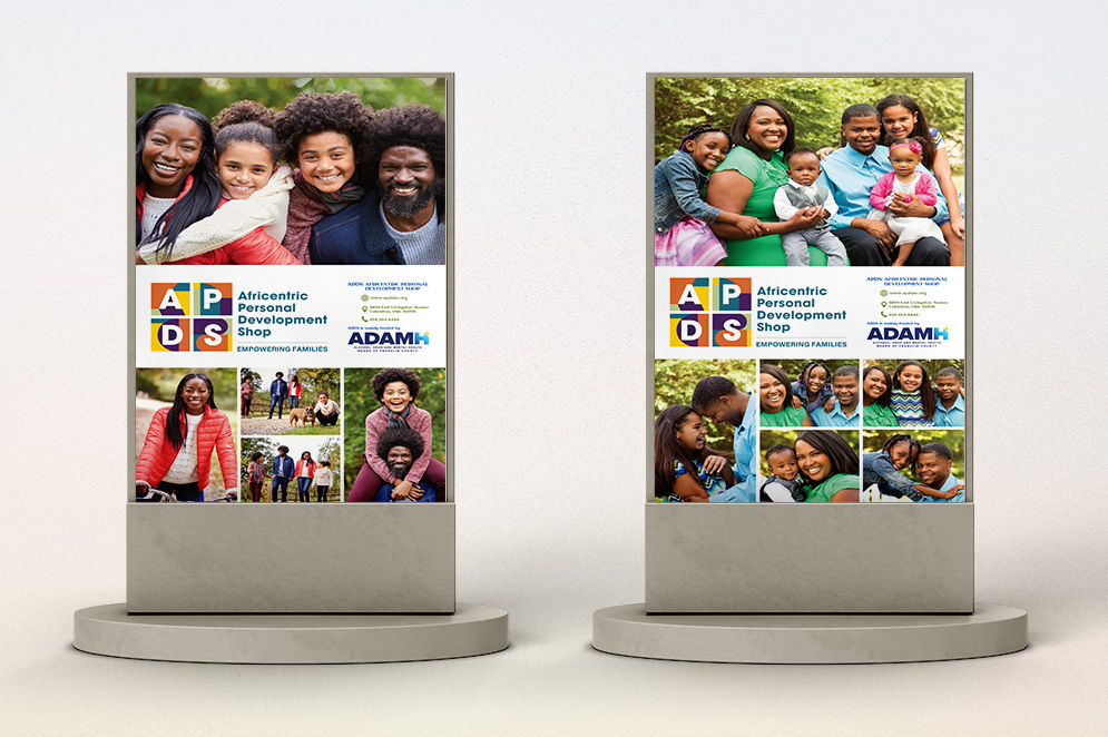
Retractable Conference Banners
Rebranded Website
The website was redesigned within the updated visual system — new photography direction, refined layout, and the updated color and patterning carried through every section. The copy, handled by a carefully selected copywriter who could speak directly to APDS's audience, was a critical component of this work. Getting the voice right was as important as getting the visual right.
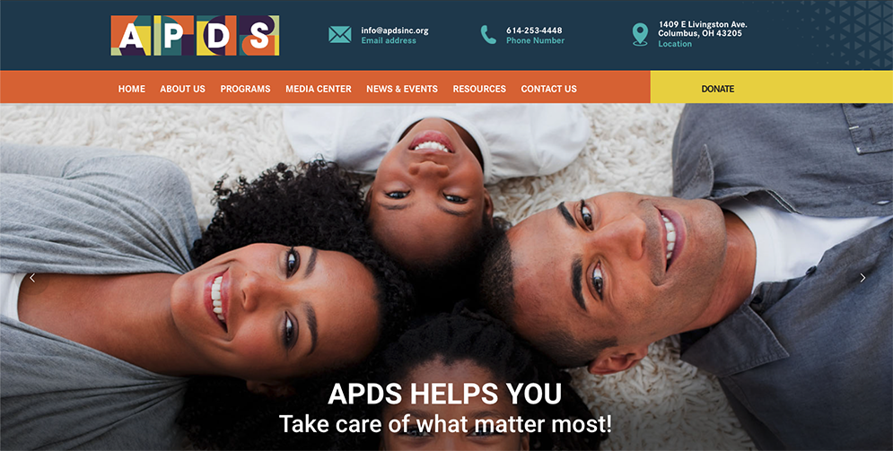
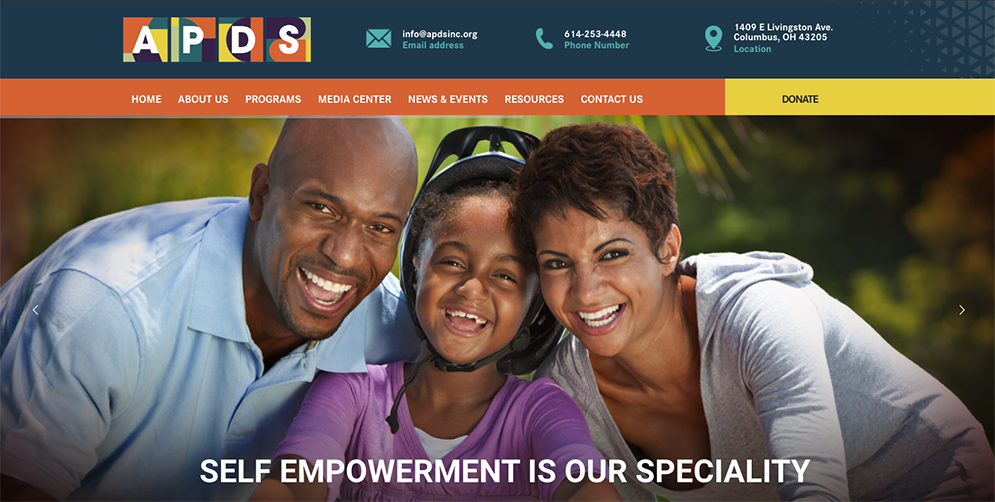
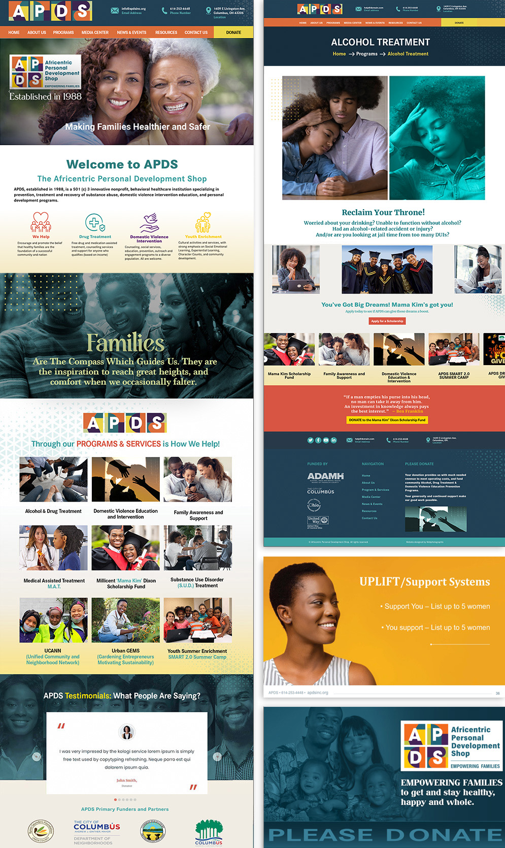
Website Layout
The rebrand required a complete rethinking of the website copy. The original content was deeply technical — appropriate for clinicians and grant reviewers, but inaccessible to the people most in need of APDS's services. Finding the right voice meant finding the right writer: someone who understood behavioral health, who could speak to an audience navigating addiction and domestic violence without condescension, and who brought genuine cultural awareness to the work. That was not a small ask. Getting it right made everything else land better.
34th Anniversary Event Branding (2023)
APDS's 34th anniversary coincided with a signature event — Breaking the Silence, a spotlight on domestic violence and the resources APDS provides. This was a milestone moment for the organization, and the event identity needed to honor that significance while also drawing new attention to a topic that often goes unspoken.
A fresh, inclusive visual approach was created to carry the anniversary celebration across a range of event materials — designed to feel joyful and commemorative while making clear the serious work that the anniversary was celebrating.

34th Anniversary People
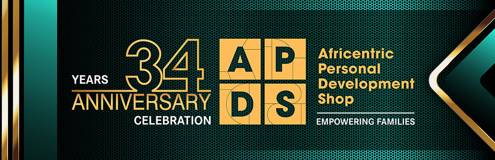
Text Banner and Table Cloth Runner
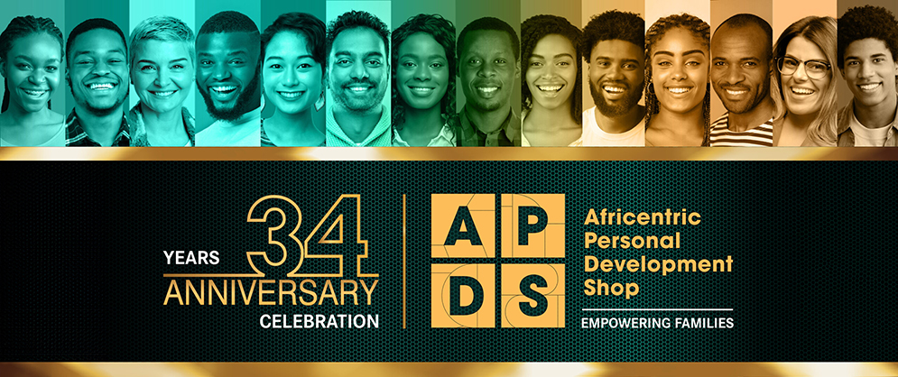
34th Anniversary Print Banner
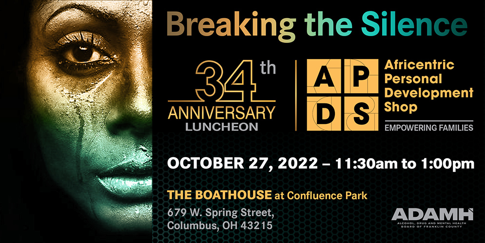
Breaking the Silence on Domestic Violence — Invitation
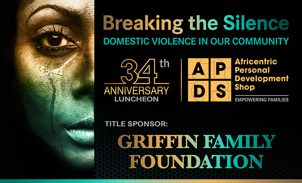
Breaking the Silence on Domestic Violence — Sponsorship Banner
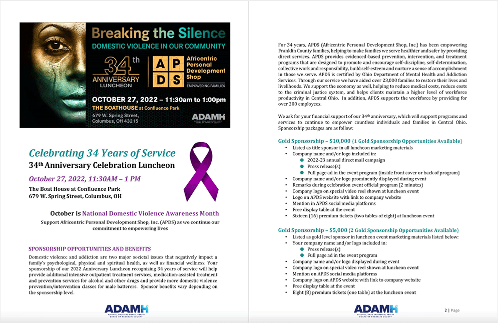
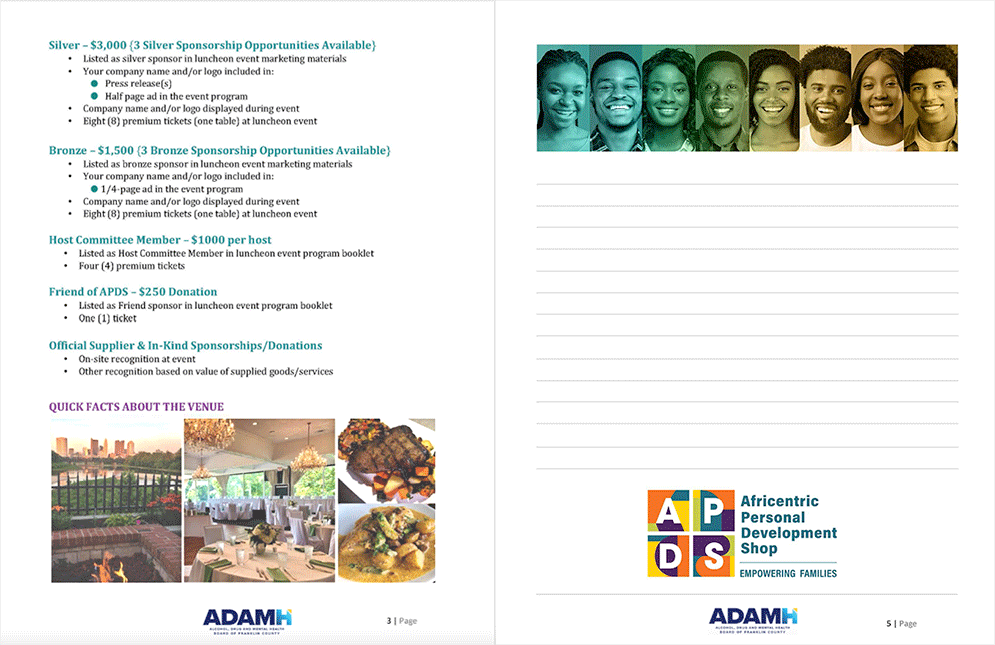
Breaking the Silence on Domestic Violence — Sponsorship Proposal
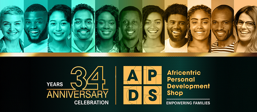
Breaking the Silence on Domestic Violence — People Banner
APDS Promotional and Corporate Collateral
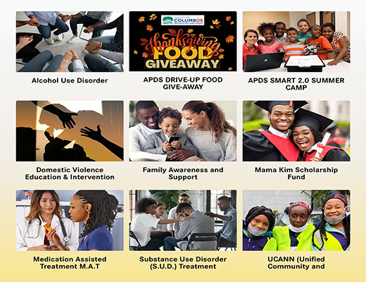
Across twelve years, a steady stream of promotional and program-specific collateral was produced to support APDS's outreach efforts. Each piece had to feel timely and relevant while staying firmly within the established brand system — a discipline that requires both speed and judgment.
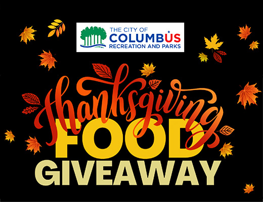
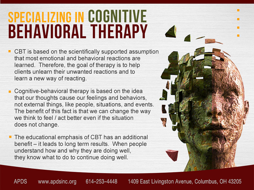
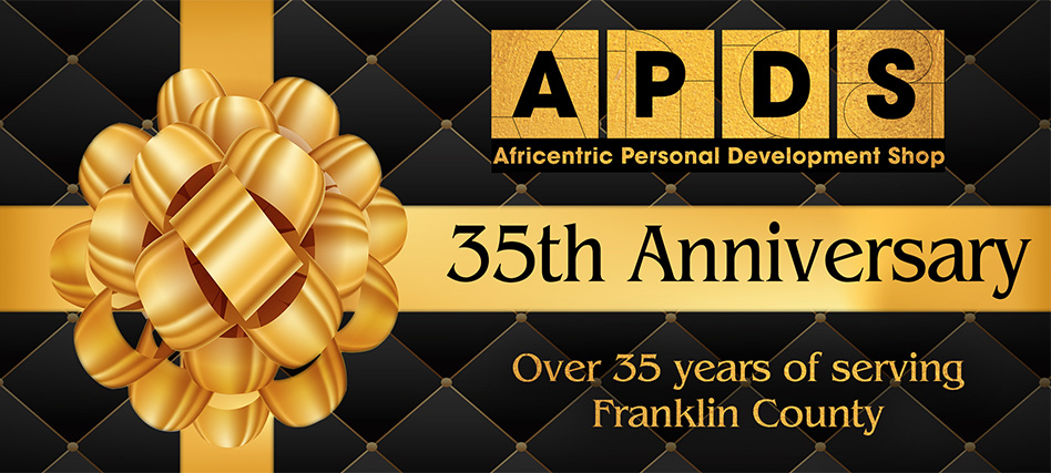
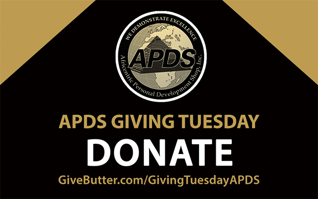
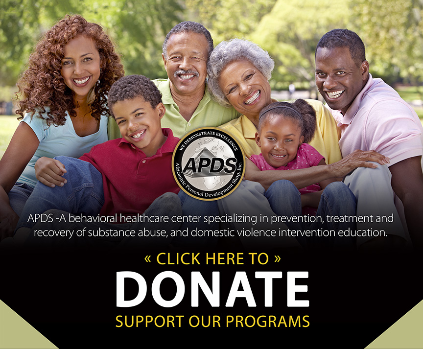
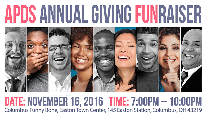
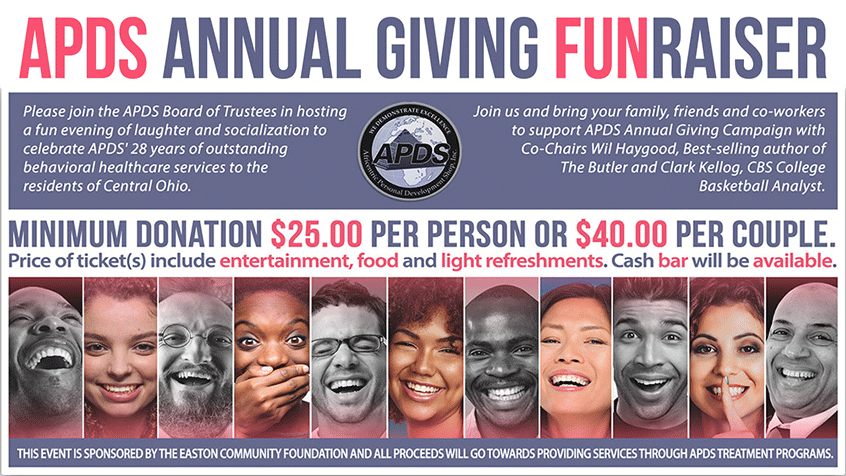
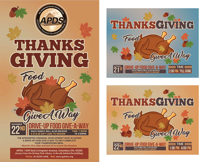
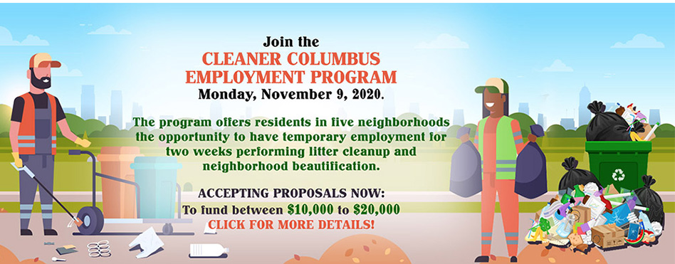
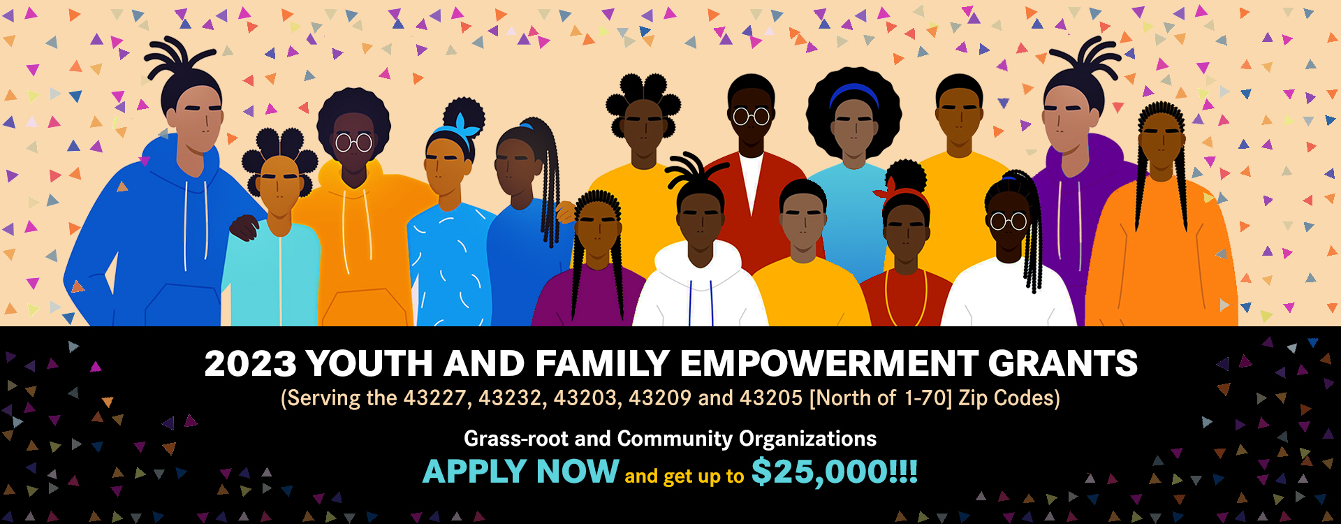
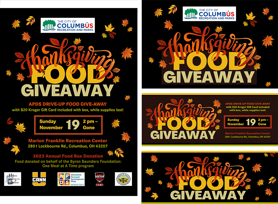
The work covered a wide range: branded PowerPoint slide templates and WordPress web slide updates kept the organization's digital presence fresh and on-brand. Fundraising campaigns, including a comedy show event and an annual donation drive, needed promotional materials that could motivate action without compromising the brand's warmth and credibility. And every year, the signature Thanksgiving Food Drive gave APDS and its youth program UCANN the opportunity to give back visibly and joyfully to the community they serve — designing materials that celebrated that generosity in equal measure.
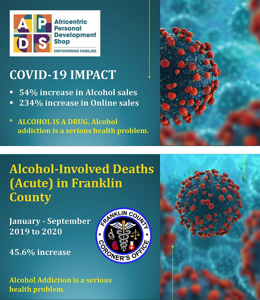
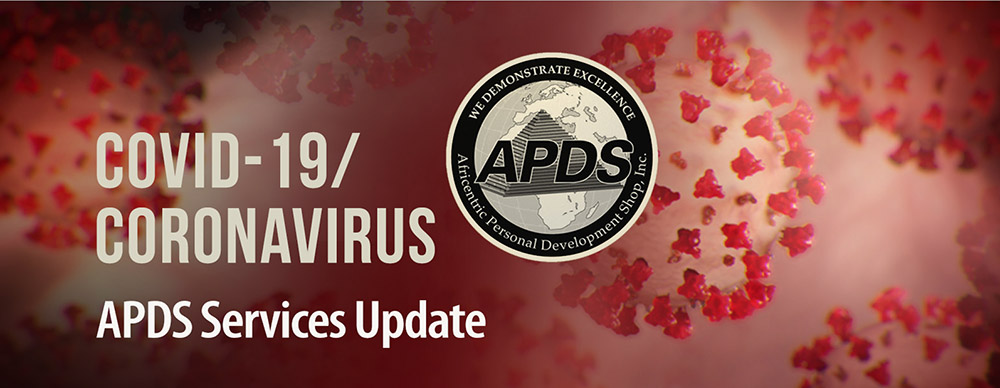
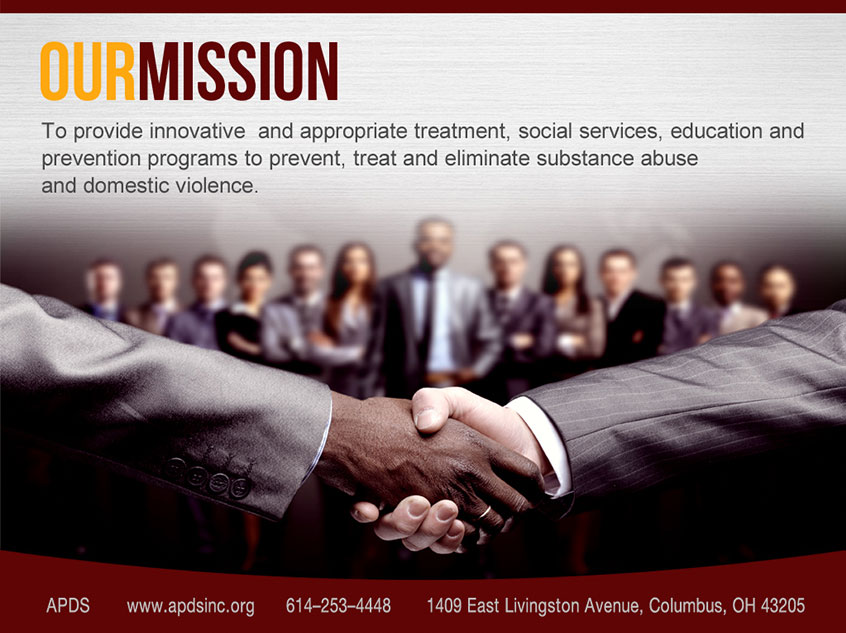
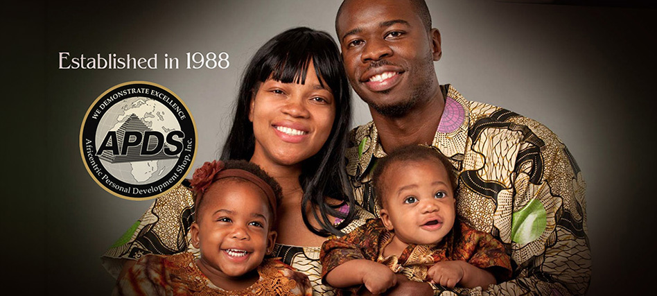
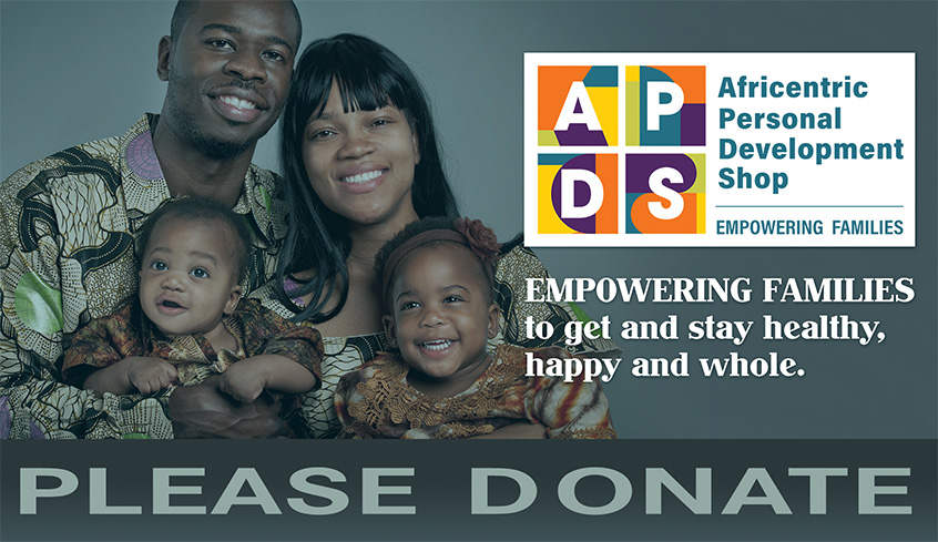
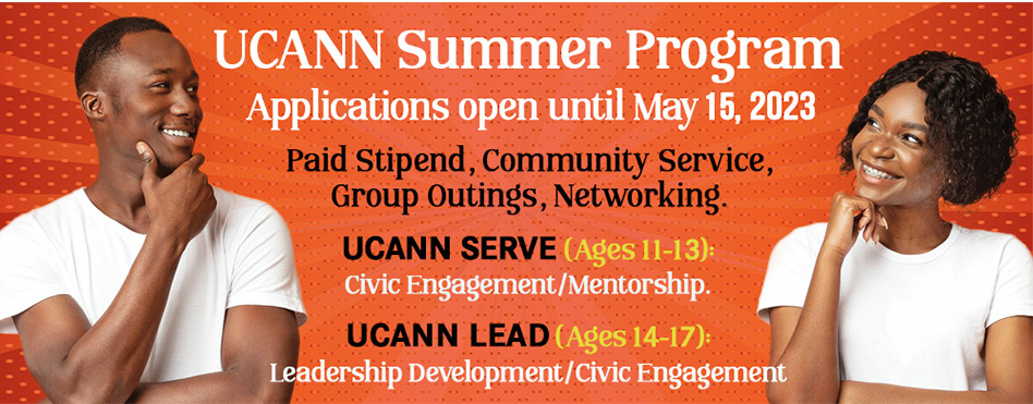

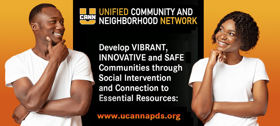
Each year APDS and its youth program UCANN collaborate with community organizations to donate food boxes to families in need. Every box is assembled to support a traditional Thanksgiving meal, and includes a $20 Kroger gift card to help with a turkey or any additional items the family needs. Designing the materials for this drive was an opportunity to celebrate generosity as much as to promote the event — warm, joyful, and unmistakably on-brand.
Website: Before and After Comparisons
A website is where brand credibility either holds or falls apart. Every design decision made across the brand (the photography direction, the color system, the typographic hierarchy, the navigation logic) has to translate seamlessly into the digital environment. These comparisons show what that looks like when it is intentional, and what it looks like when it is not.
The pages shown here under "Current Site" represent the version updated by a designer who came on after my contract ended. Where they retained the photography and layout decisions I established, the pages still read well. Where they departed from that foundation, the gap is visible.
Homepage
The original homepage was built as a unified visual experience: retouched, color-corrected photography, a cohesive section structure, a customized navigation system with intentional hover states, and every element designed to feel like it belonged. The current homepage shows what happens when a template is used as-is. Sections feel pieced together. The slideshow imagery is compressed to the point of softness. The navigation lost its refinement and reverted to a generic underline treatment that disappears against the page.
Functionality was equally important. Every link, button, and call to action on the original site was tested and verified. On the current site, two of the most prominent elements on the page do not work at all: a large green box prompting visitors to schedule an appointment leads nowhere, and an equally prominent orange box asking for donations has a non-functional Donate Now button. These are not minor oversights. They are the highest-visibility, highest-intent moments on the page — the exact moments when a visitor is ready to act. Leaving them broken signals that no one reviewed the work before publishing, and that kind of carelessness raises doubts that extend far beyond the website.
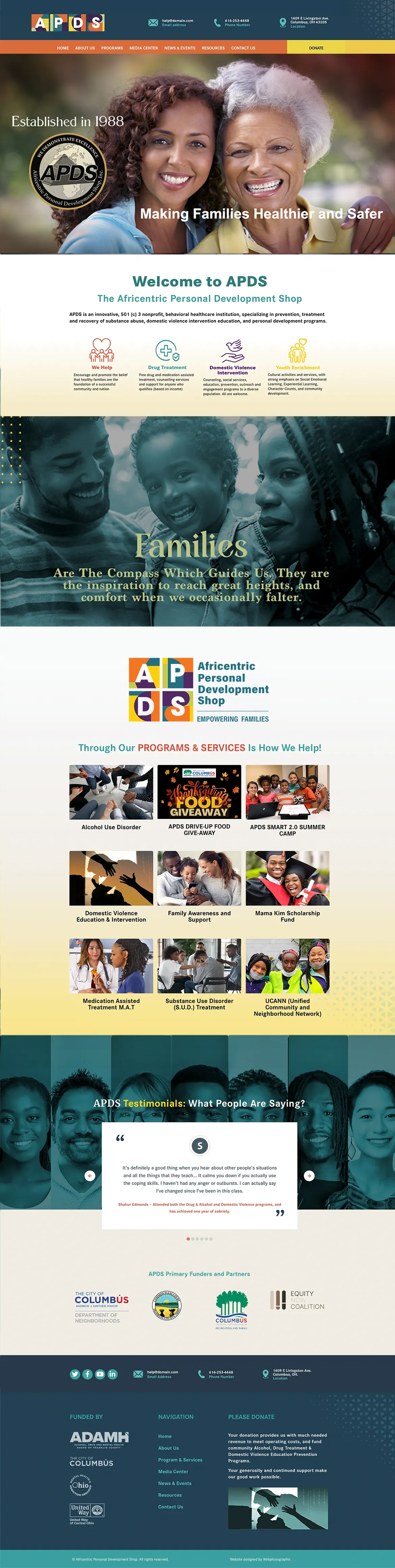
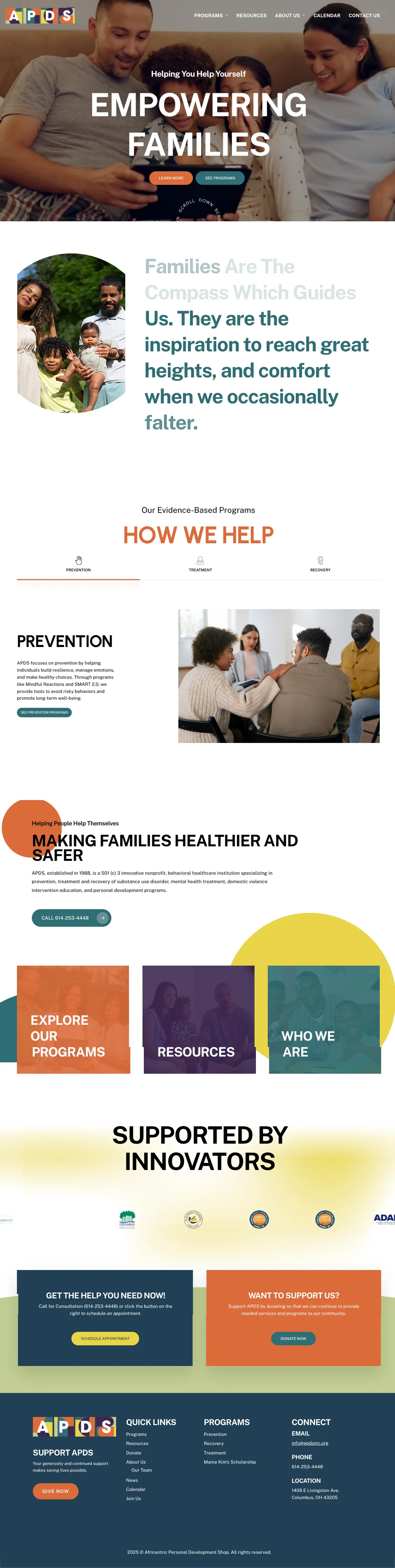
Homepage: Original design (left) vs. current site (right)
Programs and Services Page
The Programs page is one of the highest-traffic pages on any behavioral health organization's site — people land here looking for specific help. The original design treated that with respect: a custom-designed page that organized programs clearly, with curated imagery and a layout built specifically for this content. The current version falls back on the template's default gallery module, a generic grid that presents everything at the same visual weight with no hierarchy to guide the user.
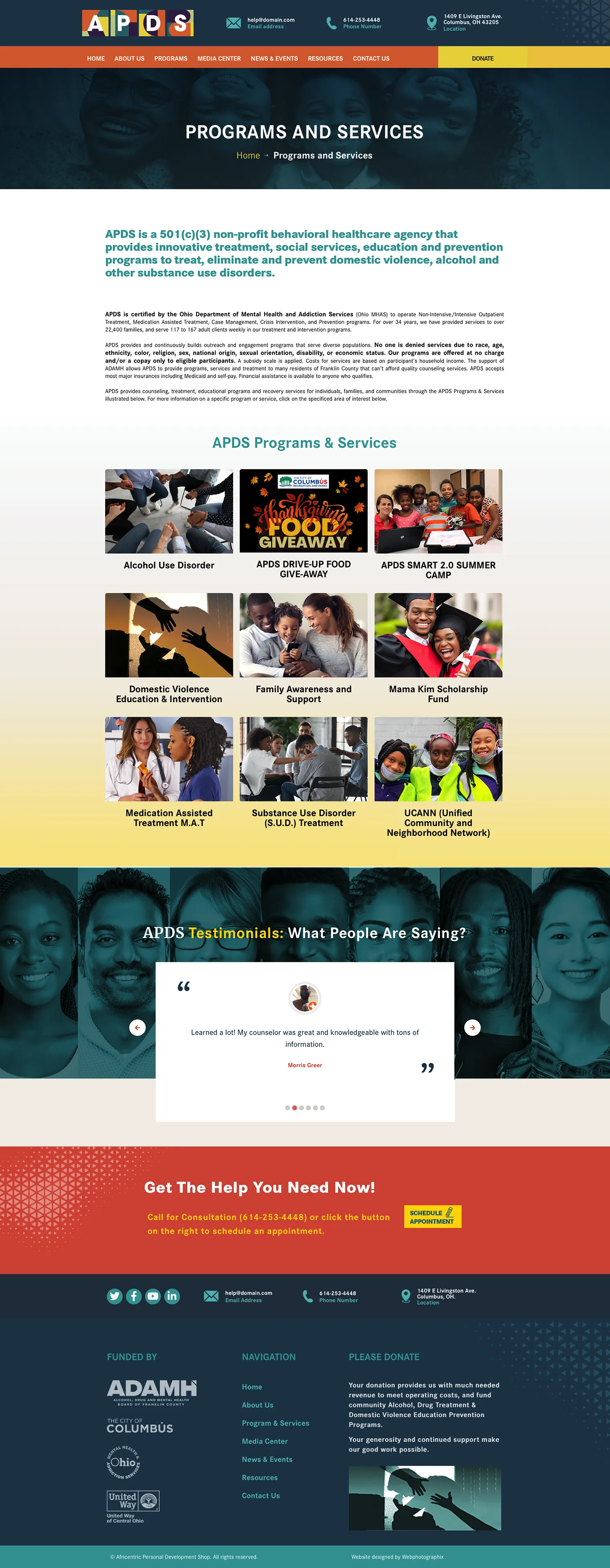
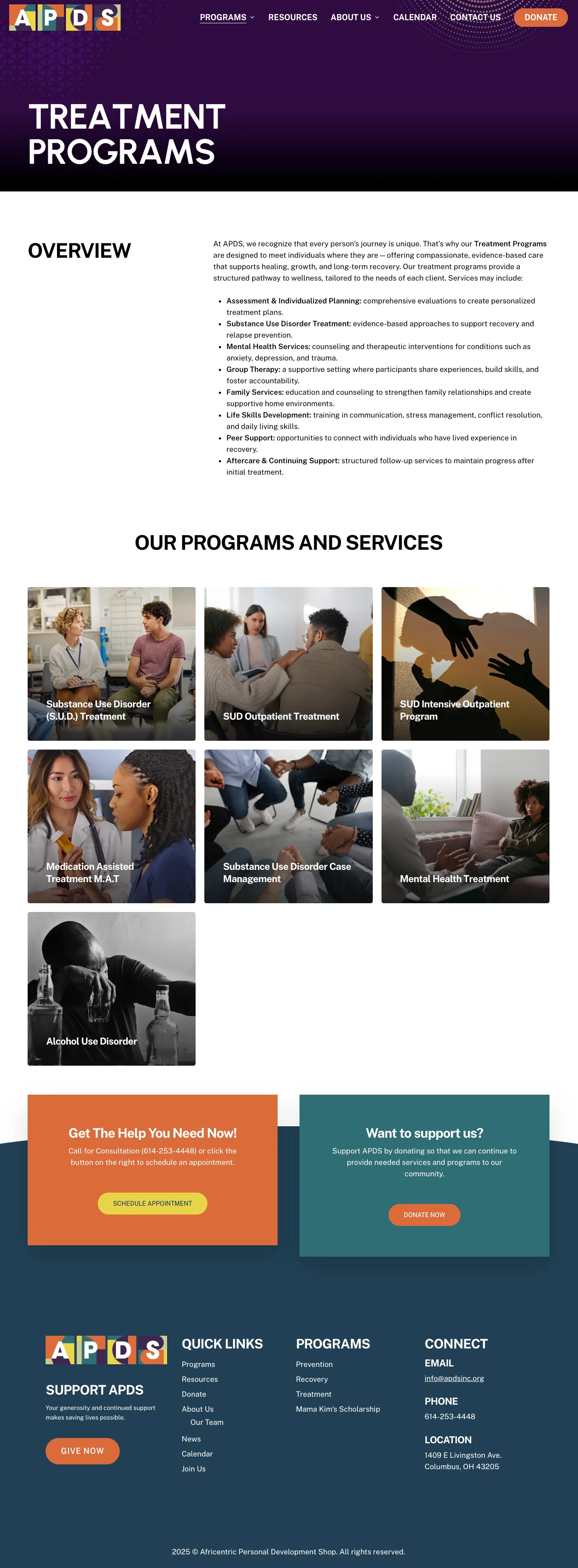
Programs and Services page: Original design (left) vs. current site (right)
Alcohol Use Disorder Page
Interior program pages are where brand consistency is most frequently tested, and most frequently lost. The original Alcohol Treatment page was built with a single photographic language: images selected for tone, retouched for consistency, and composed to carry the narrative from top to bottom. The current page introduces three visually incompatible photo styles on the same page, none of which have been adjusted to align. The result undercuts the credibility of the content.
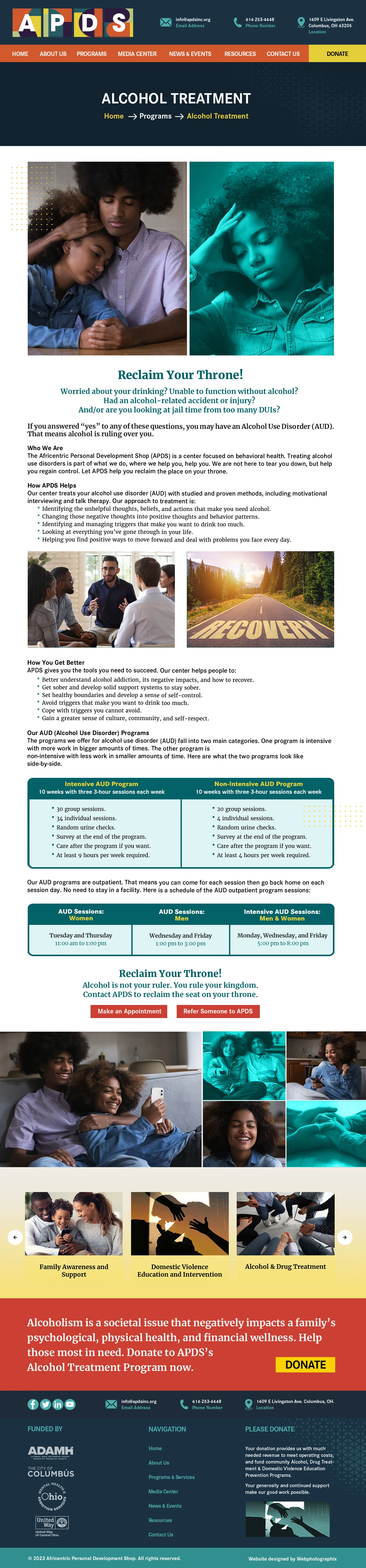
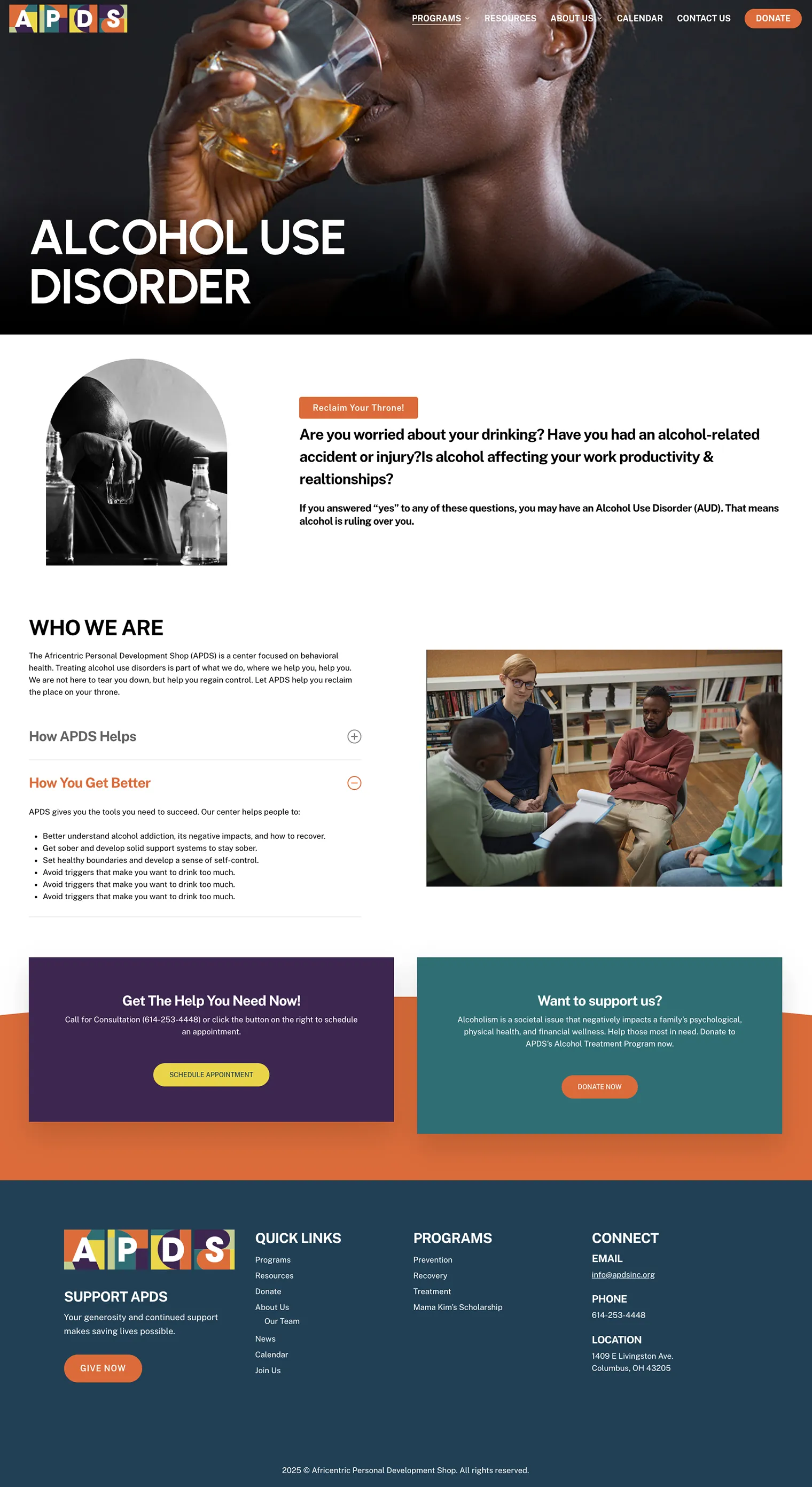
Alcohol Treatment page: Original design (left) vs. current site (right)
Navigation Design
Navigation is one of the most functional expressions of a brand's design thinking. The original dropdown was light, seamless, and considered, with bold color and contrast on hover that clearly communicated where the user was without competing with the content behind it. The current dropdown is straight out of the template: minimal styling, no visual hierarchy, a thin underline that disappears against the hero imagery.
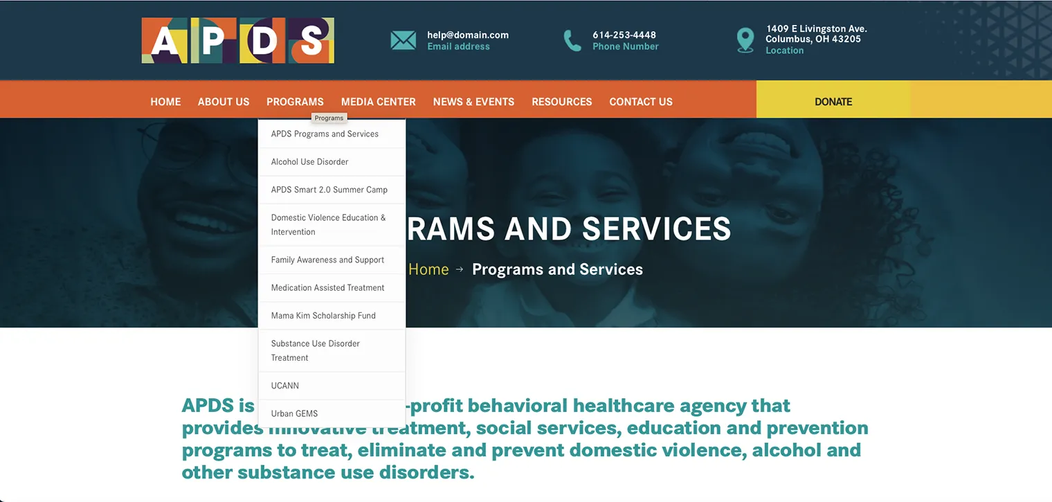
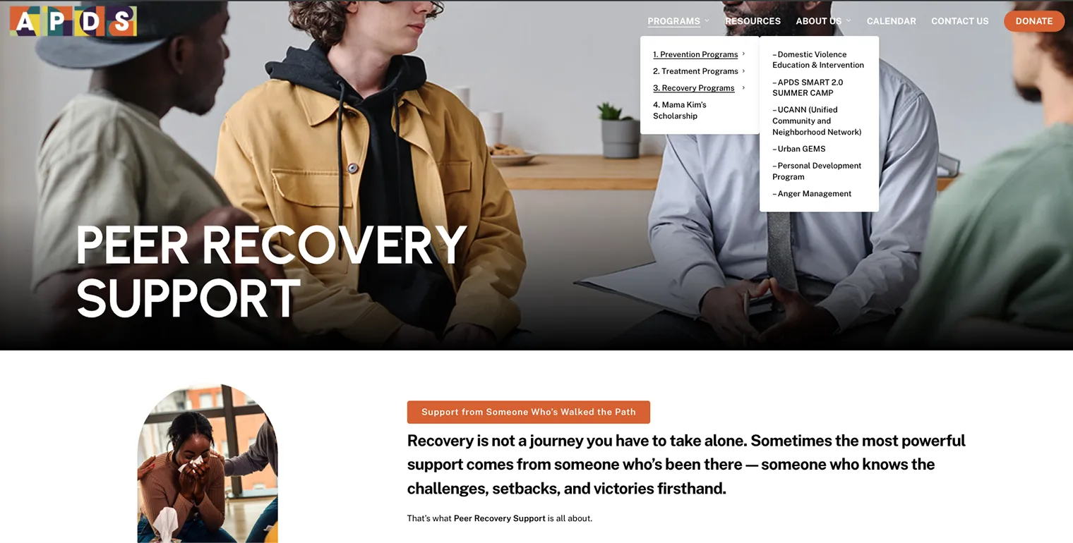
Navigation dropdown: Original design (top) vs. current site (bottom)
A Note on What Holds
It is worth acknowledging what did not change: The pages where the current designer retained the photography I selected and retouched still read well. The Medication Assisted Treatment page is the clearest example. The images are the same ones I sourced and adjusted. The page still carries the visual coherence of the original design system. That is not coincidental. It is evidence of how much photo selection, retouching and art direction contribute to the overall quality of the work, and how far that foundation can carry a page, even when the designer is different.
What This Work Demonstrates
Twelve years of trust, cultural fluency, and brand stewardship across every touchpoint.
Building Trust Through Consistency: Twelve years of continued collaboration reflects more than successful design projects. It reflects a working relationship built on reliability, communication, and an understanding of the organization's mission and audience.
Balancing Creativity with Practical Needs: Community organizations often operate with limited resources, competing priorities, and evolving goals. This work required creative problem-solving, adaptability, and the ability to deliver professional results across a wide variety of formats and initiatives.
Strategic Partnership Beyond Design: Creative value often begins before the first layout is built. Advising on messaging, audience communication, website structure, and content strategy helped ensure the work solved the right problem, not just the visible one.
Brand Consistency Across Every Touchpoint: From websites and presentations to fundraising campaigns, event branding, brochures, signage, and outreach materials, every piece contributed to a unified and recognizable brand experience.
Long-Term Brand Stewardship: Building a brand is one challenge. Maintaining, evolving, and protecting it across twelve years of growth, new programs, changing audiences, and shifting organizational priorities is another entirely. The result was a brand that could adapt to new needs and opportunities without losing the consistency, credibility, and trust that had been built over time.
Audience Sensitivity in a Community-Focused Environment: Behavioral healthcare communications must feel welcoming, approachable, and human. Every decision, from imagery and color to typography and messaging, contributed to creating a brand experience that felt credible, culturally relevant, and safe enough for people to engage with when seeking support.
Copywriting Collaboration: Strong design can attract attention, but communication only works when people understand the message. Recognizing that APDS's highly clinical language created barriers for the audiences it hoped to reach, I helped connect the organization with professional copywriting support so the content could become clearer, more approachable, and more effective without losing its credibility.
Designing for Community-Based Organizations: Behavioral healthcare, addiction recovery, domestic violence intervention, and youth services require thoughtful communication. The work must feel credible, approachable, culturally relevant, and accessible to audiences navigating difficult circumstances.
The Impact
Over the course of twelve years, APDS evolved from a collection of disconnected materials into a cohesive and recognizable brand presence across print, digital, environmental, and community outreach channels. The work extended beyond individual deliverables to include long-term brand stewardship, helping the organization communicate with greater clarity, consistency, and professionalism while remaining connected to the communities it serves.
Perhaps most importantly, the relationship demonstrates the value of trust in the creative process. From major rebranding initiatives to annual campaigns and community programs, APDS continued to rely on my creative direction year after year, allowing the brand to grow and adapt without losing the authenticity and sense of purpose that made it meaningful in the first place.