
Case Study 6:
The Fire Within

Building a Brand from
a Title, a Tagline, and a Story Worth Telling
Some projects come with a full creative brief. This one came with a title, a tagline, and a date. For aspiring author Janet Smith's debut autobiography, The Fire Within: One Woman's Journey of Adversity, Resilience, and Triumph, I was handed complete creative autonomy and trusted to build something worthy of her story from the ground up.
The scope was broad: logo and visual identity, book cover design, biography page, event signage, and a fully responsive website complete with an animated hero image and interactive slideshow. What made it remarkable was not the volume of deliverables, but the depth of creative investment each one required. The result was a cohesive brand presence that played a measurable role in growing Janet's audience and driving book sales at launch and beyond.
The Starting Point
Janet provided three things: The book title, the tagline, and event details for the launch. No existing logo. No established visual language. No reference imagery. The story itself, a personal autobiography about adversity, survival, and eventual triumph, was the only real creative brief. Everything else had to be developed from concept outward.
That kind of open brief is both a privilege and a responsibility. The creative latitude is significant, but so is the obligation to get it right. This was Janet's story. The design had to honor that without being so personal that it lost its ability to reach a wider audience. Finding that balance between intimate and universal, between expressive and professional, was the central creative challenge of the entire project.
My Role
Role: Art Director, Senior Designer, Brand Identity Designer, Book Cover Designer, Web Designer, Motion Designer
For The Fire Within, my role covered the full creative development of the project from concept through final delivery. I developed the visual identity, logo treatment, book cover, biography page, launch materials, event signage, responsive website, animated hero image, and supporting promotional pieces. Because the project began with only a title, a tagline, and the author’s story, the role required more than design production. It required concept development, visual storytelling, brand building, image creation, layout design, digital design, motion exploration, and the judgment to turn a deeply personal story into a professional public-facing brand.
The Challenge
Translating a deeply personal journey into a visual language that resonates beyond the individual. The brand needed to communicate the arc of the story, from darkness and struggle toward light and empowerment, in a way that felt emotionally authentic without being heavy or inaccessible.
It also needed to:
The Concept
The central idea was transformation. Not as a theme, but as a visual experience. Every design choice, from color to composition to typography, was built to carry the reader through the same arc Janet lived: from calamity and confusion toward clarity, confidence, and triumph.
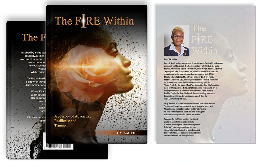
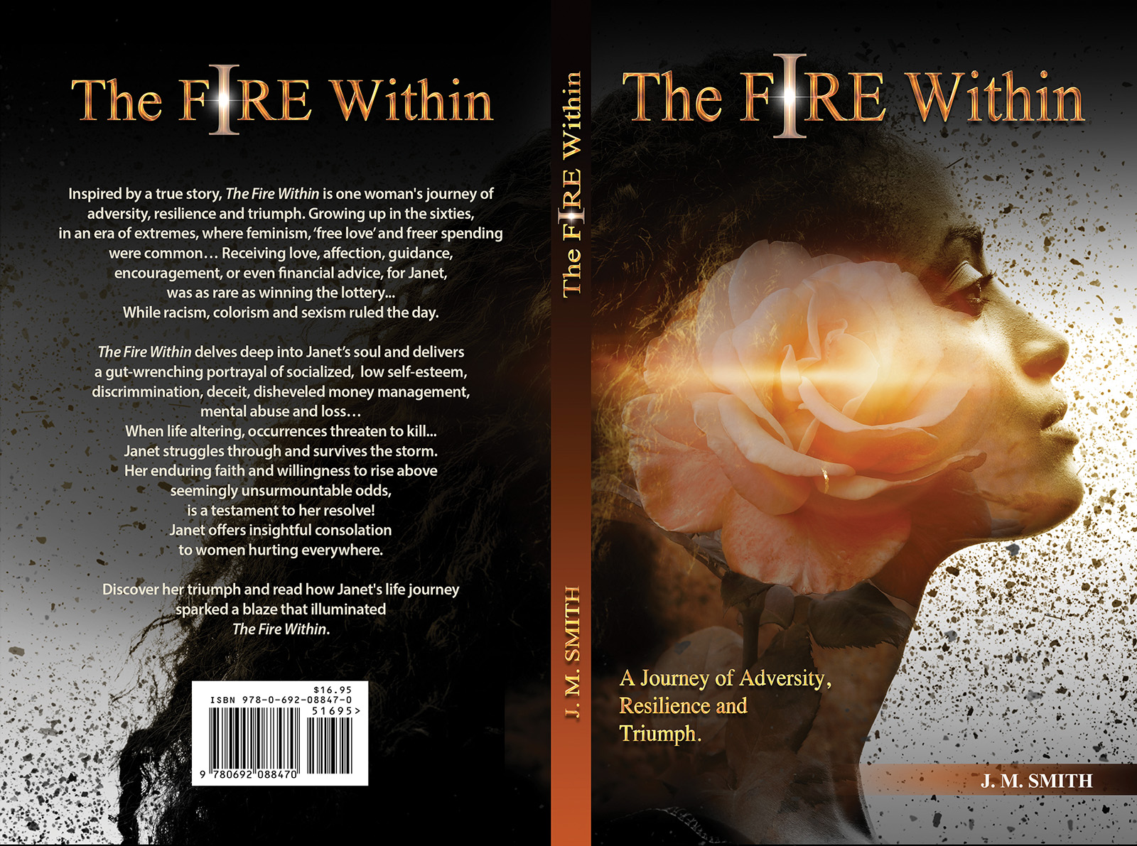
The woman's profile created for the cover and hero image is where that concept is most visible. Color moves from deep shadow into warm illumination, with light catching the edges of her face at precisely the moment the image resolves. Fragments of turbulence and discord, the debris and ash of what she survived, recede into the background. What remains in the foreground is strength.
The logo carries the same idea in a more concentrated form. The over-emphasized “I” in The FIRE Within is a deliberate signal: this is not a story about fire in the abstract. It is about one woman's internal fire, her “I,” and the journey it took to claim it.
The Fire Within Book Title and Logo (2)

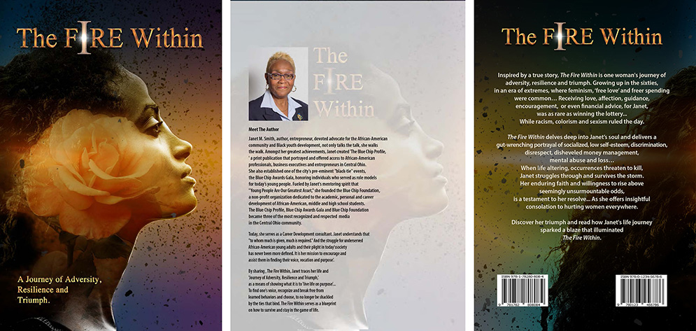
The Fire Within Book Cover Design by Giselle White
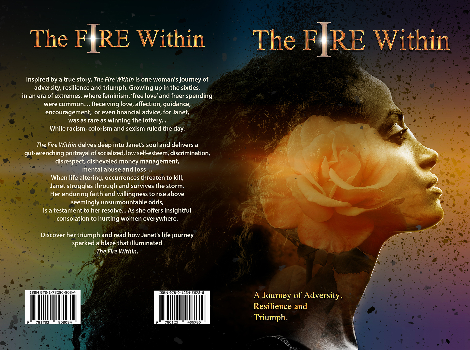
Front Cover, Back Cover and Biography page.
Motion: Bringing the Brand to Life
What the static design communicates through composition and color, the animated hero image communicates through time. Seeing the concept in motion changes the experience entirely. The darkness lifts. The light builds. The story moves.
Most of my work lives in corporate environments where motion is rarely on the table. This project was a rare opportunity to push into that space, and I explored it through Photoshop animation in a way that felt true to the brand rather than decorative. The animation was not added to the website as a feature. It is the website's opening statement.
The client's complete trust made that level of creative commitment possible, and the response confirmed it was the right call. The animated hero became one of the most talked-about elements of the launch, contributing directly to audience growth and book sales. See it in context at the live site.
The Fire Within Animation

The Website: A Digital Home for the Story
The responsive website was built in HTML and CSS, designed to carry the full visual identity into a digital experience that could reach readers wherever they are. The layout prioritized the book and Janet's story above everything else, with an interactive slideshow extending the brand's visual narrative across multiple screens and moments.
Every design decision on the site serves the same objective as the print work: make a reader want to know this story. The site needed to do that for someone who had never heard of Janet Smith, arriving cold, in under a few seconds.
The Fire Within Website Hero Image (Slide 1)
View Website
The Fire Within Website Hero Image (Slide 2)
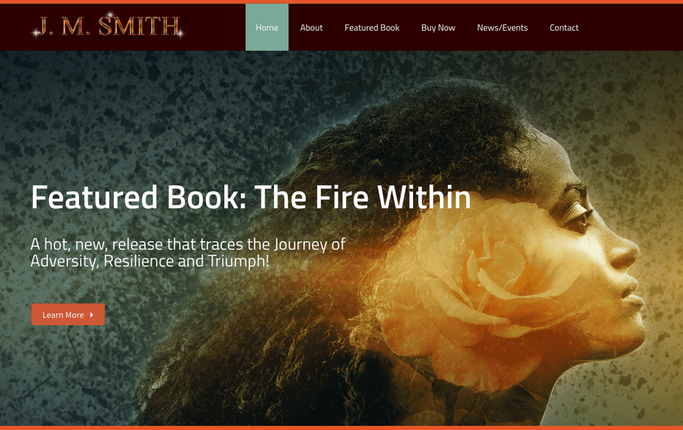
The Fire Within Responsive Website Design Screenshots
View Website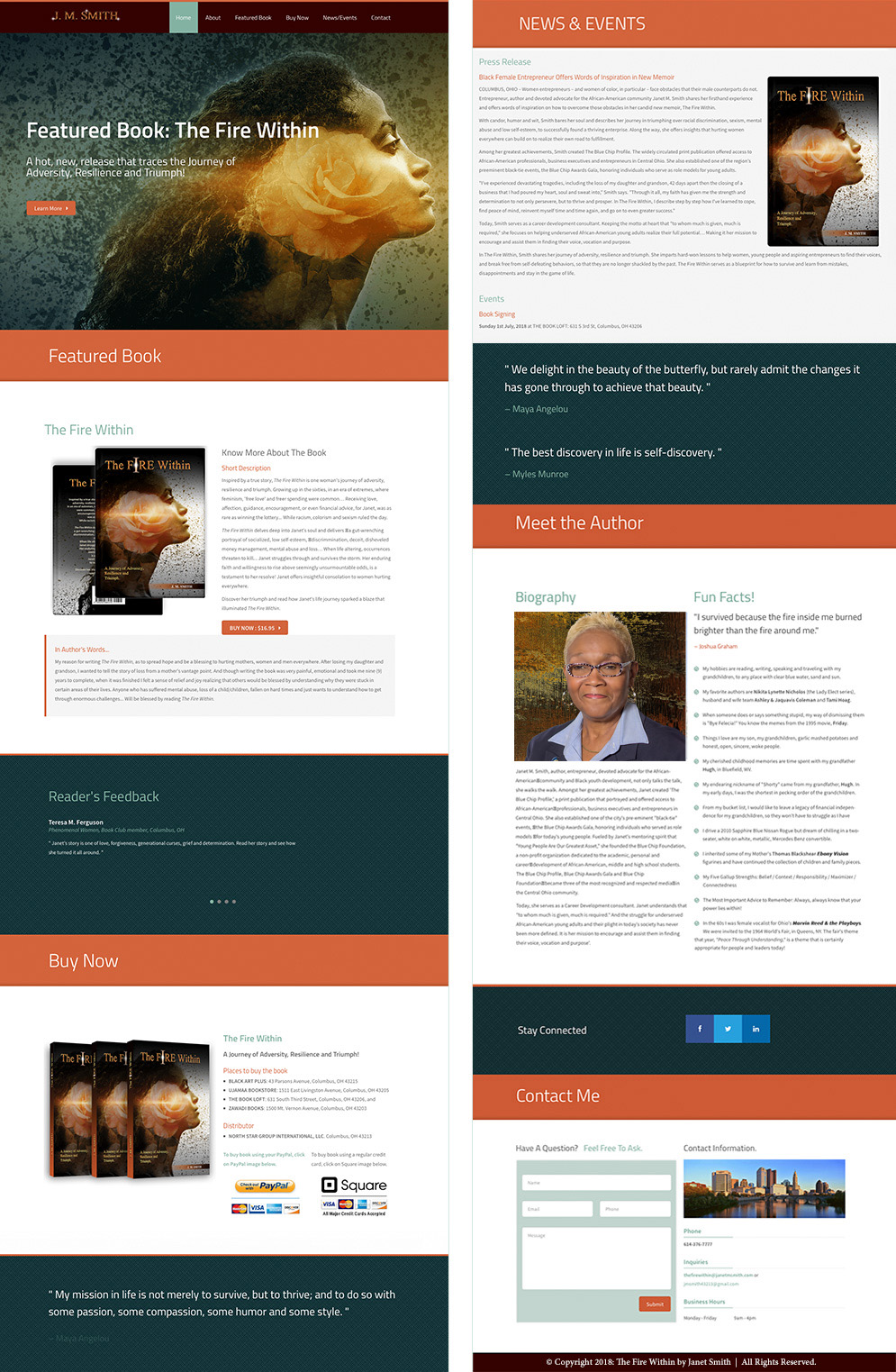
Event Materials: The Brand at Scale
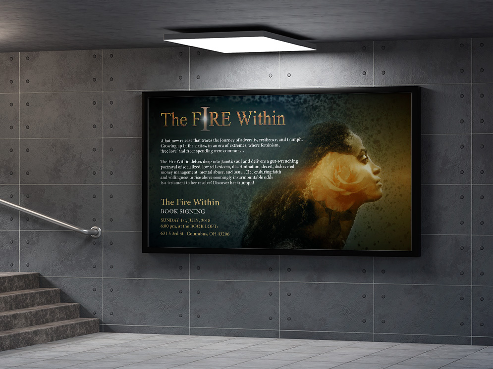
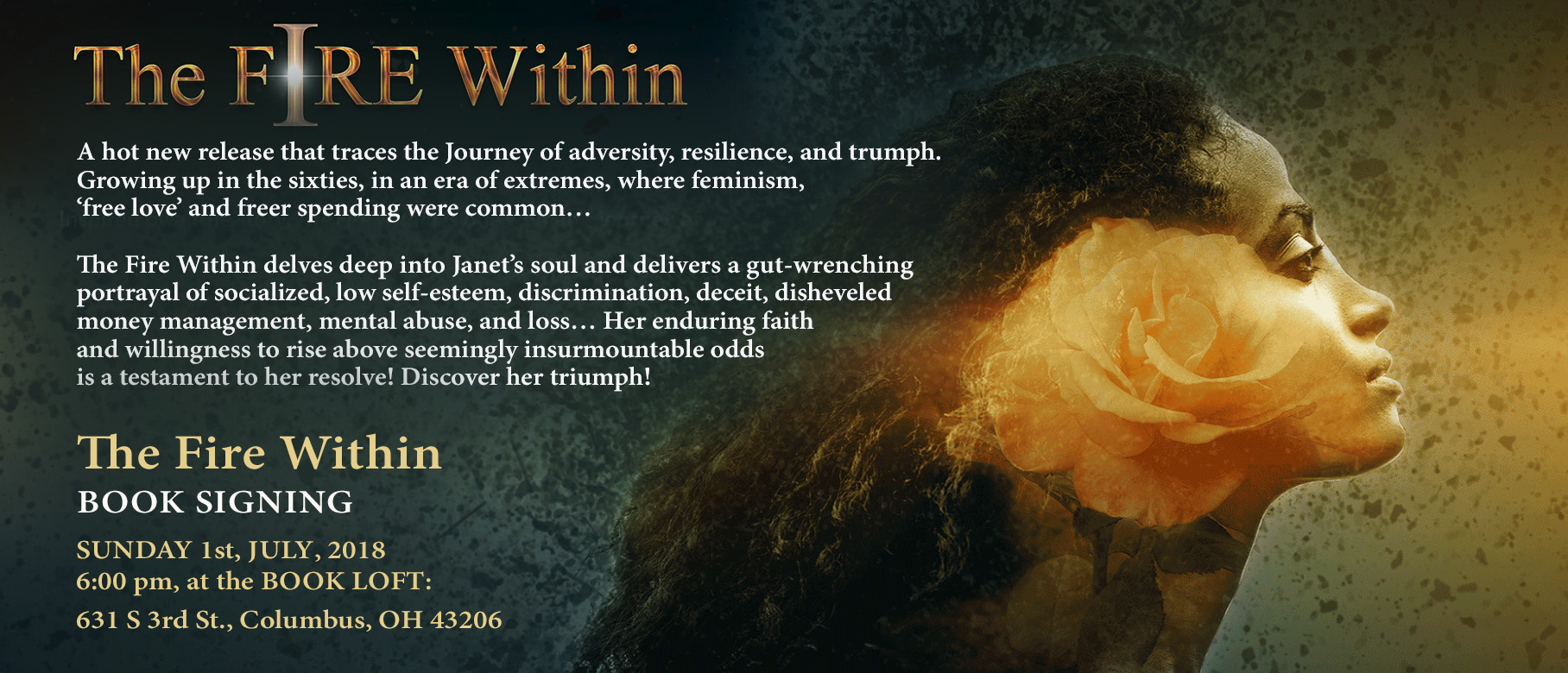
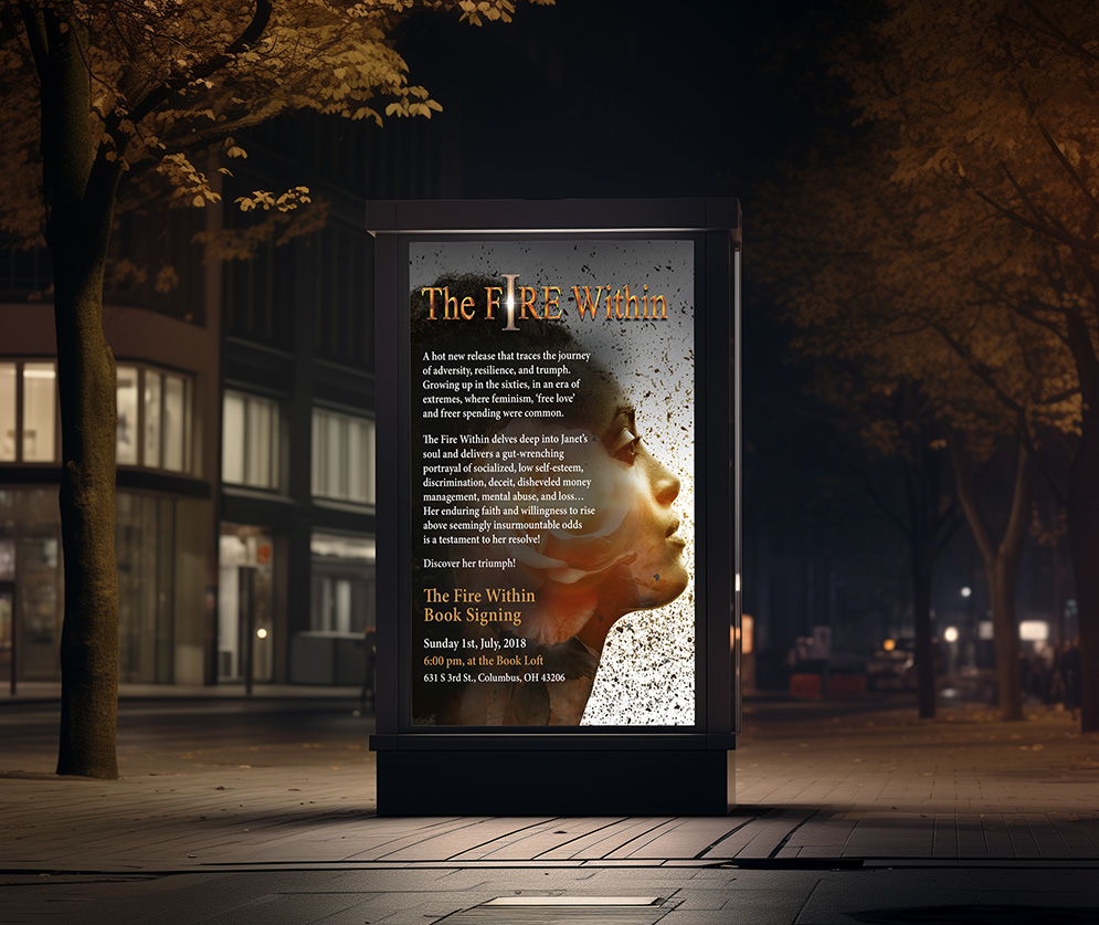
The book launch brought the identity into physical space. Environmental graphics, signage, and banners had to carry the same emotional presence as the cover and the website, now translated into large-format applications that would surround Janet and her audience during the event. What works at book-cover scale has to be reconsidered entirely at banner scale, and the visual system was built to make that translation successfully.
Additional print materials, including the author biography, promotional materials, and event collateral, completed the suite, ensuring that anyone who picked up a copy of Janet's book, The Fire Within, left with a consistent impression of the brand and the story behind it.
Event Signage & Environmental Graphics
The Printed Book

The Fire Within Book Title and Logo (1)

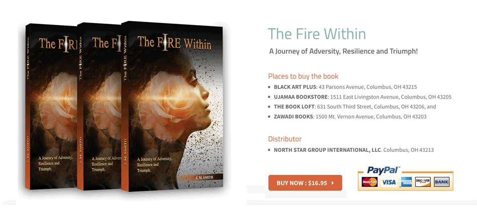
The Fire Within Book Cover Design
What This Work Demonstrates
Building a Brand from Scratch
This project demonstrates the ability to build a complete brand from a minimal starting point. With only a title, a tagline, and the author’s story as the foundation, the work developed into a cohesive identity that could support a book launch, public event, website, and promotional campaign.
Storytelling Through Design
The work shows strong concept development and visual storytelling. The cover image, logo treatment, color progression, typography, motion, and supporting materials were all designed around the same emotional arc: adversity, resilience, transformation, and triumph.
Extending the Story Through Motion
The project demonstrates cross-medium design thinking. The visual identity had to hold together across intimate print pieces, large-scale event signage, digital screens, animation, and responsive web design without losing its emotional character or professional polish.
Creating a Unified Brand Experience
The result was a full author branding package that helped give a first-time author a credible, memorable, and market-ready public presence. The unified design system supported audience engagement, strengthened the launch experience, and contributed to book sales.
The Impact
This project gave a debut author a complete, cohesive brand presence where none existed before. What began as a title, a tagline, and a personal story became a fully developed launch package spanning identity, book cover design, event graphics, promotional materials, motion, and a responsive website. The work helped Janet Smith enter the market with a polished and memorable presence, giving her story the visual strength, credibility, and emotional pull it needed to connect with readers. The animated hero and unified brand experience became key parts of the launch, helping build audience interest, support book sales, and extend the life of the project beyond the event itself.