
Case Study 3:
Honda
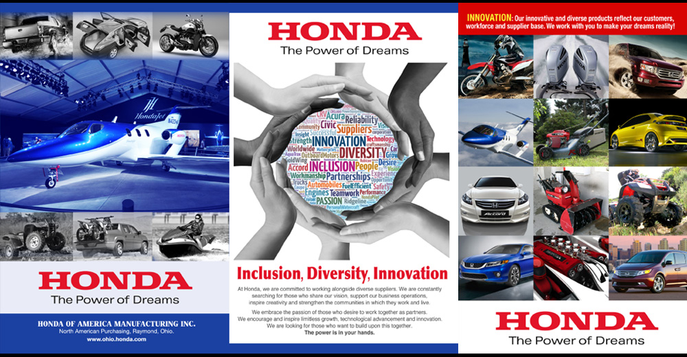
Bigger Than the Brief
What started as a request for a single flyer ultimately became a campaign system that expanded across audiences, languages, marketing channels, and conference environments. The experience reinforced an important lesson: when the idea is strong enough, the work often grows beyond the original brief.
The Context
Honda's brand spans an extraordinary range: automobiles, motorcycles, power equipment, marine products, and aviation. Communicating across that breadth while maintaining a singular, cohesive identity is no small task. For this project, the focus was on Honda's Inclusion, Diversity, and Innovation messaging: A values-driven communication that needed to resonate across diverse audiences without defaulting to obvious product imagery.
The initial brief was specific: Design a flyer using the supplied headline and copy. No automobiles. The constraint was intentional. Honda wanted the concept to stand on its own, to communicate values rather than product. That creative constraint turned out to be the most useful part of the brief.
The Challenge
How do you visually represent Inclusion, Diversity, and Innovation for a global brand without showing its most recognizable products? The solution couldn't be generic. It had to be distinctive enough to carry Honda's authority, flexible enough to work across multiple business areas, and adaptable across both English and Spanish communications.
Specifically, the work needed to:
My Role
I led concept development and visual design for the campaign from the initial flyer through its expansion into a broader marketing and conference branding initiative. My role was to translate an abstract values-based brief into a visual concept that felt distinctive, flexible, and unmistakably Honda. As the work continued to gain traction, I helped extend the system across additional applications, audiences, and languages while ensuring the core idea remained intact. What began as a single deliverable ultimately became a campaign platform capable of supporting a much larger communication effort.
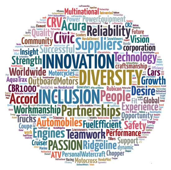
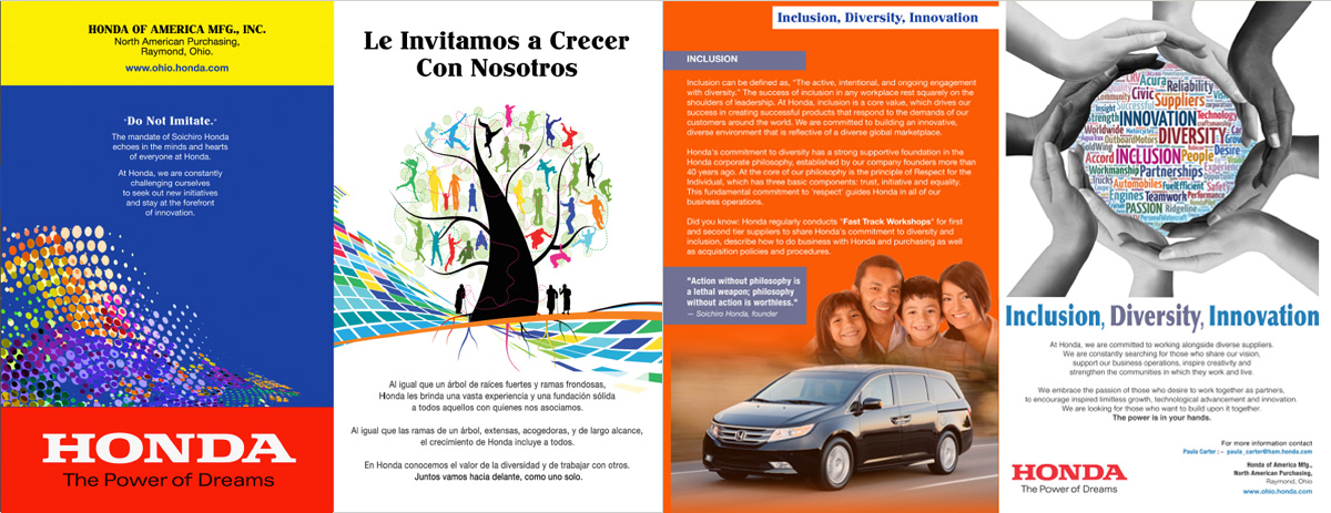
Inclusion, Diversity & Innovation Word Cloud Concept
The Concept
The central idea combined three visual elements into a single unified composition: a word cloud, a circle of hands, and a carefully considered color and layout system.
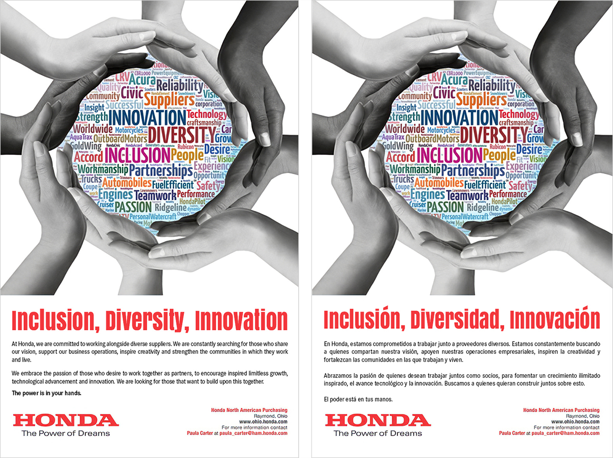
The word cloud sat at the heart of the design, representing Honda's breadth of innovation, capabilities, and product diversity. It communicated the idea of Honda's reach through words and typographic design. Surrounding it, a circular arrangement of hands became the visual anchor for inclusion and diversity, suggesting community, connection, and shared purpose without being heavy-handed or literal. By allowing innovation, diversity, products, and capabilities to exist within the same visual structure, the concept communicated Honda's breadth without relying on any single product category.
The circular composition did something additional: it subtly evoked a global perspective, reinforcing Honda's identity as a world-class brand operating across cultures, markets, and communities. And critically, the concept connected directly to Honda's brand messaging at the time: "The Power is in Your Hands." The visual and the narrative were speaking the same language.
The result was a visual system with genuine flexibility. Remove or adapt any one element and the others still hold. That modularity is what allowed it to travel across such a wide range of formats and contexts.
Campaign Concept: Inclusion, Diversity & Innovation
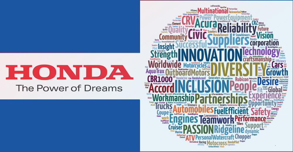
Honda of America Graphic and colored Magazine Ad
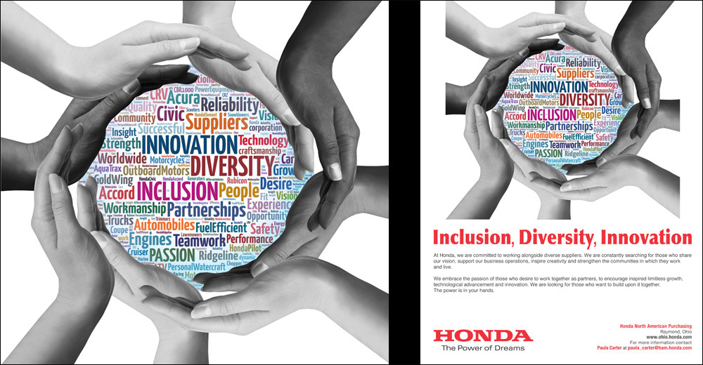
The Work
The word cloud concept was designed to position Honda as innovative, diverse, modern, and forward-thinking. By weaving Honda's values and product names into a single integrated visual, the design communicated the full breadth of the brand without relying on product photography or category-specific imagery. It was flexible by nature, visually engaging, and immediately recognizable as distinctly Honda.
The initial campaign deliverables included:
Bilingual Campaign: English & Spanish
When the Client Keeps Coming Back
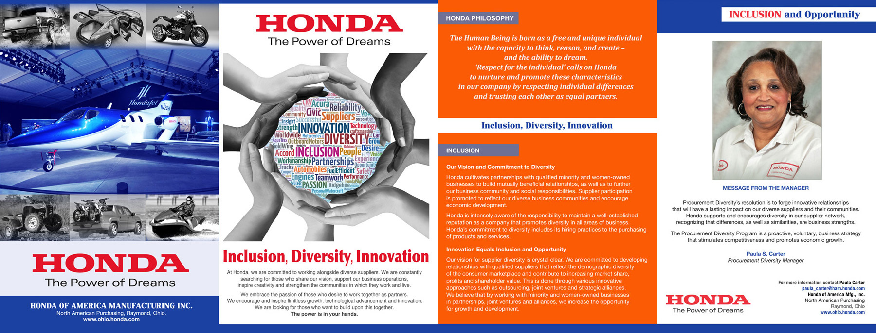
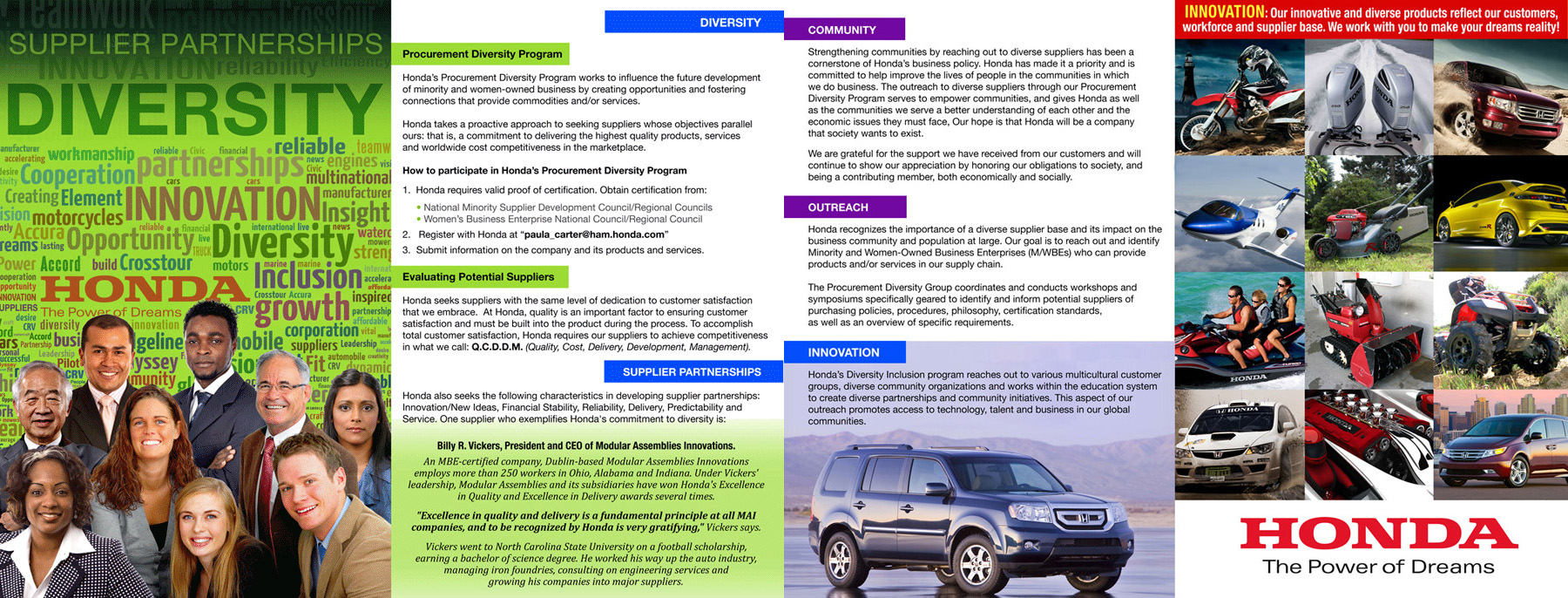
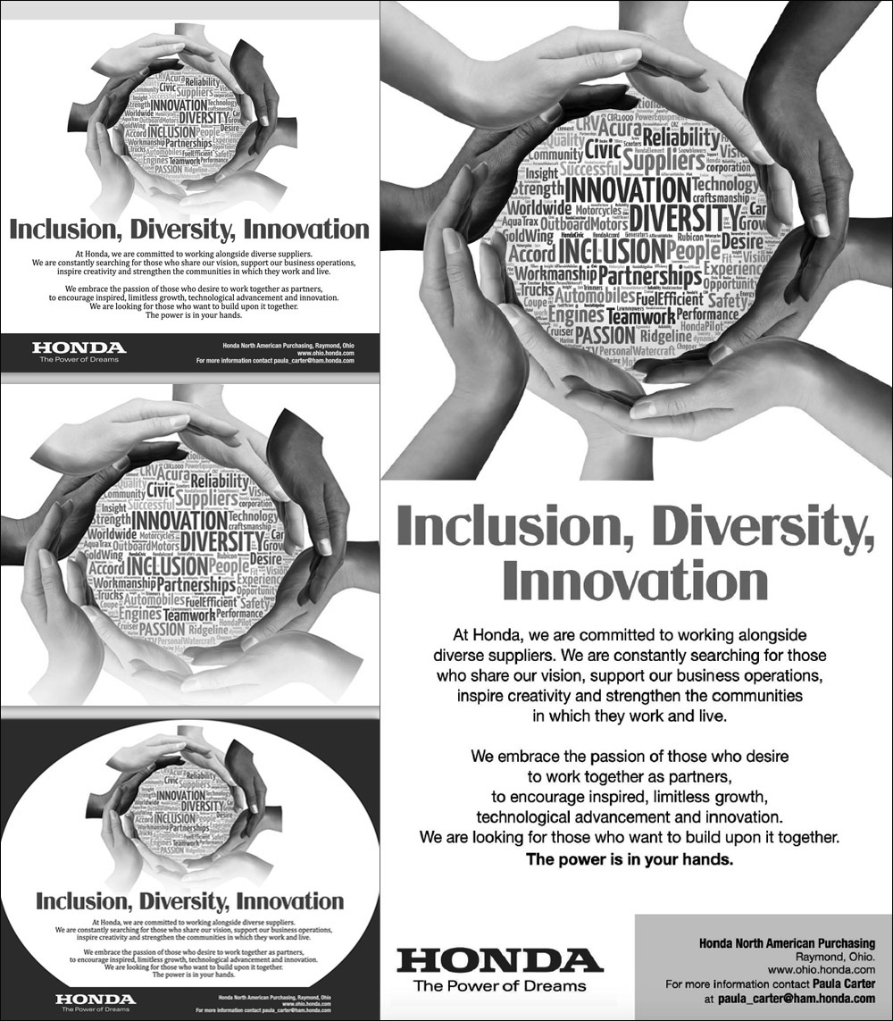
The word cloud resonated. Honda responded to it in the way that tells you a concept has genuinely landed: They kept using it. The ad appeared across more and more placements, and before long I was asked to develop it into a series of press ads. The concept had proven its range and Honda wanted more.
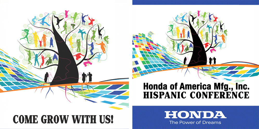
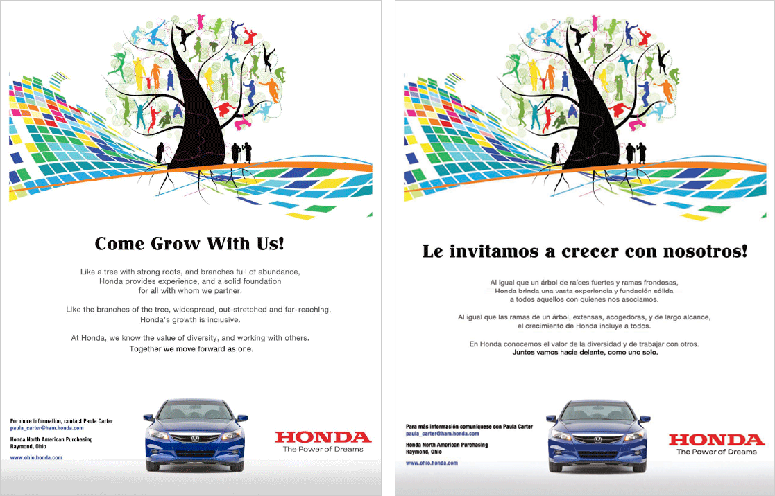
The next chapter came when Honda brought the word cloud into their Hispanic conference: "Come Grow With Us." The original English copy was adapted into Spanish, and the design carried across seamlessly into conference branding and collateral. What started as a single English flyer had become a campaign system that Honda trusted enough to put in front of a completely different audience in a live event environment.
That kind of organic expansion doesn't happen with work that was designed to fill a brief. It happens when the concept is strong enough to travel on its own.
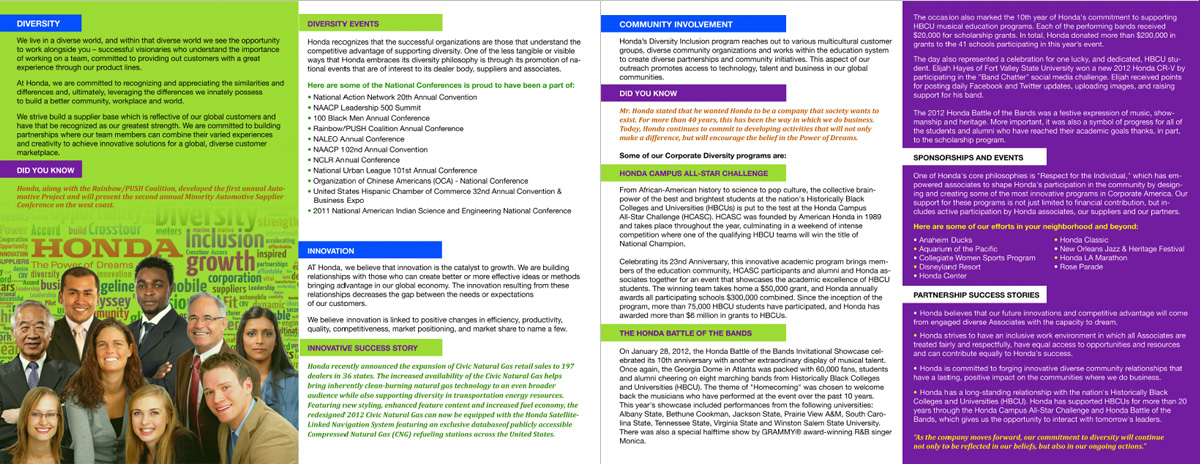
Marketing Brochure
Print & Digital Advertising
Marketing Brochure
Extension: Honda Hispanic Conference: "Come Grow With Us"
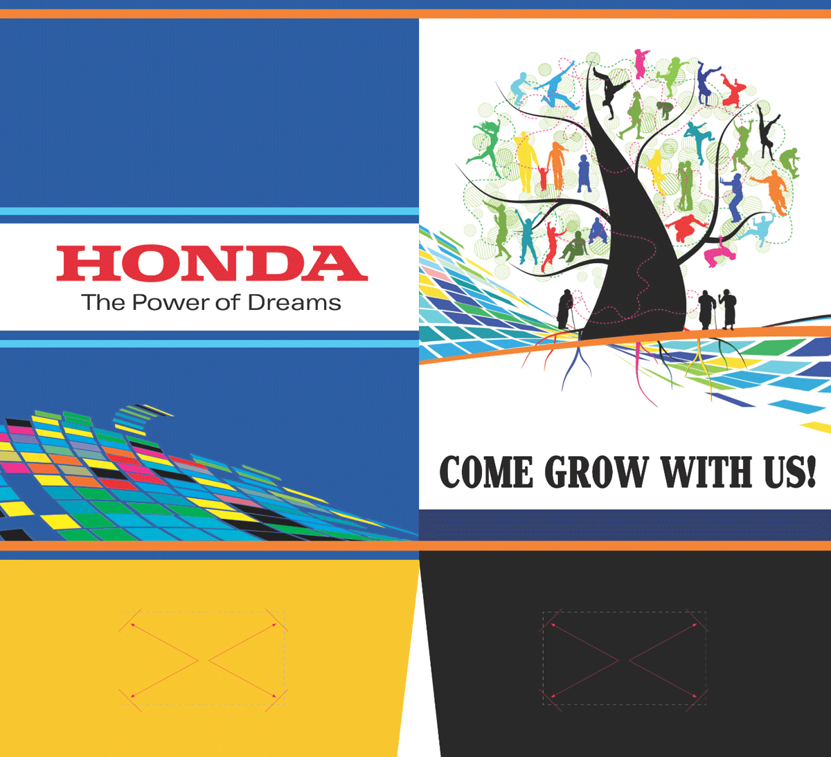
The Honda Hispanic Manufacturing Conference came with a creative situation that is more common than most designers discuss openly. Another designer had developed the core concept for the conference identity: A tree with deep roots in the community, a gathering place where friends, family, and colleagues meet, steady and welcoming as a sturdy oak. The concept had been approved by Honda. The tree design existed. What didn't exist were any of the actual conference deliverables.
That designer became unavailable before the production work could begin. I was brought in to carry the project forward from that point. What I inherited was the approved concept and the tree image. Everything you see here, the directional signage, the bilingual English and Spanish ads, the stationery, the Save-the-Date materials, the folder, and all other conference collateral, I created. The tree was theirs. The work was mine.
That is a specific skill. Stepping into someone else's creative framework and producing a full conference's worth of production-ready materials, without the benefit of being the person who developed the original idea, requires both technical discipline and creative judgment. The goal was to make the handoff invisible. No one attending the conference should have been able to tell that two different designers were involved. From the look of the work, they couldn't.
The word cloud, developed for the earlier Honda inclusion campaign, also made the transition naturally here. The English copy was adapted into Spanish and woven into the conference materials, giving the work another layer of connection to Honda's broader diversity and inclusion effort.
Save the Date: Honda Hispanic Conference
Come Grow With Us Ad in English and Spanish
Honda Hispanic Conference: "Come Grow With Us"
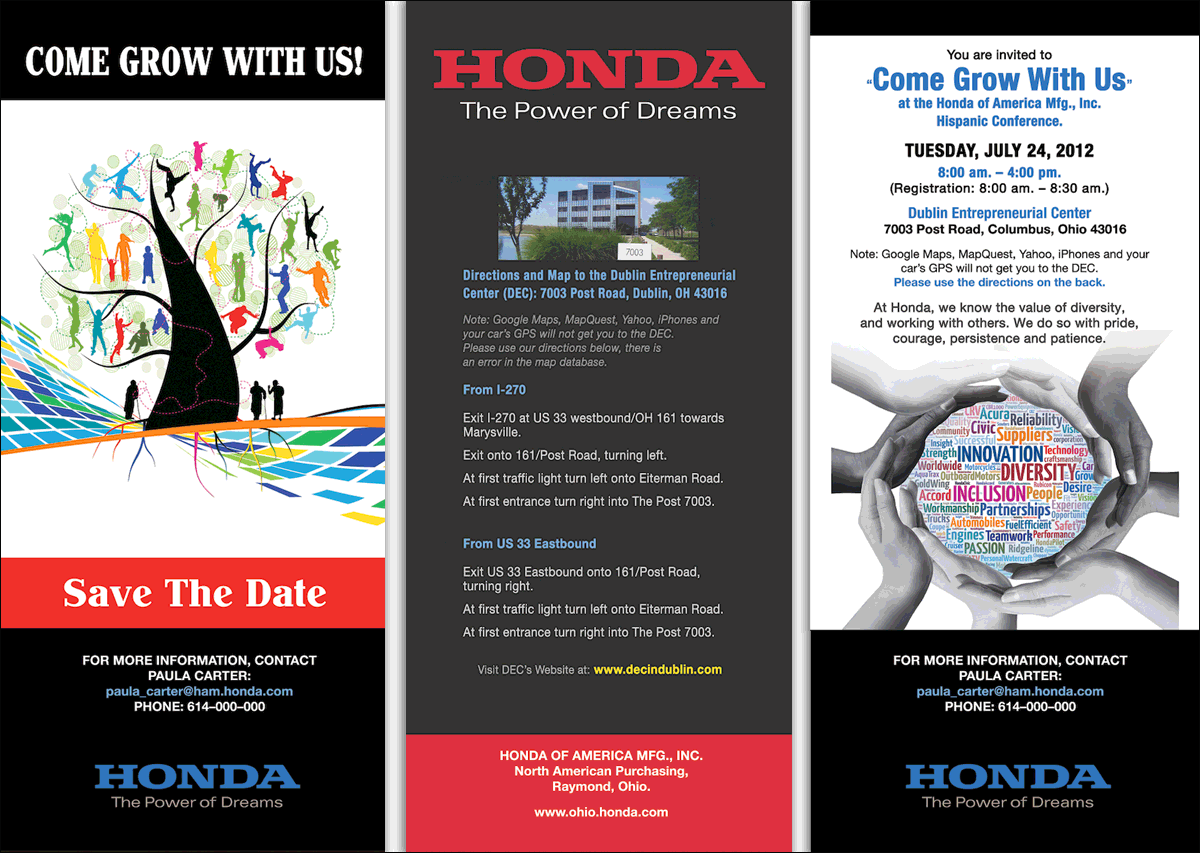
Honda Save The Date Envelope"
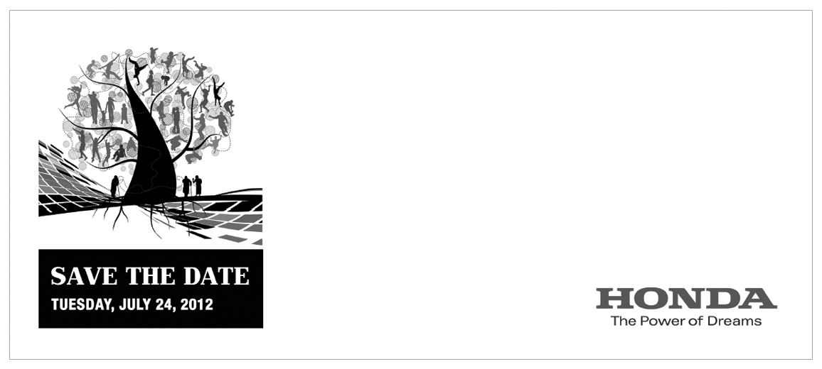
Directional Conference Signage
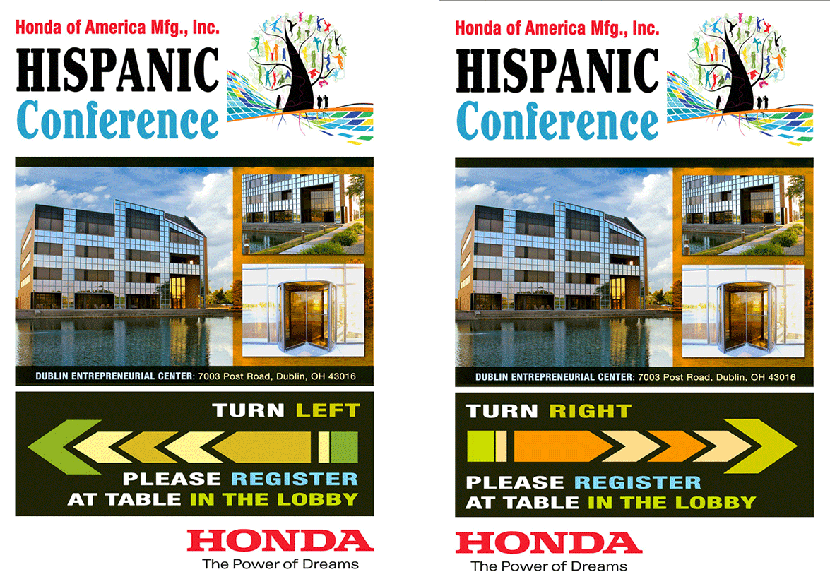
Directional Conference Signage
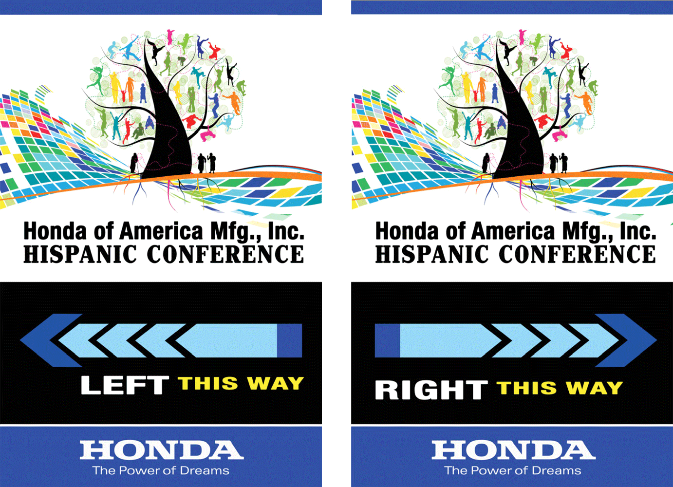
Conference Takeaway Folder
What This Work Demonstrates
Concept-First Thinking
Translating abstract brand values: Inclusion, Diversity, and Innovation, into a single, clear, visual idea that communicates immediately and holds up across every format it touches.
Proof of Concept Strength
The strongest validation of any concept is adoption. Honda expanded the Word Cloud beyond its original (design a flyer) application, carrying it across multiple campaigns, audiences, and environments as the idea continued to prove its value.
Scalable Across Audiences
Designing a concept capable of moving across languages, cultures, product categories, and communication channels while maintaining a consistent identity and message.
Narrative Alignment
Connecting visual design to brand messaging ("The Power is in Your Hands") so the concept and the copy reinforce each other, making the work stronger as a whole than either element alone.
Thinking Beyond the Brief
Recognizing opportunities beyond the original request and developing an idea with enough flexibility to support future growth, adaptation, and expansion.
The Impact
This project reinforced something I've seen throughout my career: Strong concepts have a way of outgrowing the original brief. What began as a single flyer evolved into a campaign system that supported multiple product categories, audiences, languages, and communication channels. The expansion wasn't planned from the start. It happened because the idea proved flexible enough to adapt, relevant enough to resonate, and strong enough to remain recognizable wherever it appeared.
More importantly, the project demonstrated the value of building around an idea rather than a deliverable. By focusing on Honda's values instead of its products, the concept remained scalable across print, digital, event, and bilingual applications while maintaining a clear connection to the larger brand story.