Case Study 2:
CWS Summit North America & Collaboration In The Gig Economy
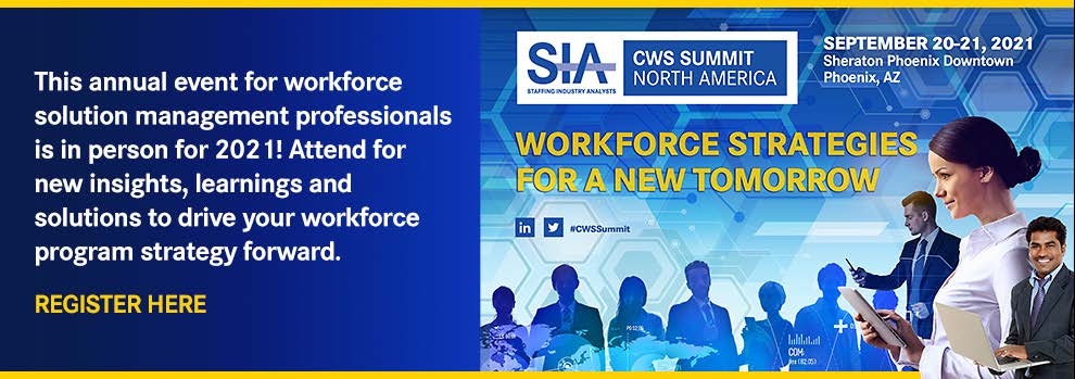
CWS Summit Event Branding
A Conference Built to Evolve and Survive Crisis
Staffing Industry Analysts is the global advisor on staffing and workforce solutions, and its flagship conference reflects that authority. The CWS Summit North America is the largest event of its kind for contingent workforce management professionals, and buyers of contingent labor, drawing HR leaders, senior procurement executives, and workforce program managers, from Fortune 100 to 500 corporations. GIGE tickets for 2021 were priced at $2,175 for SIA corporate members and $2,410 for non-members. CWS in-person pricing, which included meals, was significant enough that when SIA pivoted to an online format, the virtual tickets were offered at roughly half that rate: $640 for members and $1,280 for non-members. This is a high-investment, high-expectation audience, and the design supporting this event had to match that standard at every touchpoint.
In 2021, I led the art direction for two back-to-back events hosted at the same venue: the CWS Summit North America, themed "Workforce Strategies for a New Tomorrow," followed directly by the GIGE (GIGE) conference, "Where Tech, Talent & Suppliers Converge." What I didn't know at the start was that by launch day, COVID-19 would force one of the most compressed creative pivots of my career.
My Role
My title was Graphic Design Manager, the same as it was for every SIA event, but on this project the function leaned fully into Art Direction. I developed the concepts and produced the work across both conferences: Branding, signage, social ads, presentations, and the full run of digital promotion supporting each one.
That said, I want to be accurate about how the decisions were made. This wasn't mine to call alone. Major creative work moved through our Marketing Director, the way it always did at SIA. Once COVID hit, however, the conversation changed. What began as a conference branding project quickly became a business challenge with real financial exposure and public visibility. Our COO became actively involved, ensuring that the messaging, strategy, and creative direction worked together cohesively as the organization responded to rapidly changing circumstances.
My responsibility was to translate a rapidly changing business situation into clear, credible visual communication that audiences could trust. That meant developing and maintaining a cohesive design system across more than fifty assets spanning web, social media, presentations, environmental graphics, advertising, and conference collateral, while adapting the work in real time as priorities shifted.
The experience reinforced the importance of building flexibility into a design system from the start. When the conference pivoted to a hybrid format, the visual foundation remained strong enough to support a complete shift in messaging, audience expectations, and delivery channels without sacrificing consistency or quality. It was an opportunity to work closely with executive leadership, respond quickly under pressure, and ensure the brand remained clear, confident, and credible during a period of significant uncertainty.

The Opportunity
SIA's conference branding had historically leaned on efficient, template-based design patterns built around location imagery and repeatable structures. Practical, but well below the potential of a brand this authoritative. The 2021 theme gave me a clear creative anchor, and I took it seriously. "Workforce Strategies for a New Tomorrow" wasn't just a tagline to set in type—it was a strategic direction that deserved a visual language to match. I developed a concept rooted in people engaging with technology, a layered tech-inspired environment, and a global connectivity perspective that made the theme tangible and visually compelling.
Designing Two Conferences as One Connected Brand System
From the outset, I knew this wasn't a single-event project. CWS and GIGE run back-to-back at the same venue, with roughly a third of CWS attendees flowing directly into GIGE. I had to design both events as a connected visual system: building the CWS visual language with enough structural flexibility that key elements could carry across into GIGE's identity, while each event maintained its own distinct color system, tonal personality, and audience positioning.
That meant designing CWS with GIGE already in mind, so the transition between events felt intentional and considered. An attendee moving from CWS into GIGE should sense they're in a connected ecosystem, not walking into a completely different brand. The design had to make that connection without making GIGE feel like a visual afterthought.
The Real Challenge: Two Audiences, Two Risk Profiles
The CWS and GIGE audiences shared some overlap but operated from very different mindsets, and those differences became critical when COVID hit.
CWS drew primarily Fortune 100 to 500 C-suite and senior procurement executives. These were leaders managing large teams and responsible for enterprise-wide operations. When COVID began shutting things down, their concern wasn't personal risk—it was organizational liability. If an employee attended an out-of-state conference, got sick, traveled home, and brought illness back into the office, the downstream impact on productivity and employee relations could be severe. They started requesting refunds. At $850 to $1,500 per ticket, SIA was facing significant revenue loss.
GIGE drew a broader mix: staffing firms, gig economy players, VMS and MSP providers, middle management executives, and talent supply chain professionals. Different roles, different risk calculus. In-person connection is how this audience does business. Most were willing to attend in person, with distancing precautions in place. The event largely proceeded as planned.
This distinction shaped every design decision that followed.
My Approach: Building Resilience Into the System
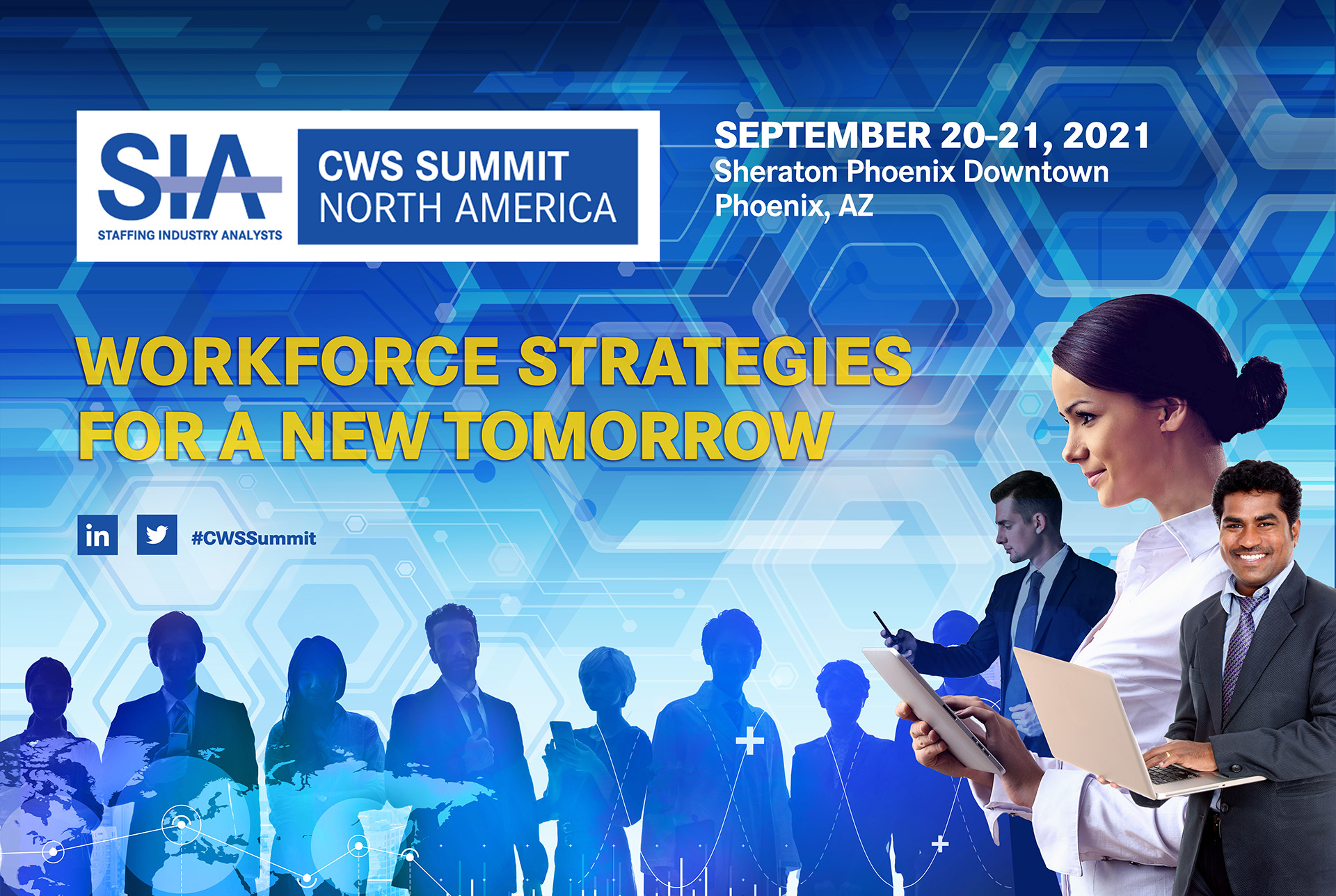
Working within SIA's established brand guidelines, I built the CWS visual direction around three interconnected concepts: people engaging with technology, a layered tech-inspired visual environment, and a global perspective expressed through connectivity mapping. These weren't decorative choices. They were drawn directly from the conference's core subject matter—the intersection of digital innovation and the evolving future of work.
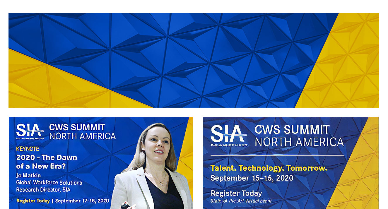
Critically, I used a patterned background structure more sophisticated than anything SIA had used before. It had a strong technological character that worked whether or not human figures were present in the composition. That decision, made for creative reasons at the time, turned out to be exactly what made the emergency pivot possible.
The Evolution: 2020 to 2021
New Concept: Forward-Looking Visual System
The Deliverables
All assets were built as part of a unified system, designed to scale across every touchpoint of a multi-day, multi-format conference experience:
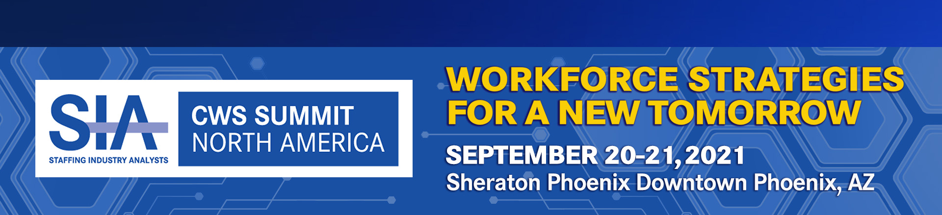
Homepage and Subpage Header
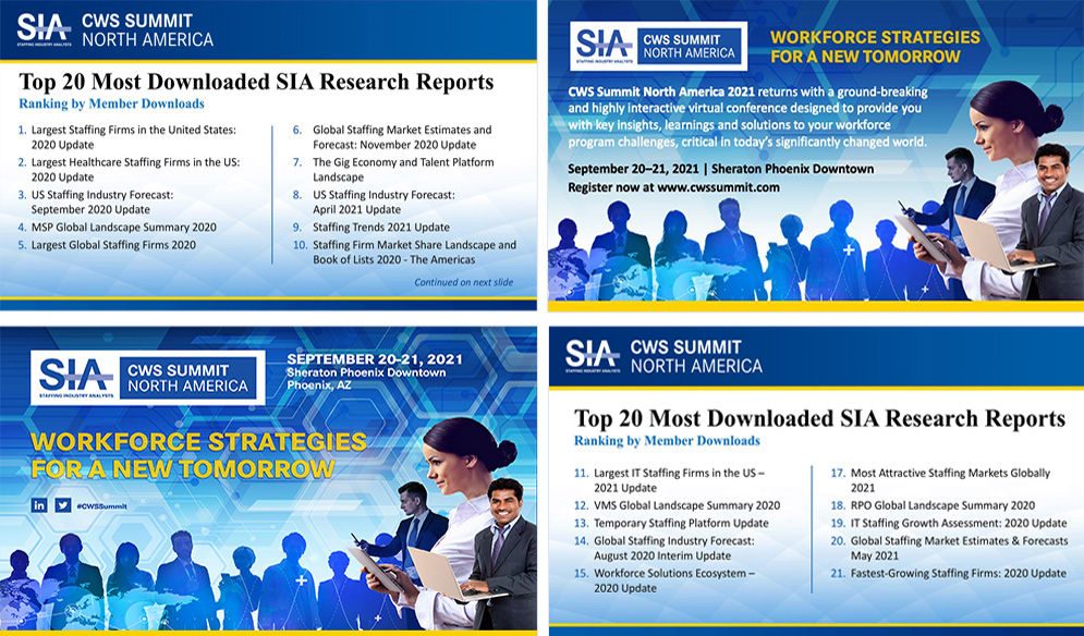
Presentation Design
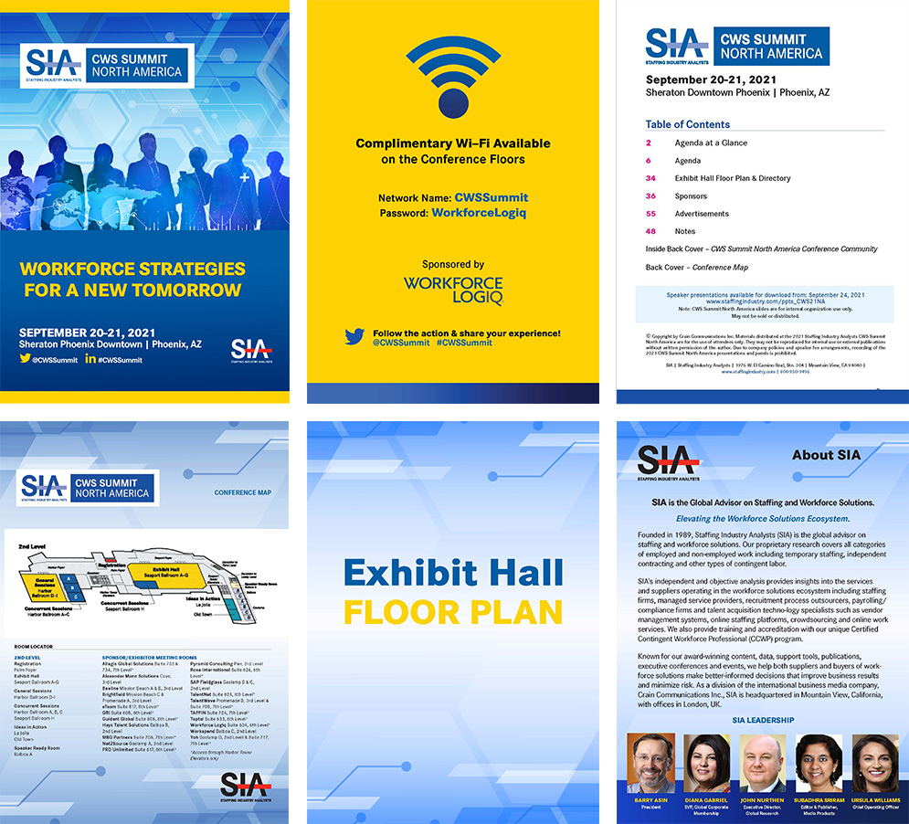
Print Collateral
Speaker Promotion & Social Assets
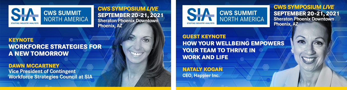
Environmental & Digital Displays
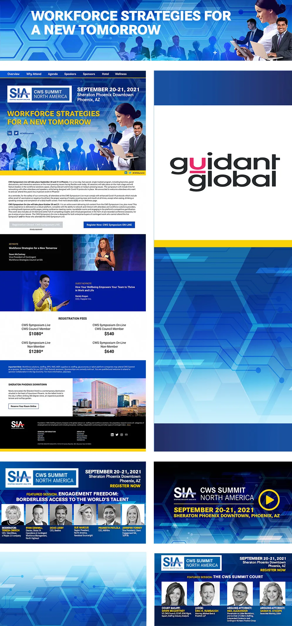
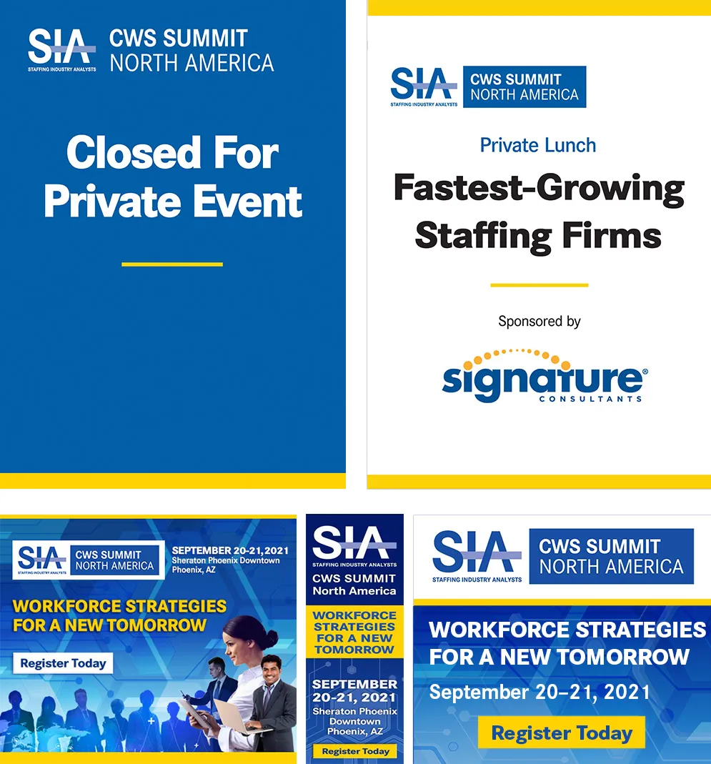
Conference Signage and Online Ads
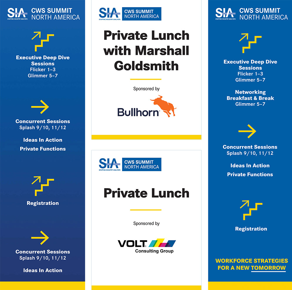
Event Signage
The Pivot: Fifty Assets. Twenty-Four Hours. Launch Day.
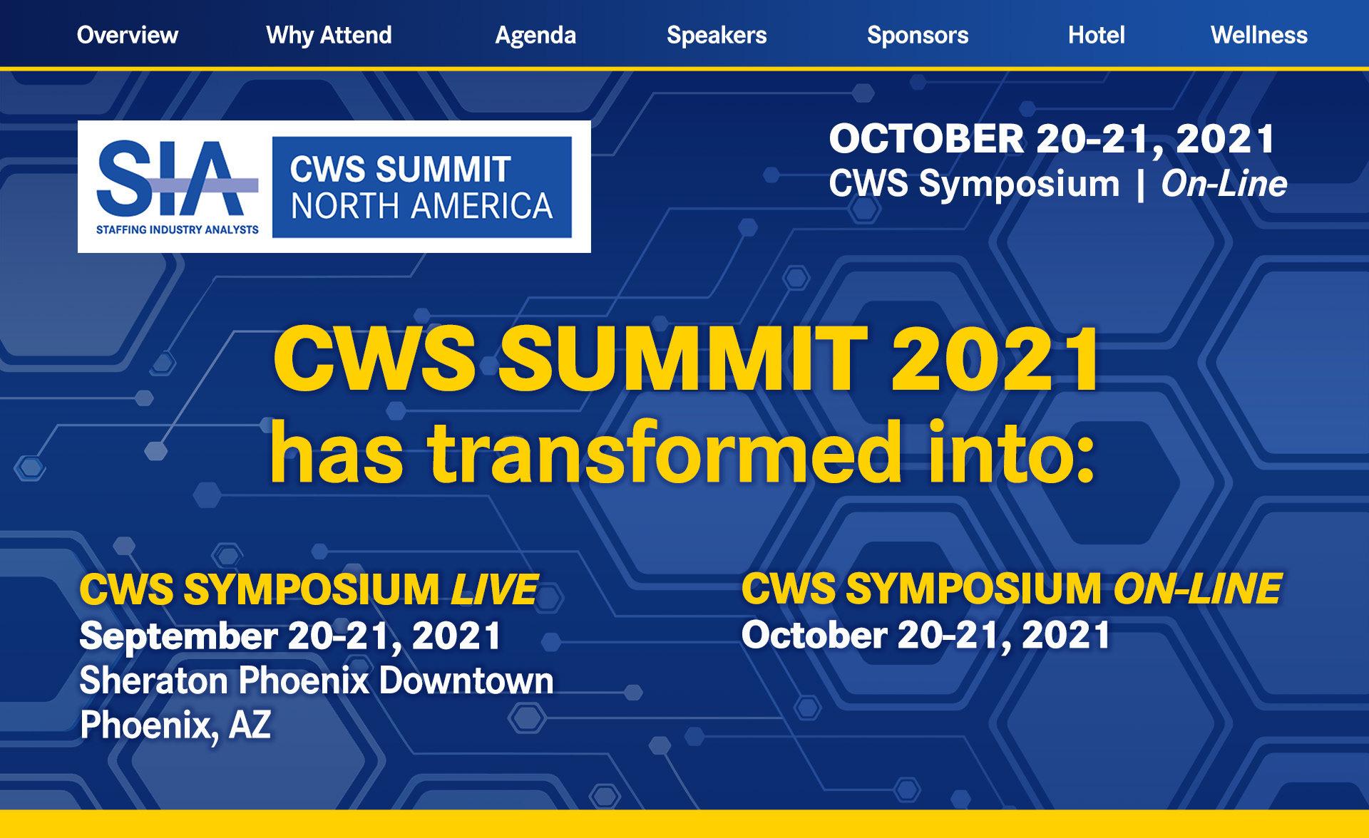
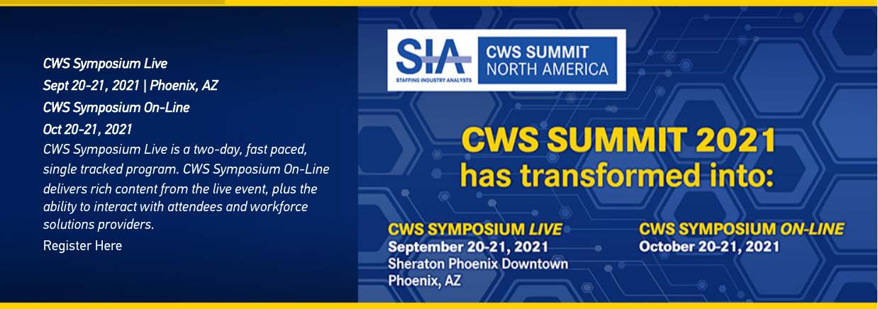
I finished all the work the day before launch. Came into the office the next morning ready to go. My manager met me with the news: everything had to change. COVID-19 had escalated overnight. States were shutting down, social distancing guidelines were being issued, and SIA's Fortune 100 to 500 executive audience was already calling for refunds. With in-person CWS tickets priced well above $1,000 per attendee including meals, and organizations sending multiple staff members, the financial exposure across refund requests was mounting fast. Leadership made the call: pivot the conference to a hybrid format immediately. CWS would split into CWS Symposium Live for in-person attendees and CWS Symposium Online for virtual participants.
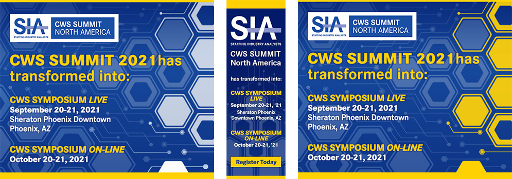
That meant every piece of in-person-focused imagery had to go. The networking energy, the people in rooms together, the physical presence that the original campaign was built around—none of it could stay. And we weren't talking about a handful of files. We're talking about over fifty assets spanning social media, the website, editorial and paid digital ads, vendor-facing materials, print files already en route. Everything needed to be redesigned and ready within 24 to 48 hours.
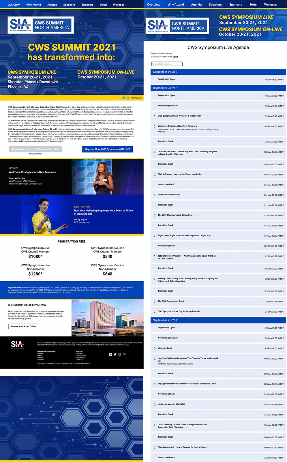
This is where building a resilient system from the start paid off. Because I had used a sophisticated patterned background with a strong technological character, the visual foundation held without the human imagery. The design didn't collapse when the people were removed. It adapted. I shifted the system toward a technology-forward, text-driven execution that communicated clearly in a digital-first context, retained the brand integrity, and gave SIA the visual confidence to keep marketing the event rather than going dark.
The pivot helped SIA retain attendees through virtual offerings, reduce revenue loss from refund requests, and keep the conference experience alive for an audience that needed continuity. Good design systems don't just look good under ideal conditions. They hold up when the conditions change completely.
Symposium Live: The Virtual Evolution
Homepage Header

Homepage Slider
Subpage Header

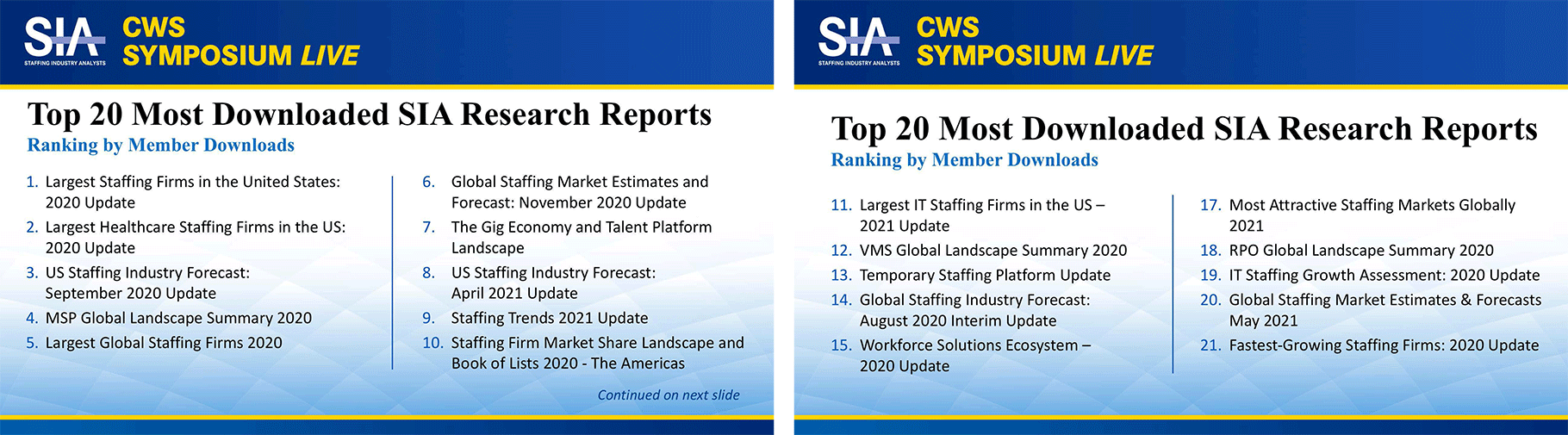
PowerPoint Slides
Online Ads and Conference Marketing
Virtual Platform Assets
GIGE (GIGE) 2021: A Different Audience, A Different Reality
Running directly after CWS at the same Phoenix venue, the GIGE conference served a different cross-section of the workforce solutions industry: staffing firms, gig economy platforms, VMS and MSP providers, RPO suppliers, and middle management executives across the full talent supply chain. About a third of CWS attendees continued on to GIGE. The rest were a separate audience entirely.
The risk calculus here was genuinely different. While the Fortune 100 executive audience at CWS was pulling back over concern for enterprise-wide operational impact, the GIGE audience was more willing to meet in person under distancing guidelines. In-person connection is central to how this community operates. GIGE proceeded largely as a live event.
That meant I was designing two events simultaneously, with two different operating realities. CWS pivoting hard toward hybrid and virtual. GIGE staying mostly in person. The design system had to serve both without losing coherence between them—and I had planned for exactly that from the start.
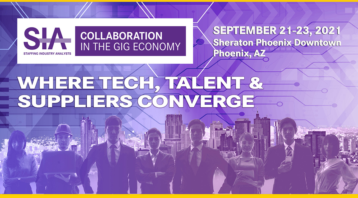
When I built the CWS visual language, I designed structural elements and layout conventions intentionally transferable to GIGE. Each event has its own color system and tonal character. But placed side by side, the two clearly belong to the same conference family. For the third of attendees who moved through both events, the transition felt considered rather than jarring.
GIGE Event Identity & Visual System
Web & Digital Presence
.jpg)
Speaker Promotion Assets
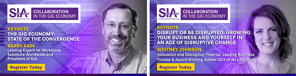
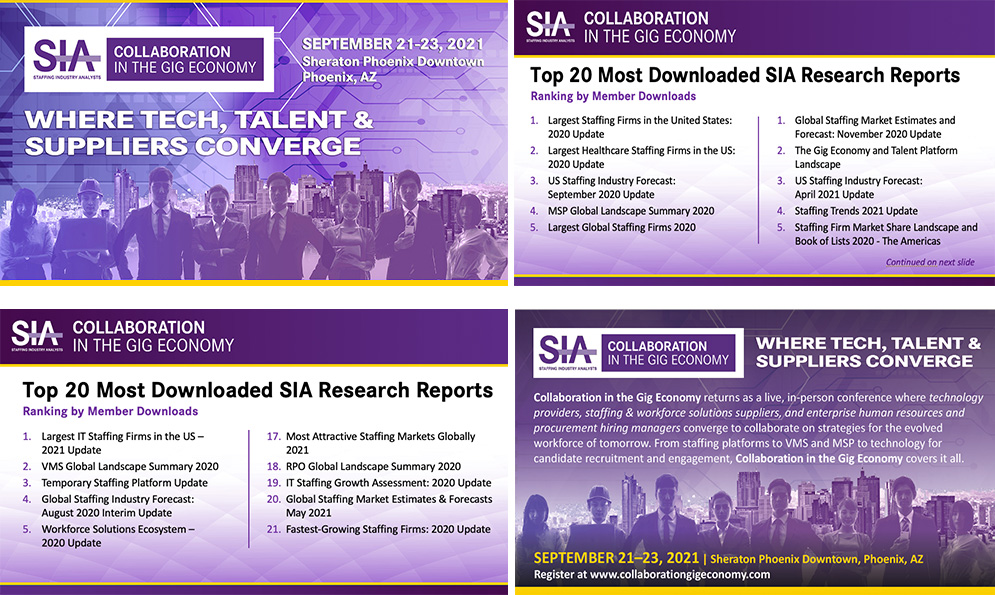
Presentation Templates
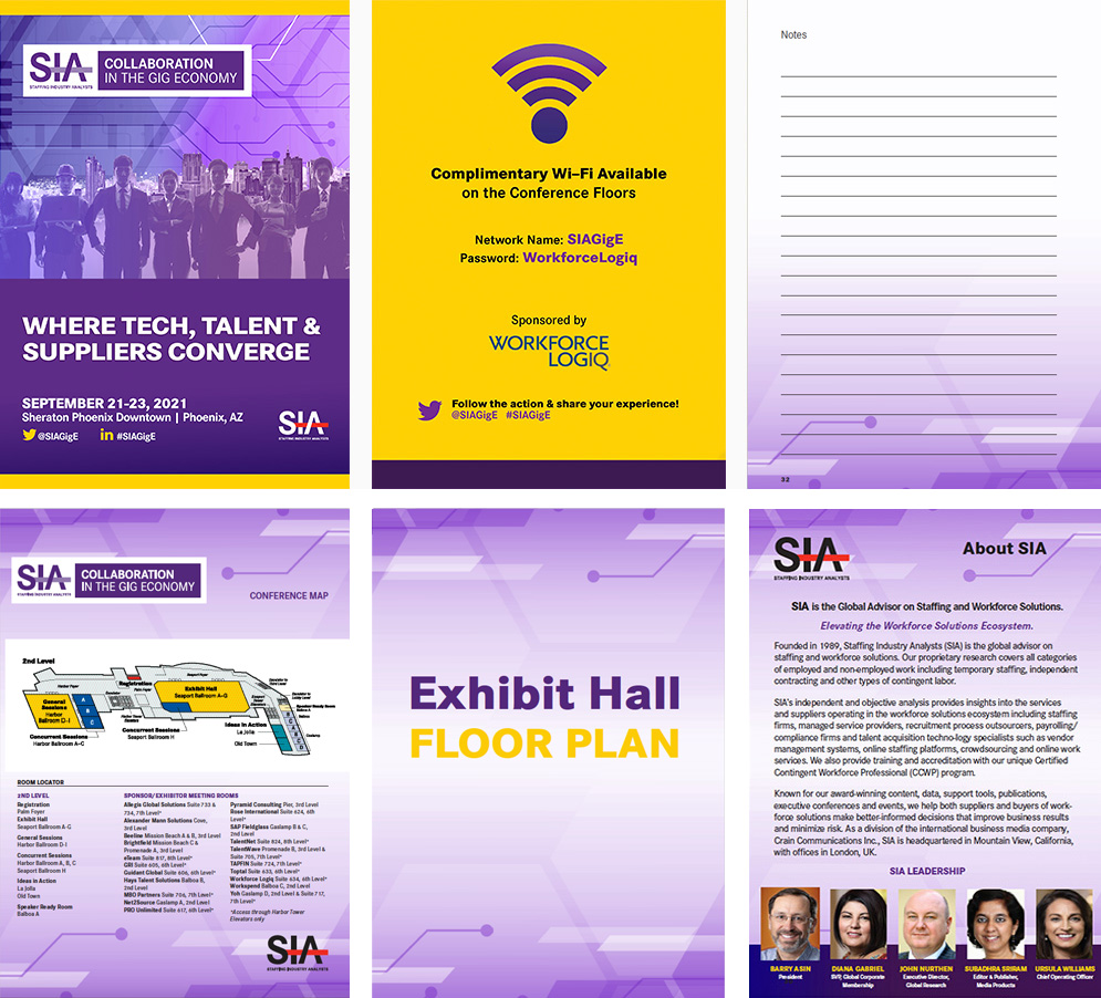
Print & Collateral
Signage & Environmental Design
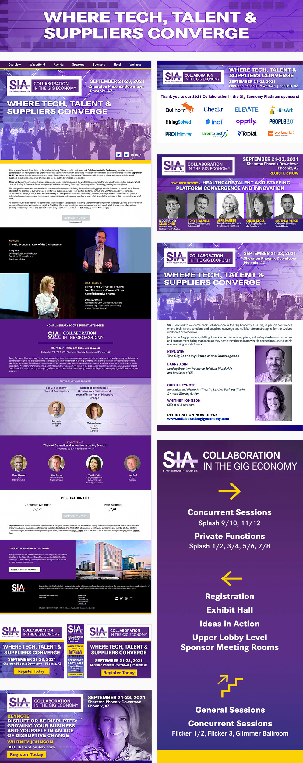
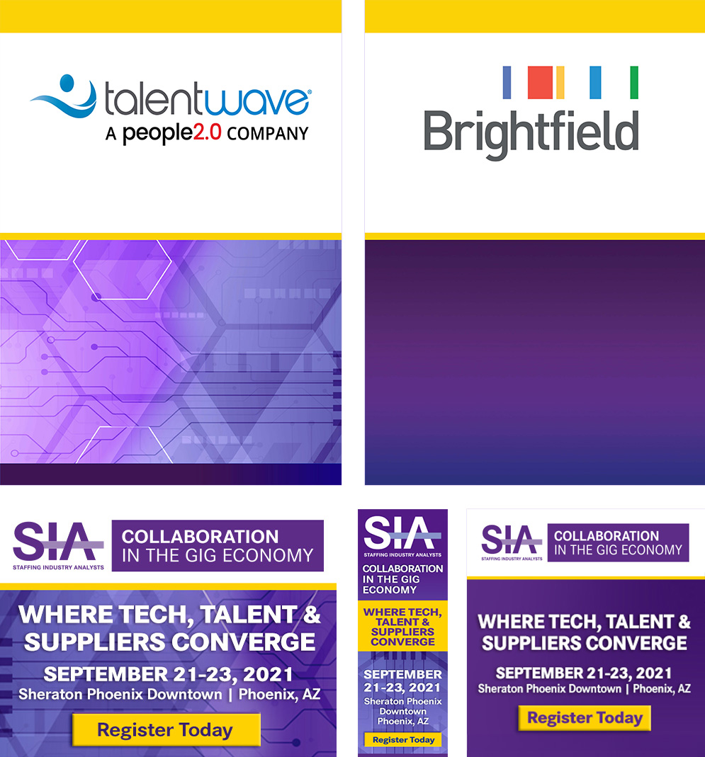
Conference Signs & Digital Marketing
Video &PowerPoint Slide Background

Website Homepage Slider
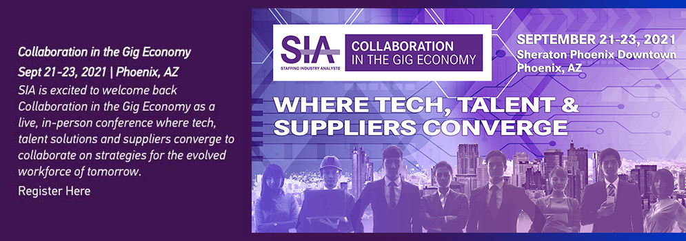
Print Ad
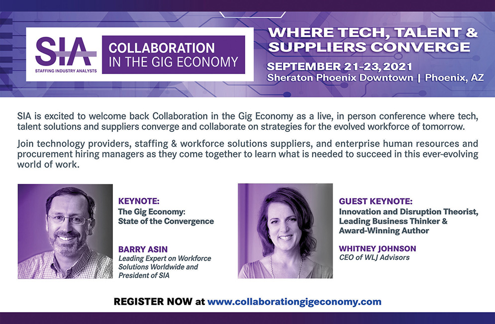
Conference Promo
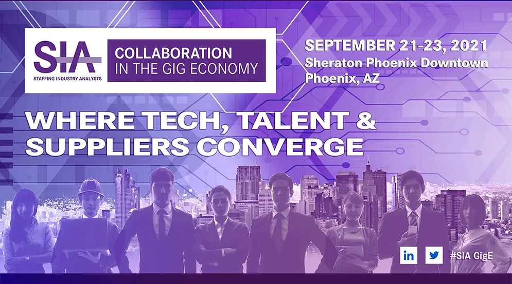
What This Work Demonstrates
Designing for Resilience
Building a visual system flexible enough to survive a complete pivot overnight, across 50+ active assets, without losing brand integrity or creative quality.
Audience Strategy Under Pressure
Recognized that Fortune 100-500 executives and workforce supply-chain professionals approached COVID risk very differently. Understanding those distinctions helped shape messaging, imagery, and communication strategies appropriate to each audience.
Connected Brand Architecture
Designed CWS and GIGE as related but distinct conference experiences, creating separate identities that could coexist within a larger visual framework while maintaining continuity for crossover attendees.
Executive Audience Communication
Developed communications for senior leaders, procurement executives, HR decision-makers, and workforce strategists from many of the world's largest organizations, balancing credibility, clarity, and visual engagement for a highly informed professional audience.
Crisis Adaptation at Scale
Successfully reworked more than fifty active assets across web, social, advertising, presentations, print, and event materials within an accelerated timeline while maintaining consistency across two simultaneous conference brands.
Collaborative Leadership
Worked closely with marketing leadership, executive stakeholders, and copywriters to ensure messaging, strategy, and visual communication remained aligned throughout a rapidly evolving business situation.
The Impact
The success of this project was not defined by the original conference branding. It was defined by the system's ability to adapt when circumstances changed completely. When COVID forced a rapid shift from a traditional in-person experience to a hybrid event model, more than fifty active assets had to be revised across multiple channels, audiences, and formats within an extremely compressed timeframe. Because the visual foundation had been designed with flexibility in mind, the brand remained cohesive, credible, and recognizable throughout the transition.
Beyond the creative work itself, the project reinforced the value of strategic thinking in design. Supporting Fortune 100 to 500 executives, workforce leaders, staffing professionals, and technology providers required a clear understanding of audience expectations, business priorities, and risk perception. The experience strengthened my ability to develop adaptable design systems, communicate effectively under pressure, and create visual solutions capable of supporting both immediate needs and long-term business objectives.