
Case Study 1:
Staffing Industry Analysts
Staffing Industry Analysts (SIA)
Where Corporate Precision Meets Event Energy
Staffing Industry Analysts (SIA) is the world's leading research and advisory firm for the staffing and workforce solutions industry. Trusted, independent, and data-driven, SIA serves a global audience of staffing firms, enterprise organizations, and industry executives, delivering market intelligence, professional development, and award-winning conferences across North America and Europe.
Project Overview
Designing for SIA meant operating across multiple brand systems within a single organization, each with its own audience, tone, and set of creative rules. Corporate communications demanded structure, restraint, and precision. Conference branding called for visual energy, distinction, and scale. Research and editorial occupied the space between. The role required moving fluidly between all of them, without losing consistency, quality, or creative clarity along the way. Adaptability and a clear understanding of how design supports different audiences was necessary.
My Role
My title at SIA was Graphic Design Manager, but in practice, much of what I did aligned closely with Art Direction. I was the person developing the concepts, shaping the visual direction, and bringing ideas to life across conference branding, corporate communications, research reports, social media campaigns, presentations, and digital marketing initiatives. That said, I don't believe in inflating titles or taking credit that isn't mine. I wasn't the final decision-maker on every project. Major creative work moved through the Marketing Director and, depending on the visibility of the piece, often the COO as well.
My responsibility was to translate business objectives into visual communication that could inform, engage, and inspire action. Whether developing conference themes, supporting research publications, creating executive presentations, or promoting global events, the goal remained the same: finding the most effective way to communicate complex ideas to the audiences they were intended to reach.
Some concepts were approved immediately. Others evolved through discussion, feedback, and refinement. Learning how to advocate for ideas, navigate differing perspectives, and strengthen the work through collaboration became an important part of the role and further shaped my approach to creative leadership.
SIA Global News Concept Video: Promo 1
The Environment
SIA operates across several distinct departments, each requiring a different creative approach while remaining connected to the broader brand. Understanding those distinctions, and designing within them intentionally, was central to the work.
Corporate Communications operated with a highly restrained palette: Grey and white as the foundation, with limited use of red and black. Layouts were structured, minimal, and built around clarity and credibility. Every design decision followed SIA's style guide with strict adherence to colour, logo placement, typography, and image usage.
Conference Branding offered greater creative latitude. Each event had its own visual identity, typically built around two primary colours, with more flexibility in composition, scale, and visual energy. These identities needed to feel distinct and dynamic while still communicating the authority of the SIA brand.
Editorial and Global News allowed for the most expressive visual approach of all: Full colour usage, bolder treatments, and more personality across web banners and social media graphics.
Research and Analyticscombined structured, data-focused layouts with concept-driven cover design, adapting visual treatments to reflect both SIA's credibility and the subject matter of each report.
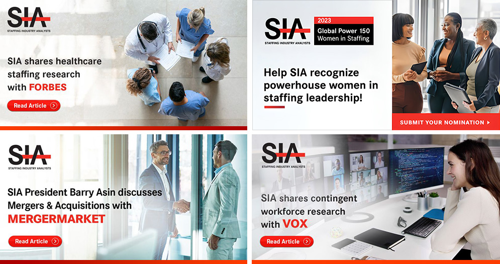
LinkedIn, Web & X Social Media Ads

The Challenge
Working at SIA meant moving between creative disciplines that operated by completely different rules. The audiences were different, the constraints were different, and the expectations were different. Often all within the same week.
The challenge wasn't simply technical. It was about understanding what each environment required and bringing the right level of creative expression to it, without losing the thread that held the whole brand together. Each event and department had its own guidelines, its own tone, and its own audience. The work had to move fluidly between all of them while remaining consistent, purposeful, and clear.
At the same time, the volume was high, the deadlines were real, and the audience, senior executives across global markets, expected nothing less than polished, professional work.
The Approach
The approach began with understanding. Each system had its own logic, and the work needed to honour that logic rather than fight it. For corporate communications, typography, spacing, and structural hierarchy became the primary design tools, creating visual interest through restraint rather than decoration. For conference branding, limited colour palettes were transformed into rich, scalable identities using composition, gradient, and scale to generate energy and distinction. Across all of it, layout consistency, alignment, and design quality remained the constant, while the level of creative expression shifted to suit the context.
Corporate Communications
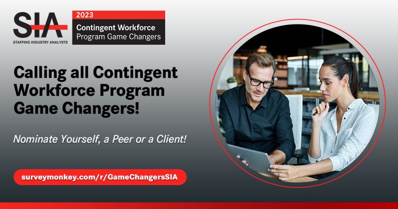
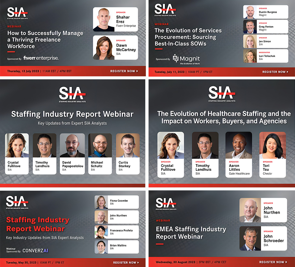
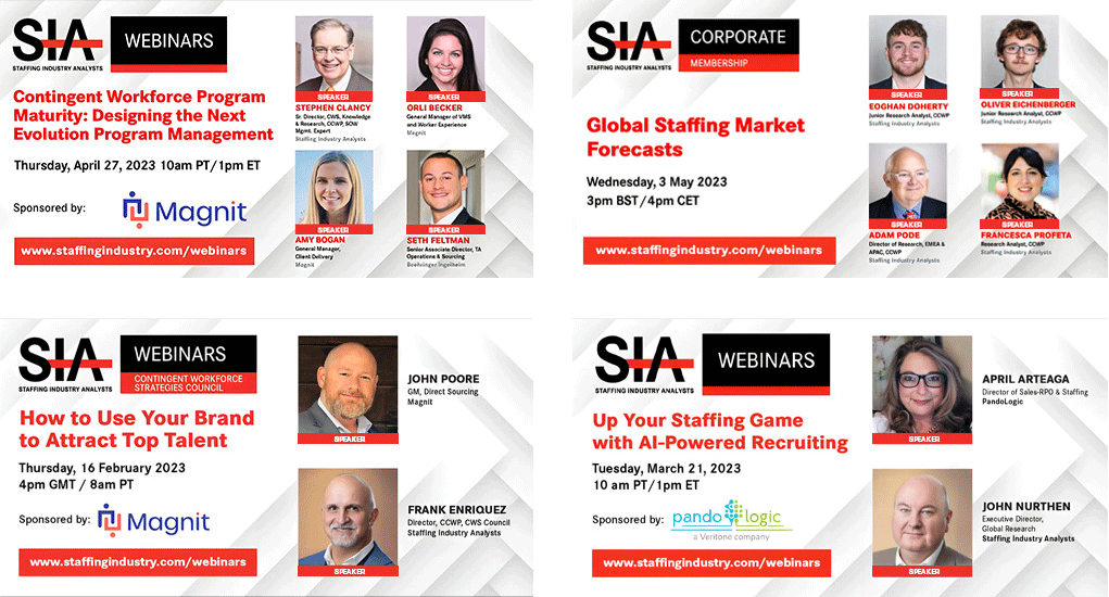
Corporate communications work for SIA was designed to communicate authority, clarity, and trust to a professional, executive audience. Working strictly within the brand's established colour system and style guidelines, the focus was on creating materials that felt structured and credible without feeling cold or static. Webinar marketing packages, speaker highlight graphics, email campaigns, and supporting digital assets were developed to present complex research and industry insights in a clear, accessible format, reinforcing SIA's reputation as a trusted voice in the industry.

RE-BRANDED (Grey, Red and White) SIA Webinar LinkedIn & Twitter / X Social Badges
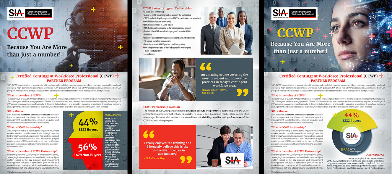
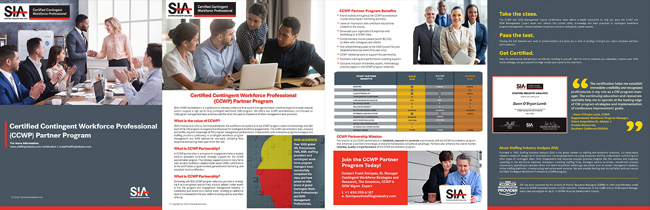
CONTINGENT WORKFORCE PROFESSIONAL (CCWP) COLLATERAL
CCWP collateral used to promote SIA's one-of-a-kind accreditation programs designed for professionals managing corporate contingent staffing.
SIA PRESS RELEASE SOCIAL BADGES
SIA Global News Concept Video: Promo 2
ORIGINAL SIA Branded (Red, White and Black) Webinar LinkedIn & Twitter / X Social Badges
SIA Webinar PowerPoint Slides

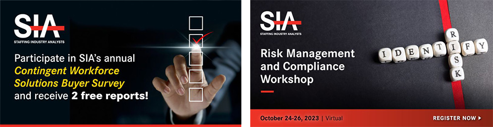
SIA Social Media Advertising
SIA Global News Concept Video: Promo 3
Conference Branding
Conference work was where the creative range expanded. Each of SIA's events, spanning four regional and two global conferences annually, required a focused visual identity built to extend across digital, print, social, and environmental applications. Working within limited colour systems, visual energy was generated through composition, gradient, type scale, and supporting graphic elements. The goal was always the same: create a distinctive, memorable presence for each event that felt worthy of its audience, without losing its connection to the SIA brand.
Conference Logos and Colors
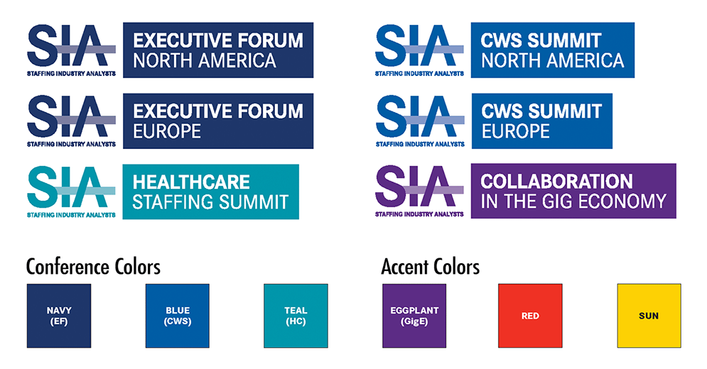
These identities were extended across a wide range of applications, including web, social, signage, presentations, and printed materials.The goal was to create a strong visual presence for each event while maintaining alignment with the broader SIA brand.
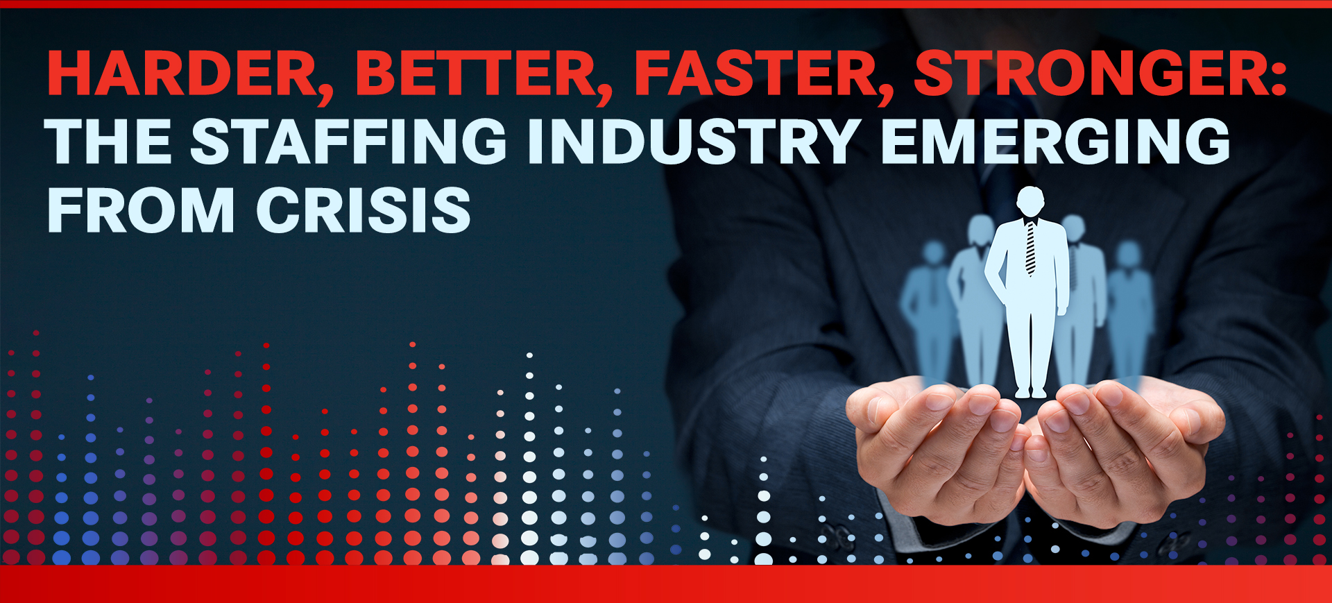
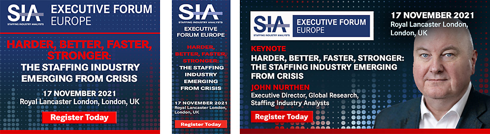
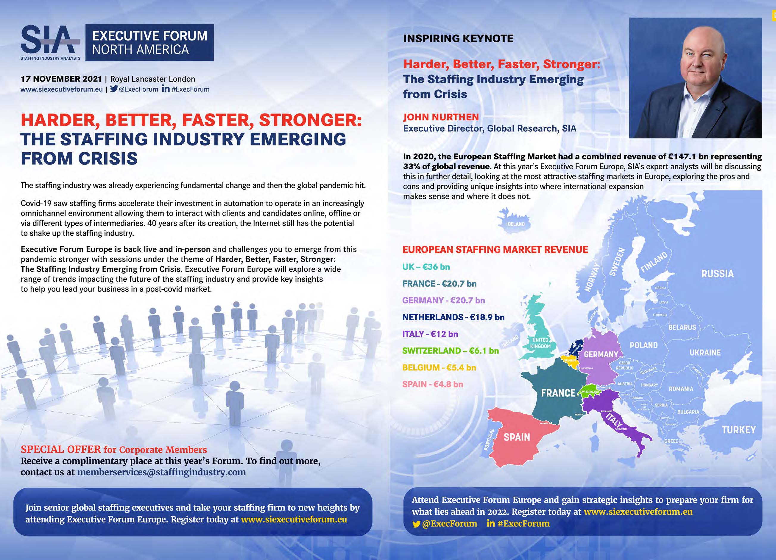
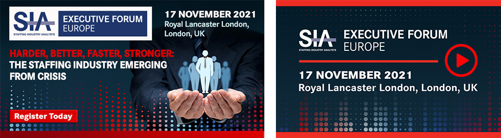
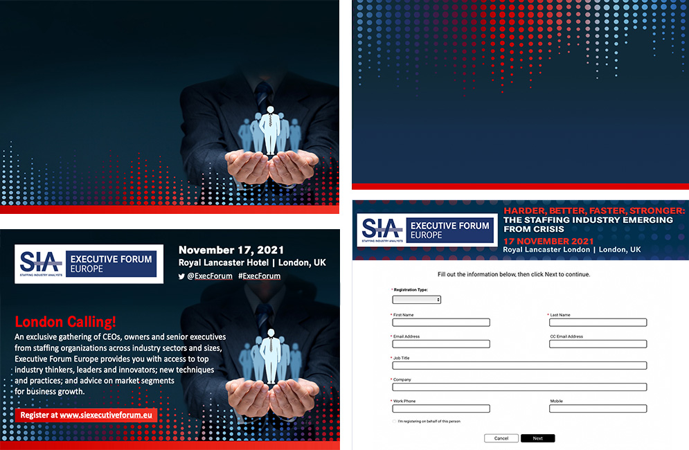
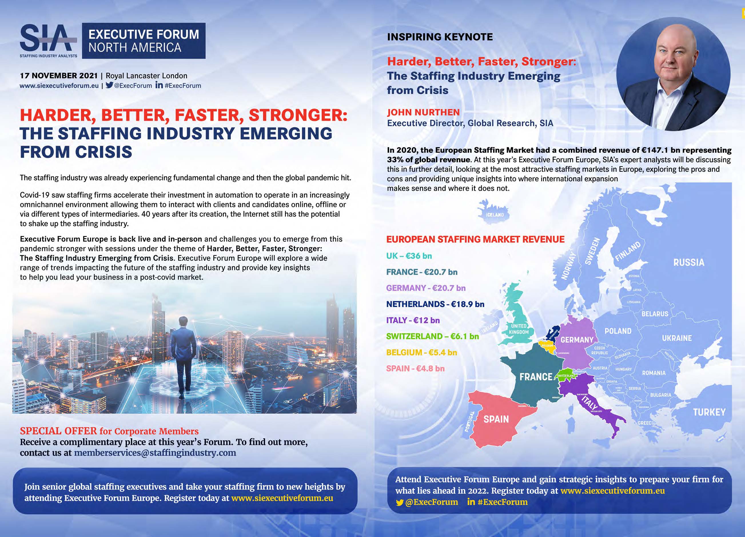
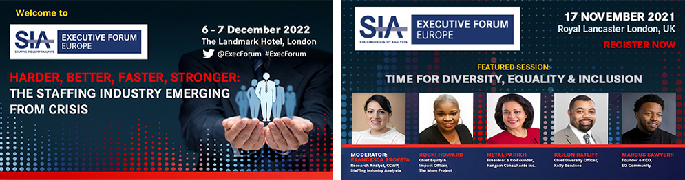
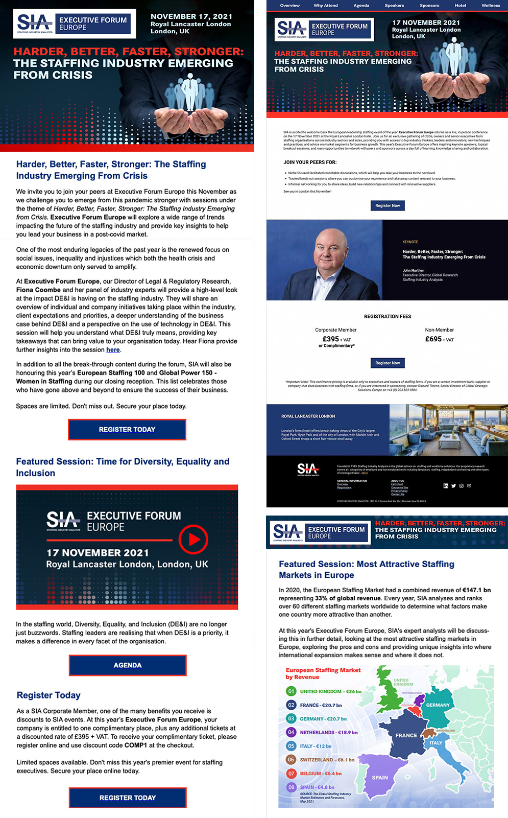
EVENT BRANDING: Executive Forum Europe (EFE) CONFERENCE
The Executive Forum Europe (EFE) package shown here is representative of the full scope of deliverables, including hero images, website headers, keynote and speaker social badges, web sliders, press ads, PowerPoint presentations, and the conference website itself. Each element was designed as part of a cohesive system, built to scale across every touchpoint of the conference event experience.

-1.jpg)
.jpg)
Research and Analytics
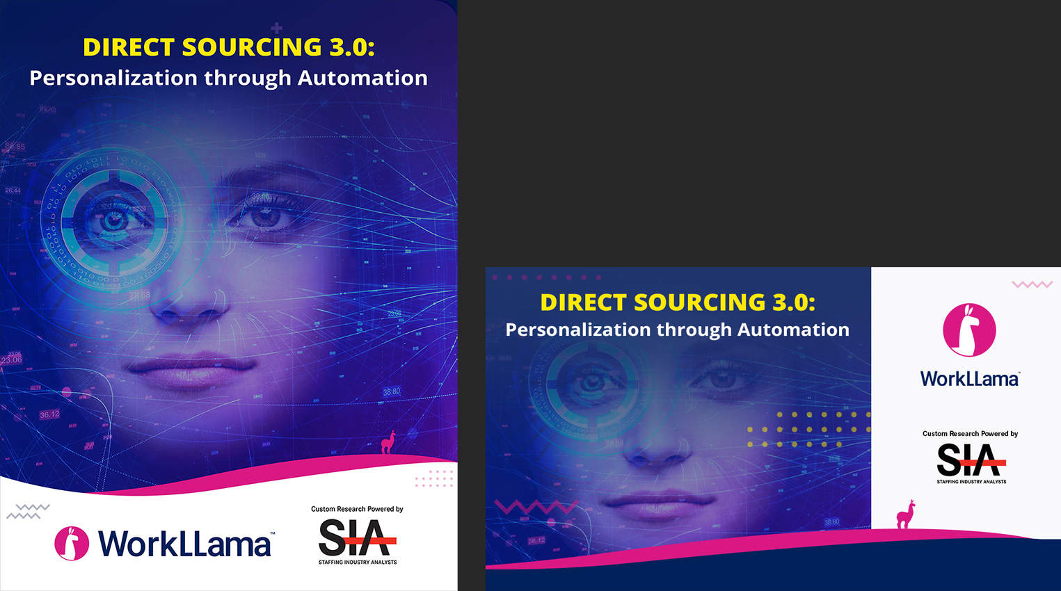
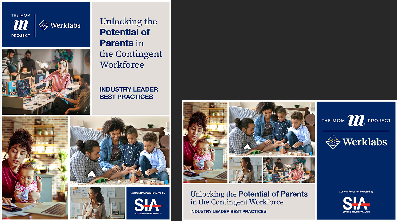
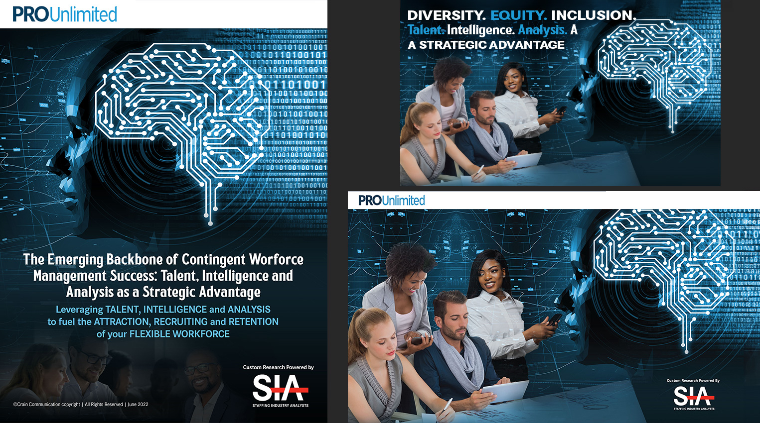
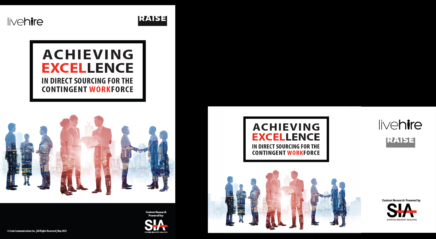
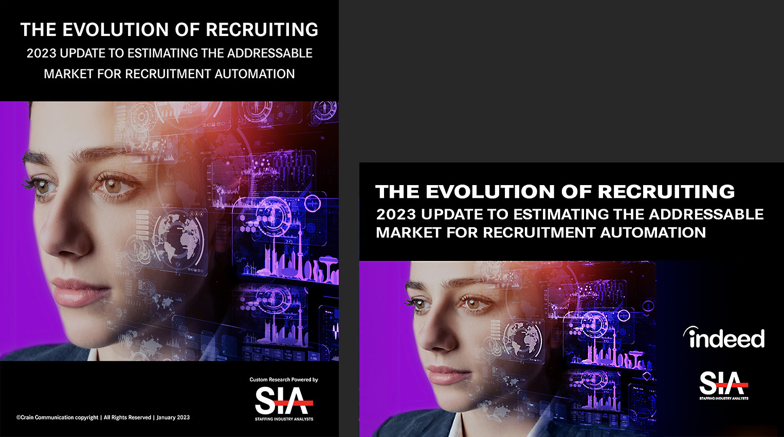
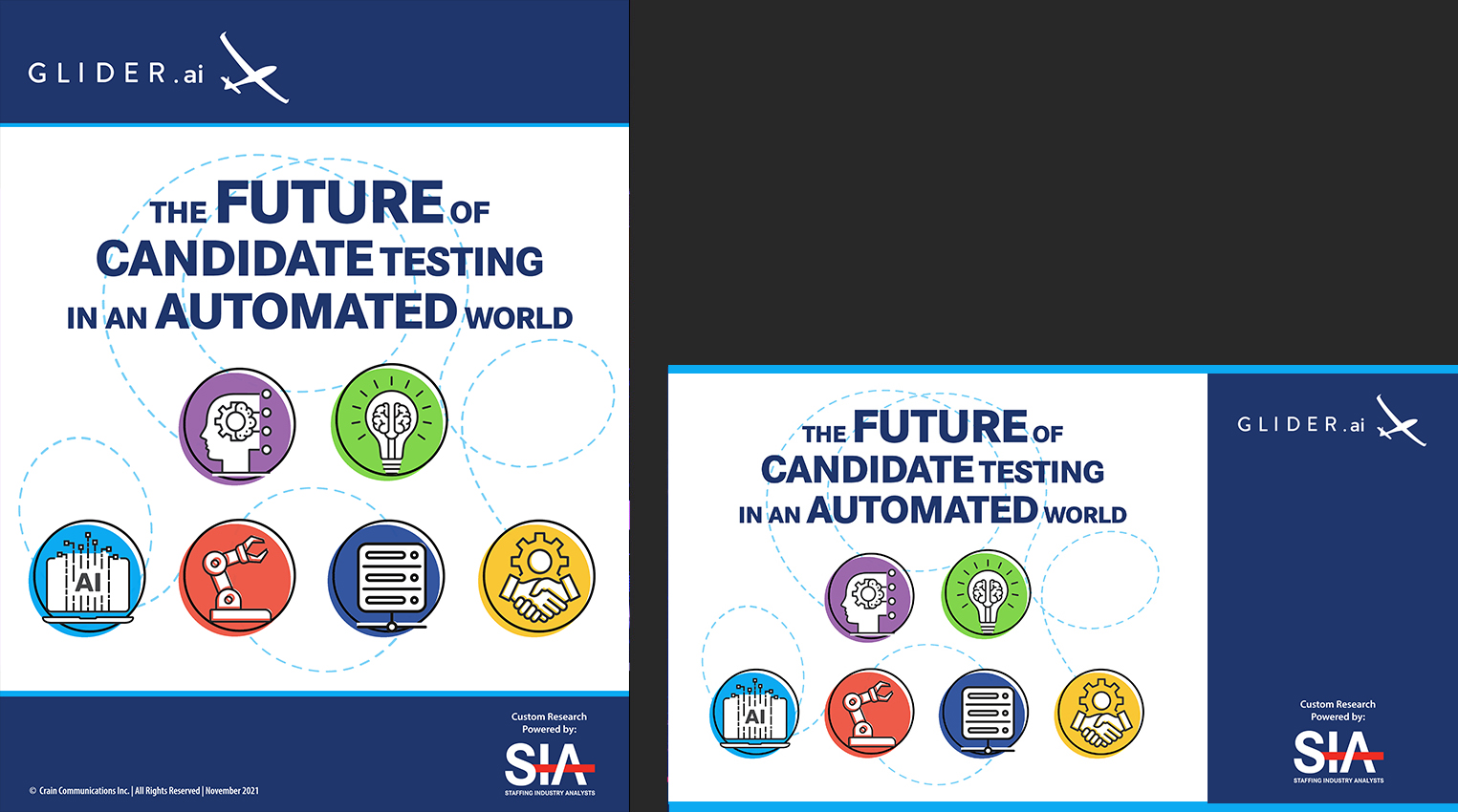
Research and Analytics work required a different kind of creative discipline, one that balanced data clarity with visual engagement. Internal report layouts followed a consistent, structured format to support readability and credibility. Cover designs were concept-driven, developed to reflect the theme and subject of each study while incorporating partner brand guidelines where required. Partners included WorkLama, Glider, iHire, Indeed, and The Mom Project, each requiring careful integration of their visual identity within SIA's established framework. The result was a body of work that felt authoritative, polished, and tailored to its audience.
SIA RESEARCH REPORT COVER DESIGN & SOCIAL BADGE PROMOS (***Click on Images for a larger/better view)
Outcome
Multi-Brand Design Leadership
Successfully designed across multiple visual systems simultaneously, adapting to the needs of corporate communications, conference branding, editorial content, research publications, and digital marketing while maintaining consistency and quality throughout.
Audience-Centered Communication
Executive leaders, staffing professionals, conference attendees, researchers, sponsors, and global audiences each required a different visual approach. Every design decision was shaped by an understanding of who the work was intended to reach and how they would engage with it.
Scalable Event Branding
Developed conference identities that extended across websites, presentations, digital advertising, social media, environmental graphics, signage, printed collateral, and event experiences, creating cohesive systems rather than isolated deliverables.
Corporate Precision and Creative Flexibility
Balanced strict brand standards with creative exploration, understanding when restraint was required and when stronger visual expression could be used to create energy, distinction, and engagement.
Cross-Functional Collaboration
Partnered with marketing, research, editorial, executive leadership, and external stakeholders to develop work that supported both creative objectives and broader business goals.
Design Systems That Support Growth
Built repeatable templates, scalable assets, and flexible design frameworks that improved efficiency while maintaining a high standard of quality across multiple departments, formats, and campaigns.
Executive Fortune 500 Audience Communication
Developed communications and event branding for senior leaders and decision-makers from many of the world's largest organizations, creating work that was clear, credible, and engaging for highly informed professional audiences.
The Impact
Over three years at Staffing Industry Analysts, I helped support one of the most recognized brands in the workforce solutions industry, creating work that ranged from executive communications and research publications to global conference branding, digital marketing, social media campaigns, and event experiences. The audiences included staffing professionals, enterprise organizations, and decision-makers from many of the world's leading companies, including Fortune 500 brands. Each initiative required a different creative approach while remaining aligned with the broader SIA brand.
The experience reinforced the importance of adaptability at scale. Supporting multiple departments, initiatives, audiences, and communication channels required more than strong design execution. It required the ability to understand different business objectives, translate them into effective visual communication, and maintain consistency across a wide range of formats without allowing the work to become repetitive or formulaic. That balance between flexibility and cohesion remains one of the most valuable skills I carried forward from my time at SIA.