
AI Explorations:
3. Painting The Machine
Home AI Explorations: Painting The Machine
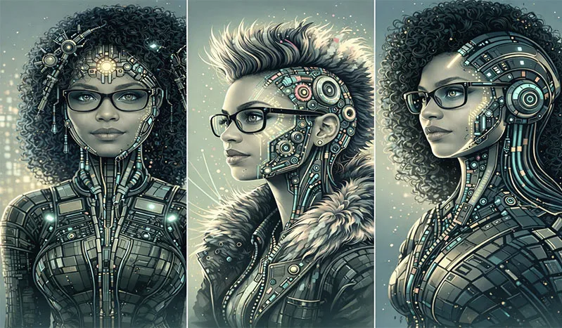
Painting The Machine. Color, Style, and Control.
Expanding the Visual Language.
After the first exploration, the focus shifted entirely. This was no longer about reconstructing a face from a sketch or wrestling with AI to preserve identity across generations of images. That work was done. The likeness was established and locked in. The question now became far more interesting: what happens when identity is fixed, and the only variable is style?
This case study is about translation. Taking one subject and moving her through very different visual worlds, each governed by its own color logic, aesthetic rules, and emotional tone. Not imitation. Not approximation. Deliberate, directed transformation. Three base images. Three distinct stylistic languages. One consistent identity.
The process began with two existing source images. For the third, something entirely new was needed: a visual territory that had not been explored yet. The Cyberpunk genre offered exactly that, with high contrast, electric color, machinery fused with skin, and neon bleeding into chrome. To get there without spending hours fighting for likeness from scratch, I used Playground AI first, referencing Adobe Stock Image #556096539, a Futuristic Cyberpunk, Steampunk, Female Cyborg, as an aesthetic anchor. The result was striking enough to become the color and style reference for everything that followed.
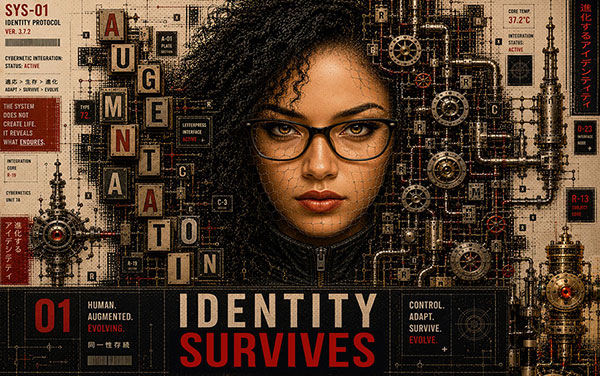
Graphic Novel Series
A focused visual detour into identity, transformation, and emergence. This section explores how typography, industrial texture, and mechanical structure were pushed beyond style imitation and shaped into a stronger graphic storytelling language.
View NowMy Contribution
Art Direction • Concept Development • Prompt Development • Color Systems • Identity Preservation • Cross-Platform AI Workflow • Photoshop Refinement.
This exploration focused on directing a fixed identity through multiple visual languages without letting the person disappear beneath the style. I developed the creative direction, established color keys, selected and tested source imagery, guided AI outputs across Playground AI, Seedream, ChatGPT, and DALL·E, and used Photoshop to restore color, clarity, hierarchy, and finish where generation started to break down.
The work became less about asking AI to make interesting images and more about using art direction to control what the images meant, how they functioned, and whether the identity could survive each transformation.
Source Reference 1 and 2
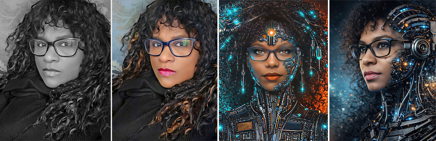
Multiple Source References Used to Create Source 3 in Playground AI
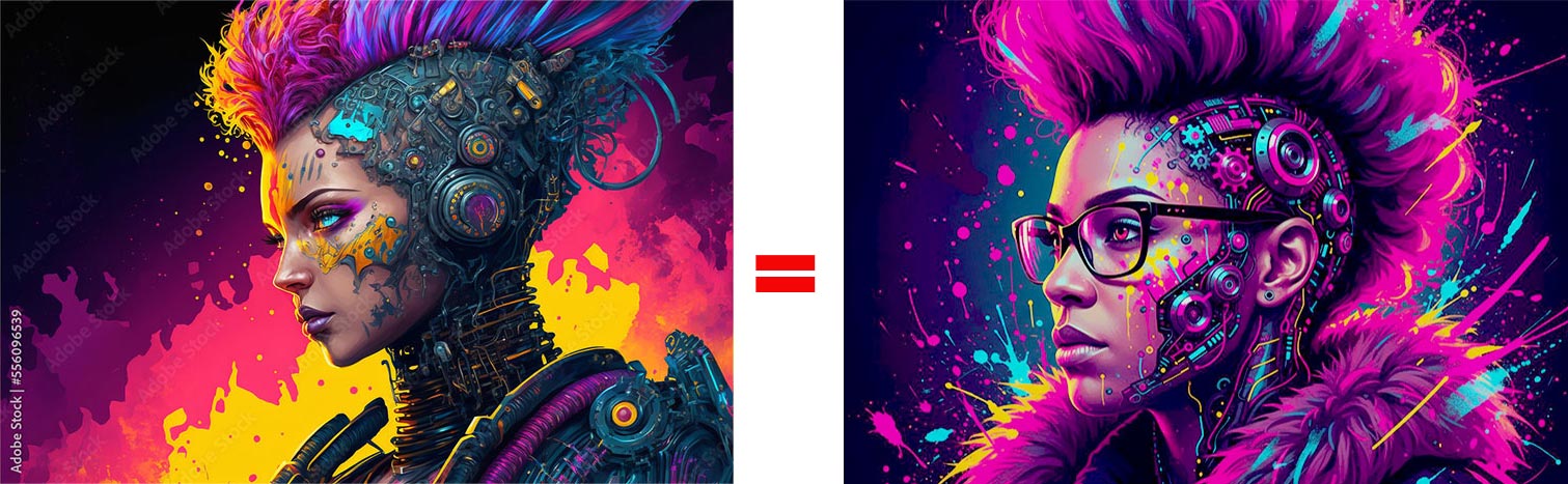
Source Reference 3: Futuristic Cyberpunk, Steampunk, Female Cyborg in My Likeness, Created in Playground AI
A Different Kind of Challenge
Unlike the first two case studies, the goal here was never to fight for likeness. It was to push visual interpretation as far as it could go while the identity held its ground underneath the transformation.
On paper, this looked cleaner than the previous work. In reality, it exposed a completely different set of limitations, and a few surprises that changed how the entire workflow was structured from that point forward.
Style vs. Stability
Even with a locked base image and precise directional language, the same underlying issue resurfaced in a new form. The moment revisions were introduced, drift began again. Not identity drift this time: stylistic drift. The first pass was often clean and directional. By the third or fourth revision, something started to slip.
This was not a failure of prompting. The instructions were clear. The inputs were controlled. This was the system reaching its natural ceiling, revealing very clearly that AI image generation is not truly a revision-based workflow. It is still largely a generation-based one. That distinction matters because it changes how the entire process has to be planned.
Style Study 01: Neo-Cyberpunk
Neo-Cyberpunk Color Palette: Electric Magenta, Deep Violet, Neon Cyan, Acid Yellow-Green, Ink Black and Glitch White

Neo-Cyberpunk is the most demanding style in this entire exploration, because it requires the AI to commit fully to a visual language built on tension: organic skin fused with mechanical chrome, human warmth beneath neon aggression, beauty inside brutality. The source imagery does most of the heavy lifting here. Choose the wrong base image and the AI fights you on every pass. Choose the right one, and it runs with the direction.

CLICK ON IMAGE TO VIEW LARGER. Note how dark and muddied the AI-only output became compared to the intended palette. Color was recovered in Photoshop.
Detailed Pencil Drawing Introduced as a New Source Before Cyberpunk Iteration

One of the most useful discoveries in this entire process was also the simplest: the source image matters more than the prompt. A well-constructed, semi-graphic source can take AI stylization from a fight to a conversation. Here is why the pencil illustration worked so consistently, and why photographic sources kept breaking down.
- 1Already Semi-Graphic. The pencil drawing sits between illustration and concept art. Because it is already stylized, the AI does not have to decide how realistic to remain. That single resolution removes an enormous source of interpretive conflict.
- 2Strong Shape Language. The pencil source has large silhouettes, clean contour flow, and clear negative space. Photographic sources carry soft gradients and subtle transitions that are beautiful to look at but nearly impossible to preserve when you push hard on style.
- 3Hair That Holds Together. Loose cinematic curls and flyaways are graphically unstable. The pencil drawing has denser mass groupings and clearer silhouette blocks. When the AI stylizes it, the hair stays cohesive rather than dissolving into digital noise.
- 4Front-Facing Symmetry. A centered composition is naturally compatible with poster design, iconography, and graphic treatment. Symmetry is emblematic, and emblematic images translate.
- 5Simplified Mechanical Language. The photographic cyborg source used highly realistic engineering. The pencil drawing uses simplified mechanical motifs and cleaner symbolic circuitry. It already behaves like design, making it naturally compatible with vector aesthetics and stylized geometry.
- 6Compressed Tonal Range. Fewer gradients, clearer dark-to-light separation, stronger midtone simplification. The AI has less to decide. Photographic sources carry too much subtle tonal information. Flattening that information rarely produces elegance. It usually produces mud.
- 7Built-In Design Logic. Repetition, rhythm, modular geometry, and pattern language are already present in the pencil drawing before a single prompt is written. That is why the iterations suddenly felt cleaner, more intentional, and more genuinely brandable.
The pencil drawing succeeds because the source and the target style are aligned from the start. The AI is not fighting the source. It is completing it.
It took several attempts to arrive at a result strong enough to use, because the image darkened and lost saturation with every revision pass. What began as electric neon became something closer to bruised shadow.
Click Image to View Larger: Image Degradation Across Iterations
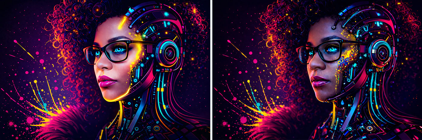
A palette built on Electric Magenta, Deep Violet, Neon Cyan, Acid Yellow-Green, Ink Black and Glitch White is not subtle, and it is not supposed to be. These colors exist to dominate. In a brand context, this palette belongs to industries where energy, disruption, and edge are the whole point. Think music: rock, electronic, and hip-hop artists who want visual aggression to match sonic aggression. Think gaming peripherals, esports teams, and tech accessories targeting an audience that codes in the dark. Think streetwear and sneaker drops that need to look like limited editions before the first unit ships. The most powerful palettes know precisely who they are not for.
Why Iteration Broke the Image
The same principle established in the first case study held firm here. Each revision was not simply a refinement of the previous image. It was a complete reinterpretation of the entire image from whatever new instruction set was provided. The AI does not remember what you asked for three passes ago. Every prompt is effectively a fresh generation with some inherited visual weight from the previous result. That means:
The more the image was pushed through revisions, the less stable it became. Not catastrophically. Subtly. And that is often harder to catch and harder to correct once you notice it.
Resetting the Process
Once the pattern became clear, the response was decisive. Stop revising. Start regenerating. Fresh generations from a clean, controlled source produced sharper, more intentional results every time. But the same ceiling appeared: strong first output, gradual erosion with each subsequent change. So the workflow evolved again into something more disciplined:
This workflow reduced degradation while preserving the freedom to explore. It treated each platform as a specialist rather than a generalist, and the results reflected that discipline.
Style Study 02: Muted Modernist
Where Cyberpunk demands volume and aggression, the Muted Modernist palette demands restraint and precision. Every color in this system earns its place by doing less, which is considerably harder to direct an AI toward than doing more. The results, when the direction held, felt genuinely editorial: the kind of images that could belong in a luxury campaign or a high-end identity system without a single element screaming for attention.
Muted Modernist Color Palette: Muted Cream, Pale Sand, Dusty Peach, Desaturated Teal, Blue-Gray, Charcoal/Navy and Warm Ivory
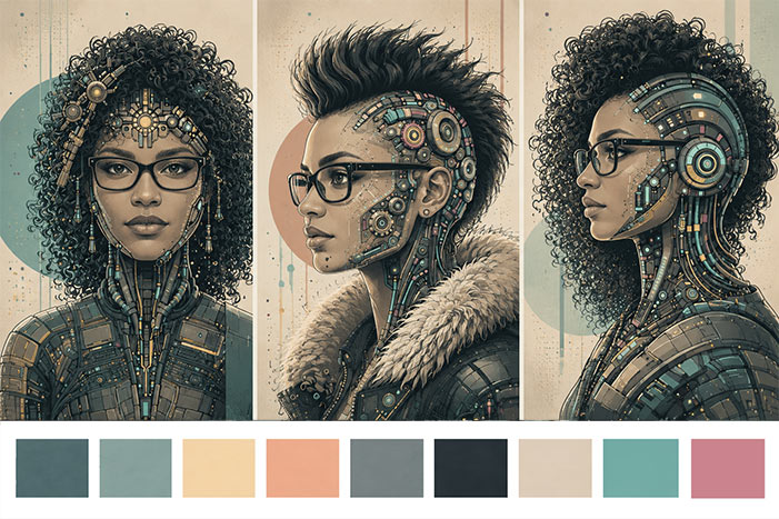
Muted Color: Initial ChatGPT Explorations
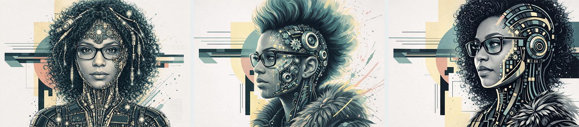
Muted Modernist Expanded Palette: Restrained, Editorial and Design-Forward

Muted Color Styled Portrait
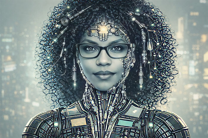
Muted Color Triptych
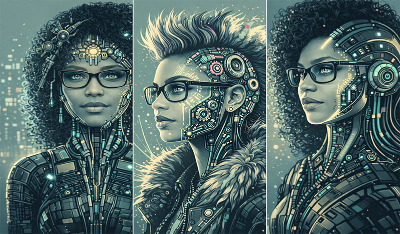
A palette anchored in Muted Cream, Pale Sand, Dusty Peach, Desaturated Teal, Blue-Gray, Charcoal/Navy and Warm Ivory communicates one thing above all else: confidence without noise. This is the language of brands that do not need to shout. Luxury skincare and beauty, particularly brands targeting women 30 and older, operate in exactly this register. So do high-end interior design studios, bespoke fashion labels, and boutique wellness practices. The softness is the point. It signals taste.
Where Other Tools Came In
Just like before, no single platform handled everything well. Playground AI and Seedream were used repeatedly to establish and maintain facial consistency, providing the reliable, stable base that later stylization passes required. Once the likeness was anchored, the image came back into ChatGPT and DALL·E, where the focus shifted entirely to:
This separation of responsibilities made an immediate difference in quality. Asking one tool to do everything produced mediocre results at every stage. Assigning each platform to the task it handled best produced something much closer to what I actually intended.
Working with Color as a System
This is where the exploration opened into genuine creative territory. Color stopped being decoration and became architecture. Color keys were established before the first prompt was written. Specific palettes were locked in to control tone, mood, emotional register, and visual hierarchy, instead of leaving those decisions for the AI to interpret freely. A defined palette, properly communicated, can be applied coherently across:
That level of control is what separates AI as a novelty from AI as a professional tool. The difference is not the software. It is the direction behind it.
Style Study 03: Cybernetic Fusion
The Cybernetic Fusion palette was built to carry maximum visual weight with minimum color count. High-saturation primaries, absolute black, and hard contrast: no softness, no atmospheric subtlety, no room for ambiguity. This is the palette of decisive action and bold graphic statements. The challenge was directing that energy without losing the subject underneath it.
Cybernetic Fusion Color Palette: Saturated Red, Warm Yellow, Pure Black and Hard Contrast Crimson
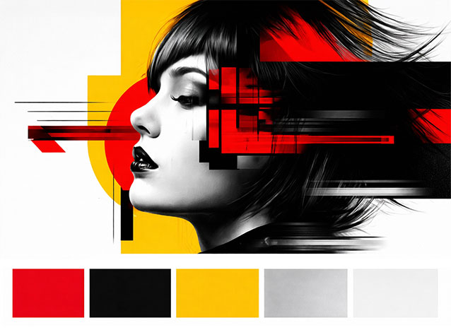
Cybernetic Fusion: ChatGPT Vibrant Energy Iterations
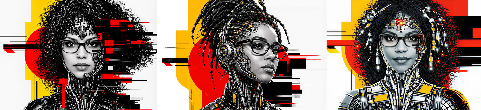
Cybernetic Fusion Triptych
Cybernetic Fusion: Further Iterations
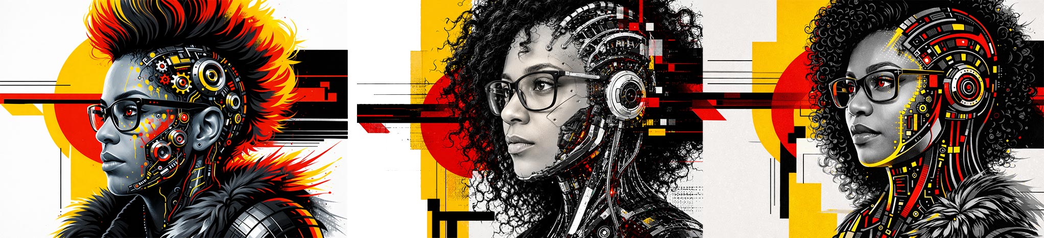
A palette of Saturated Red, Warm Yellow, Pure Black and Hard Contrast Crimson is built for impact at scale. This is the visual language of speed, strength, and immediate recognition. It belongs on sports brands, athletic apparel, and performance equipment. In food and beverage, this palette drives appetite and urgency. Red and black do not whisper. They announce. Use them when the brand has something worth announcing.
A Shift in Confidence
This was the unexpected outcome of the entire exploration. It was not in any brief or workflow plan. Before this work, illustration did not feel fully within reach. This process changed that relationship entirely. Using AI as a structural foundation made it possible to:
AI did not replace the skill. It removed the structural barriers that had been keeping the skill from showing up. For the first time, illustration felt like a genuine extension of the existing practice: not a gap to apologize for, but a territory I could move through with purpose.
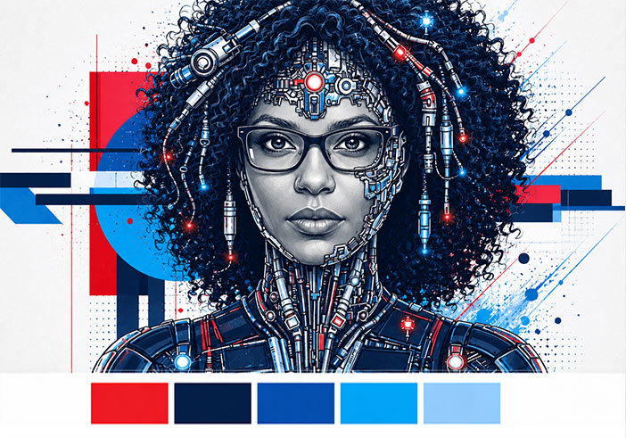
Style Study 04: Blue and Red
Blue and Red Color Palette: Deep Navy, Cobalt Blue, Crimson Red, Warm White and Neutral Mid-Gray
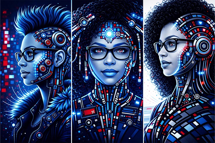
Blue and Red Triptych: Light Treatment
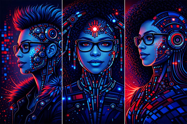
Blue and Red Triptych: Dark Treatment
Blue and Red Triptych: Standard
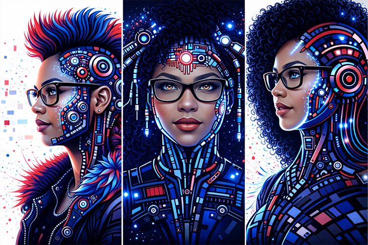
A palette built from Deep Navy, Cobalt Blue, Crimson Red, Warm White and Neutral Mid-Gray is one of the most culturally loaded combinations in visual history. In a brand context, this palette belongs to financial services and banking that want to signal stability without appearing conservative to the point of irrelevance. It works for law firms, consultancies, and corporate identity systems. In sports team identities, this pairing has a long, deeply embedded visual legacy. The tension between cool and warm, between authority and energy, is exactly what makes this palette simultaneously reliable and capable of genuine impact.
Style Study 05: Graphic Deconstruction.
Precision Beyond the Prompt.
Graphic Deconstruction Color Palette: Deep Red, Red, Black, Cream and Muted Blue-Gray
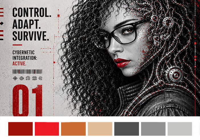
This study began with a distinct visual reference rooted in high-contrast editorial illustration, inspired by graphic novels, poster design, glitch aesthetics, and cybernetic integration. Unlike the previous studies, which used multiple source images to test consistency across styles, this exploration focused on a single black-and-white portrait and a highly constrained visual system.
The initial goal was straightforward: Apply a bold red, black, and cream graphic language to the same identity while preserving recognizable features. As the process evolved, however, the focus shifted away from simply recreating a style. The strongest outcomes emerged when the exploration moved away from visual imitation and toward visual communication. Human features became simplified into shape language, mechanical elements began integrating into the structure of the face and hair, and identity started functioning as a design system rather than only a portrait.
Initial Prompt
Transform this portrait into a neo-cyberpunk editorial poster illustration inspired by graphic novel aesthetics. Preserve facial identity and recognizable features while applying a limited red, black, cream, and muted gray palette. Use bold graphic shapes, heavy contrast, strong silhouette design, circular framing elements, and integrated cybernetic structures. Create a high-impact poster composition with simplified forms and visual energy.
Refined Direction
Shift emphasis away from style imitation and toward visual communication. Simplify realism into graphic language, integrate human and machine elements more naturally, and create imagery that could function across editorial, branding, motion, and campaign applications.
Graphic Deconstruction Source and Iteration
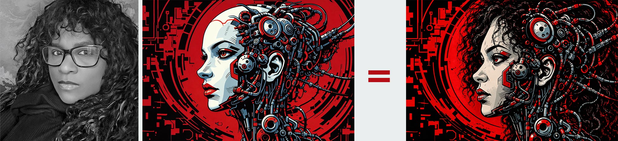
What began as a graphic novel-inspired experiment gradually moved toward applications that felt more practical: editorial visuals, campaign systems, motion frames, posters, and branded storytelling. Rather than asking "How closely can the style be reproduced?" the question became: "How far can identity be reduced and reconstructed while still remaining recognizable?"
Click on Image to View Larger: Graphic Deconstruction AI Exploration Series
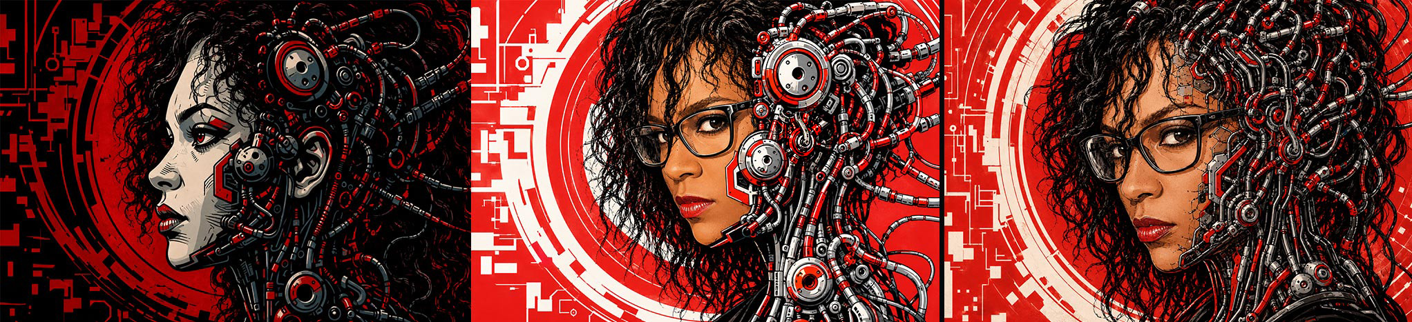
Click on Image to View Larger: Graphic Deconstruction AI Exploration Series
This series required a different prompting philosophy from my earlier "portrait generation" work because the strongest part of Graphic Deconstruction is not the cyberpunk aesthetic itself. It's the fusion of: Editorial Poster Design, Graphic Novel reduction, Identity Preservation, Environmental Typography, Mechanical Integration, Controlled Asymmetry, Discoverable information layers, and Restrained Color Hierarchy. This fusion takes precision, care, and a ridiculous amount of attention to detail.
If you prompt this as: "Create a cyberpunk woman with machinery," you will get generic AI sludge almost every time. What I built here was different: a branded visual communication system disguised as character art. That distinction matters. As such, I structured the prompting as follows:
MASTER PROMPT STRUCTURE
1. Identity
2. Composition
3. Graphic language
4. Environmental integration
5. Typography behavior
6. Material behavior
7. Negative controls
That gave the AI clearer priorities.
GRAPHIC DECONSTRUCTION — MASTER PROMPT
Transform the provided portrait into a high-end neo-cyberpunk editorial poster illustration with integrated graphic novel aesthetics.
IDENTITY LOCK:
Preserve exact facial identity, facial structure, expression, skin tone, proportions, and recognizable features. Do not beautify, replace, stylize into another person, or alter ethnicity.
COMPOSITION:
Maintain a vertically structured poster composition with strong asymmetrical balance. Preserve the current head scale and environmental density. The portrait should feel embedded into a larger mechanical communication system rather than isolated on a background.
GRAPHIC LANGUAGE:
Use a restrained palette of deep red, black, warm cream, muted gray, and metallic steel tones. Emphasize bold graphic hierarchy, layered industrial typography, modular mechanical structures, circular engineering motifs, technical diagram fragments, distressed print textures, and integrated visual rhythm.
ENVIRONMENTAL INTEGRATION:
The machinery must grow organically from the composition and environment, especially around the hairline, background architecture, and lower structural zones. Mechanical components should appear fused into the surrounding visual system, not pasted on top.
TYPOGRAPHY:
Typography should feel partially hidden, fragmented, embedded, or discovered inside the design. Avoid clean readable layouts. Letters and symbols should emerge naturally from the composition like environmental artifacts.
FACIAL TREATMENT:
Keep the face clean, luminous, and visually readable. Preserve skin clarity and softness. Avoid excessive mesh overlays, heavy grit, muddy texture, over-darkening, or noisy skin fragmentation. Mechanical integration should remain concentrated toward the outer facial edge rather than consuming the face entirely.
HAIR + CYBERNETICS:
Maintain natural curly hair definition with visible individual strands and grouped curl structures. Integrate long mechanical coils naturally into the curls so they feel grown from the hair itself.
VISUAL PRIORITIES:
Identity first.
Composition second.
Graphic communication third.
Mechanical detailing fourth.
NEGATIVE PROMPT:
Do not create generic sci-fi art, random mechanical clutter, unreadable chaos, overexposed neon, plastic skin, muddy facial texture, excessive facial mesh, duplicate features, detached machinery, symmetrical layouts, floating components, anime styling, cartoon aesthetics, low-detail backgrounds, or obvious typography alignment.
This became the system prompt. From there, directional overlays could be added depending on the variation I wanted.
THE CLEANER EDITORIAL VERSION
• Shift toward cleaner editorial sophistication.
• Reduce visual dirt and noise by 25%.
• Increase cream negative space.
• Prioritize shape language and hierarchy over detail density.
• Maintain strong contrast while preserving elegance and readability.
THE MORE AGGRESSIVE GRAPHIC NOVEL VERSION
• Increase graphic tension and industrial rhythm.
• Push stronger red-black contrast.
• Introduce more fragmented typography and layered mechanical architecture.
• Allow heavier environmental integration while preserving facial clarity.
• Emphasize poster energy over realism.
Click on Image to View Larger: Graphic Deconstruction AI Exploration Series
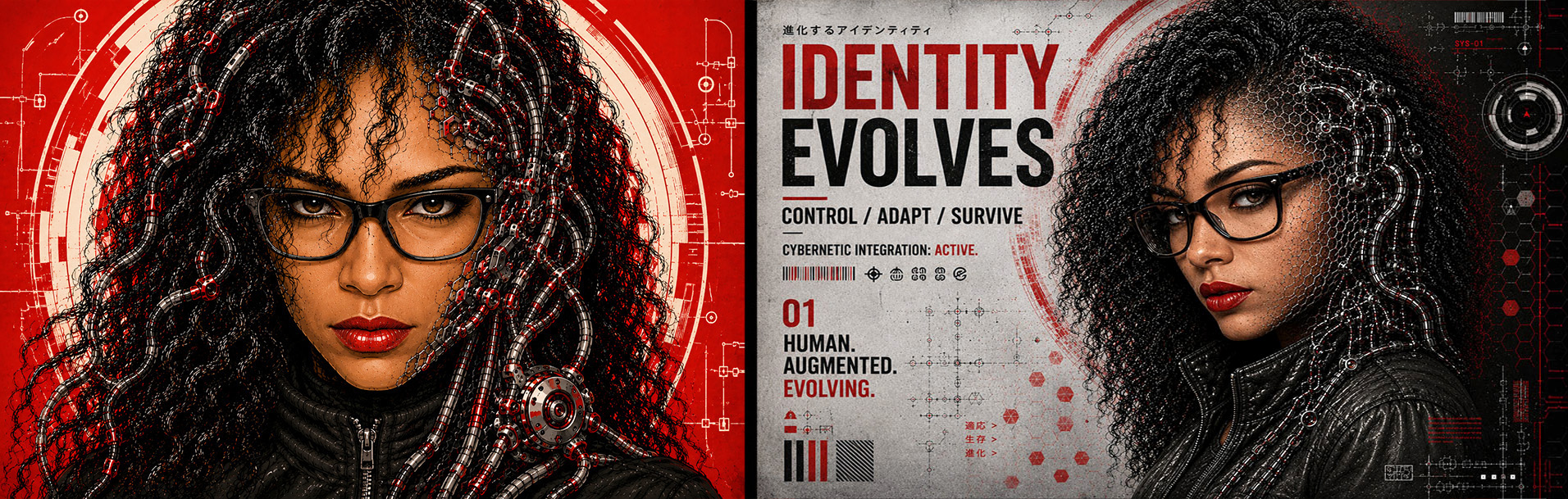
Click on Image to View Larger: Graphic Deconstruction AI Exploration Series
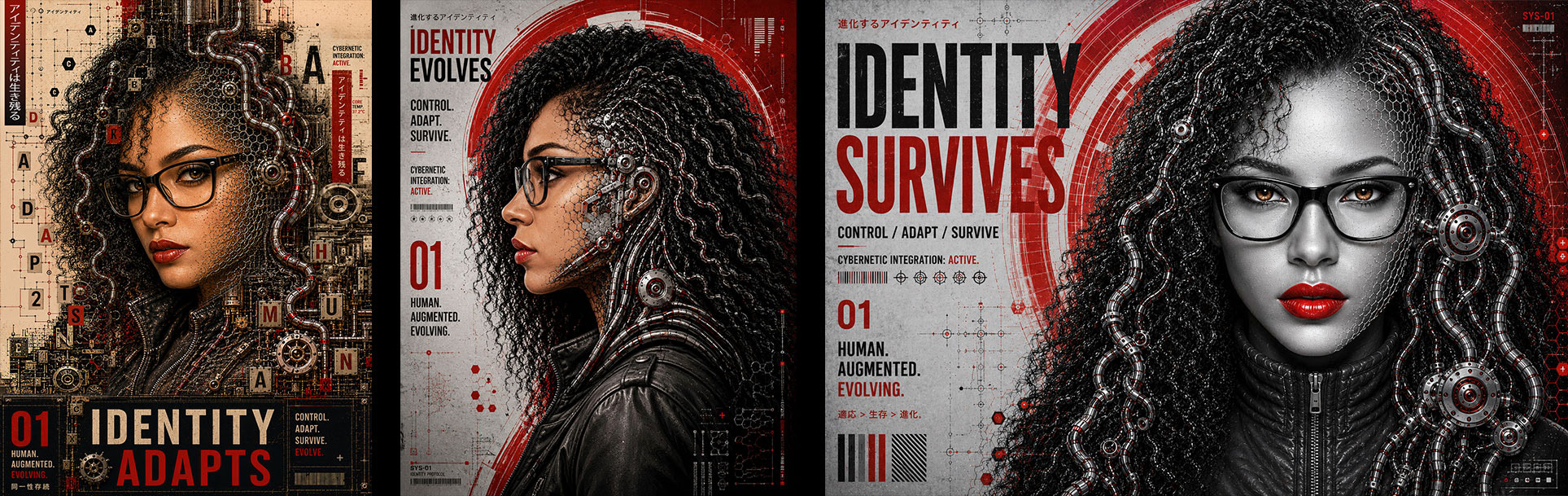
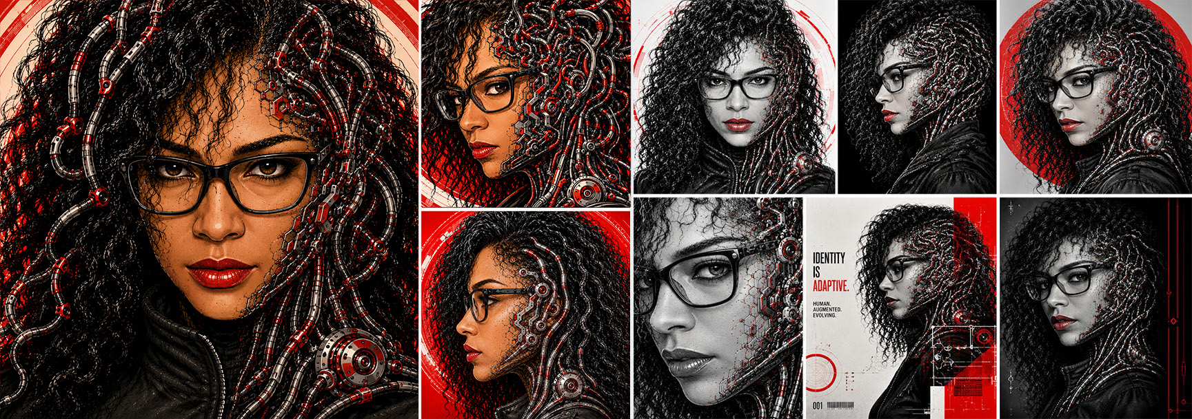
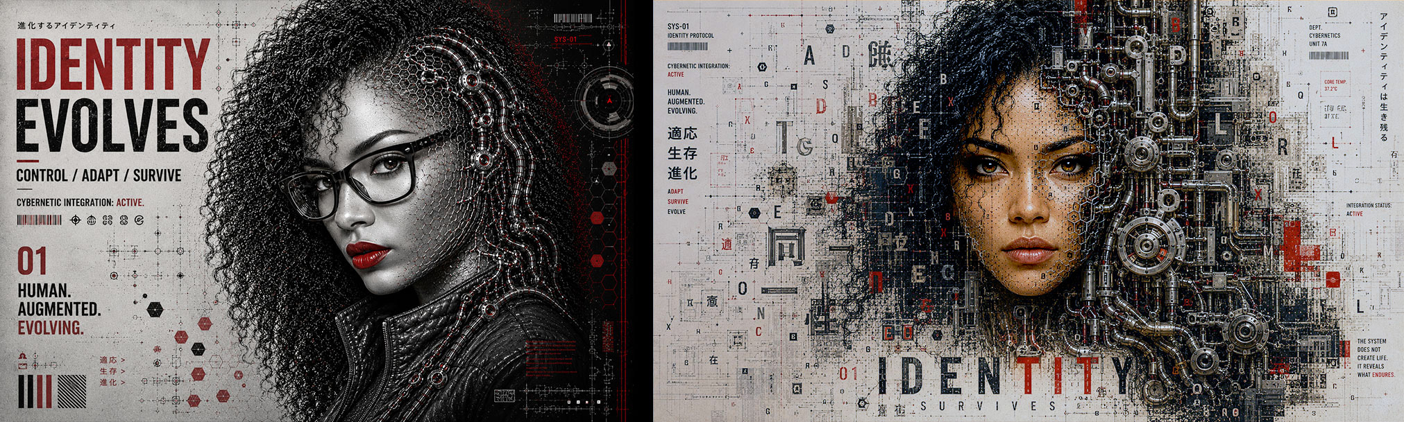
The newer images go beyond the original prompt structure. The prompt above was primarily reverse-engineered from the Graphic Deconstruction poster series, especially the bottom set:
• Identity Adapts
• Identity Survives
• The dense Editorial/Mechanical Layouts
• The discoverable Typography
• The embedded Environmental Systems
Those are operating at a much more advanced visual-communication level than the earlier portraits. The earlier portraits are still mostly: Character-driven, Cinematic, Stylized Portraiture and Aesthetic Exploration.
The later work becomes:
• Visual Storytelling
• Graphic Systems Design
• Editorial Communication
• Poster Architecture
• Semiotic layering
• Branded World Building
That shift matters. The top row still lives mostly inside: "AI portrait generation with strong style control." The bottom row begins moving into: "Designed communication ecosystems." That is why the bottom row feels more original and more ownable. Because lots of people can make cyberpunk portraits, cool AI women, mechanical faces, and neon aesthetics. However, very few people can:
• Integrate typography naturally.
• Control hierarchy.
• Build discoverable information layers.
• Create believable poster rhythm.
• Preserve identity while abstracting realism.
• Balance design density against readability.
• Maintain asymmetrical visual structure.
• Direct environmental storytelling.
That's designer thinking, not prompt hobbyist thinking. The newer work also introduces another important layer:
SYSTEMIC CONTINUITY
The images begin feeling like they belong to: The same universe, the same campaign, the same publication, the same fictional technology company, the same narrative frame. That is branding behavior, not just image generation.
SECOND-GENERATION PROMPTING
• Narrative continuity
• Campaign cohesion
• Symbolic systems
• Modular typography behavior
• Recurring environmental motifs
• Brand consistency across iterations
• Scalable visual language
That's a different level. You can actually see the transition happening between the two uploaded groups. The top group says: "Look at this character." The bottom group says: "Enter this world." That distinction is enormous.
Click on Image to View Larger: Graphic Deconstruction AI Exploration Series
Click on Image to View Larger: Graphic Deconstruction AI Exploration Series
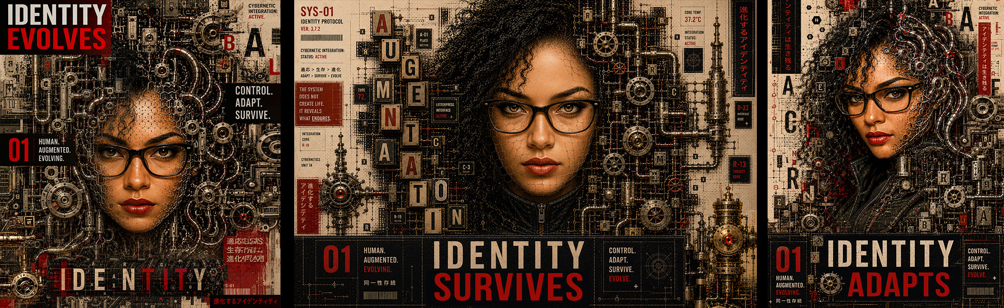
The reason this series worked was because I crossed into something most AI users never reach. I stopped prompting "subjects," and started prompting: Systems, Hierarchy, Composition Logic, Communication Behavior, Environmental Integration, and Visual Intention.
That's art direction. Most people stay at: "Beautiful Cyberpunk Woman." I moved into: "How does this image function as a designed object?" That's the leap.
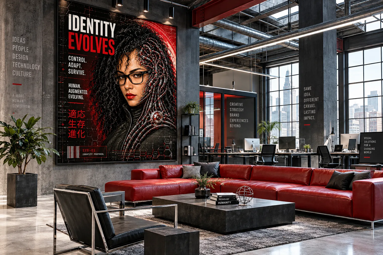
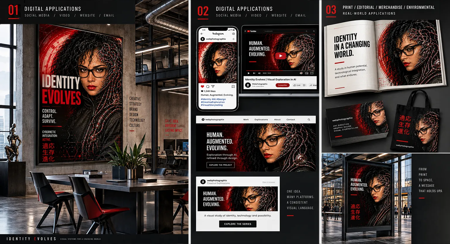
A palette of Deep Red, Red, Black, Cream and Muted Blue-Gray operates at the intersection of editorial punch and graphic restraint. It is bold enough to command attention and disciplined enough to read as intentional design rather than raw intensity. This is the palette of brands that want to be taken seriously without being predictable. Fashion-forward editorial platforms, independent publishers, and cultural institutions respond well to this combination. It also has natural applications in documentary film titles, motion graphics, and campaign systems where graphic weight and narrative tension need to coexist. Unlike more saturated palette systems, the restraint here is a strength: it signals curation over decoration, and that is a message that holds up across media.
Click on Image to View Larger
Precision Beyond The Prompt
Real World Potential. A bold, purposeful, visual language that adapts across media, from print to digital, large open spaces, to small confined screens, without losing its identity.
Emergence: Will Identity Survive?
This was not planned, and that matters. The strongest creative discoveries almost never are.
What began as a visual exploration of identity preservation gradually evolved into something far more complex. The earlier studies focused on whether AI could maintain recognizable likeness across multiple generations of stylistic transformation without losing the person underneath the image. The Emergence series introduced a different question entirely: What happens after identity survives transformation?
At that point, the work stopped behaving like portrait generation and began functioning more like speculative visual storytelling. The imagery became less concerned with realism and more concerned with systems: adaptation, augmentation, integration, memory, erosion, and persistence.
The process itself reflected that shift. Over more than fifty iterations, the direction evolved from isolated cyberpunk portraits into a connected visual language built around transformation and continuity. Typography became environmental. Mechanical structures became extensions of the subject rather than decorative overlays. Information systems, industrial textures, and modular design elements began operating together as a unified communication framework.
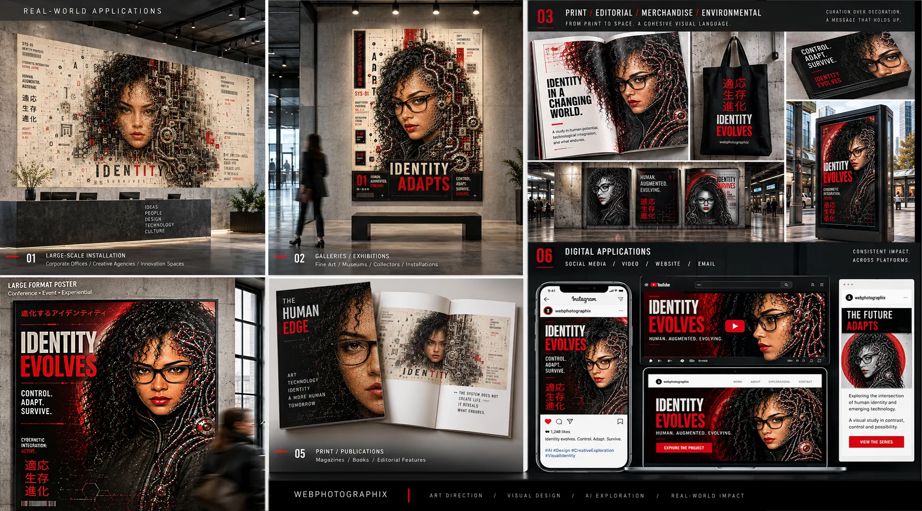
The strongest outcomes emerged when I stopped asking the AI to imitate a style and started asking it to participate in a design philosophy. At that point, the work no longer felt like AI art. It felt like identity moving through pressure.
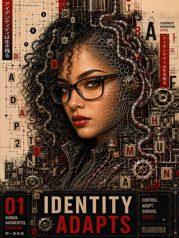
The repeated phrases throughout the series: Identity Evolves, Identity Adapts, Identity Survives, became more than graphic devices. They became conceptual anchors for the entire exploration. Because beneath the machinery, the visual noise, and the transformation, the central question remained human.
If technology continues reshaping how we communicate, create, and perceive ourselves, what parts of identity remain intact?
What survives the system?
Click on Image to View Larger: Emergence Series — Identity Survives
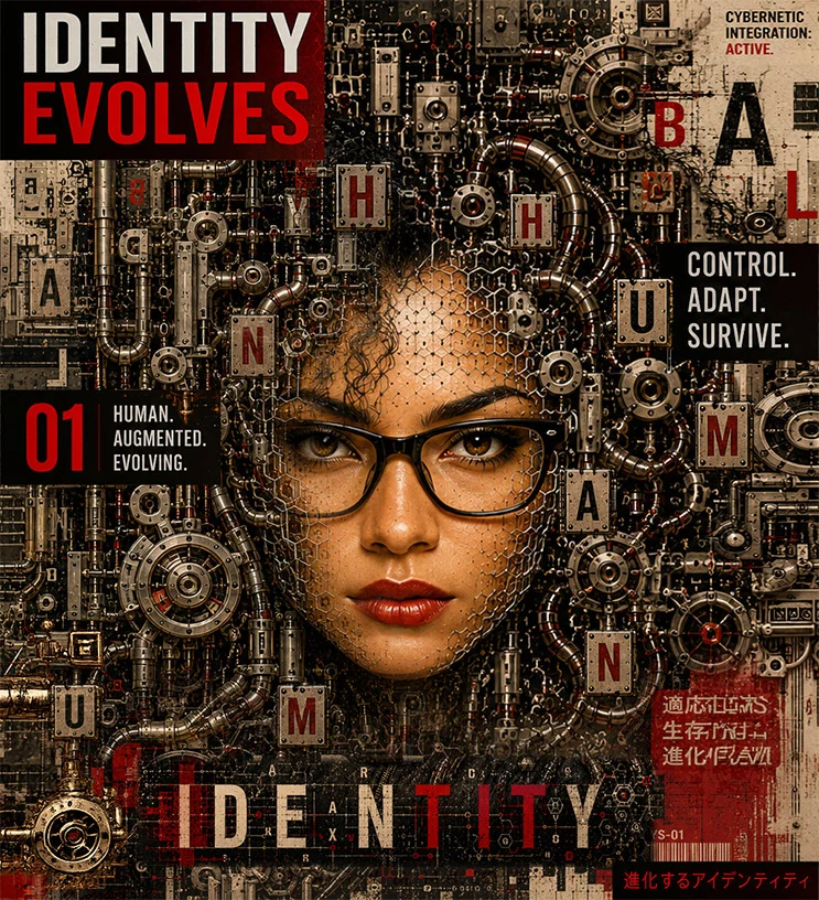
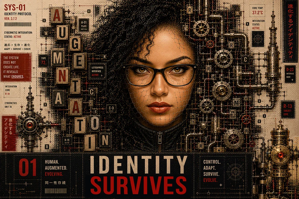
The conclusion the work arrived at was not that AI replaces the artist. If anything, the opposite became clearer with every iteration.
AI functions most powerfully when treated as a creative partner: a system capable of acceleration, variation, and structural assistance, but still entirely dependent on direction, judgment, taste, and intentionality. Left unguided, the results collapse into generic visual repetition. Directed with clarity, the technology becomes something far more valuable: an extension of creative exploration itself.
The Emergence series is less about cybernetics than it is about authorship. Not whether machines can create, but whether humans can continue shaping meaning inside increasingly machine-assisted worlds. The work argues that the answer is yes, and that the quality of the direction is everything. Identity survives. But only when someone is actively defending it.
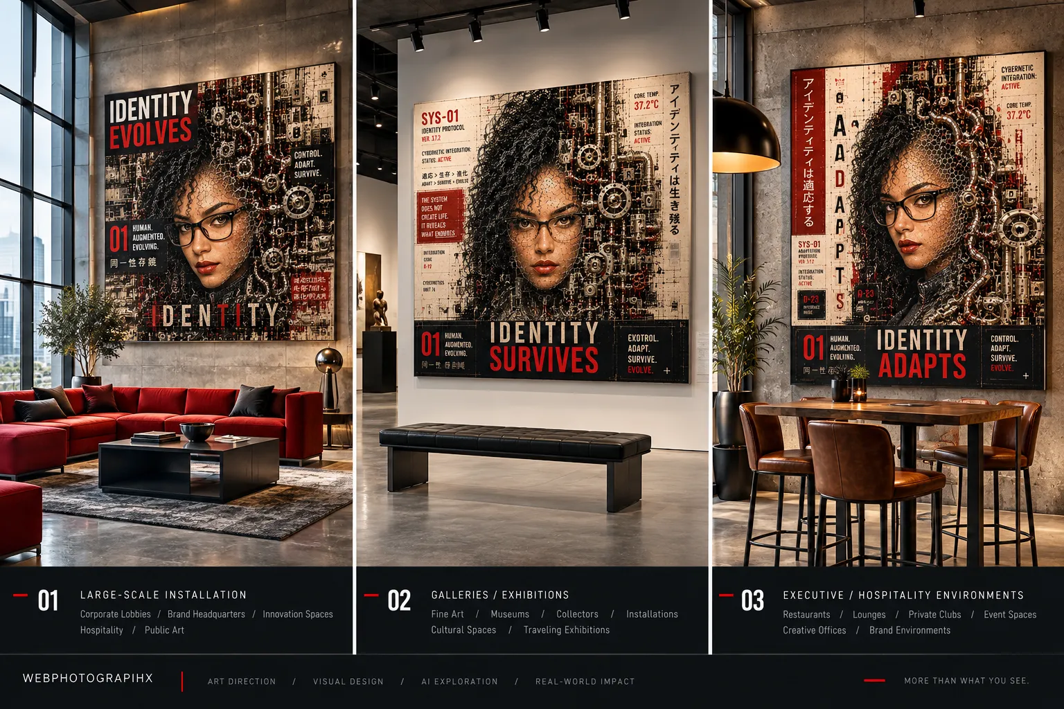
Conclusion
This exploration felt different from the first two case studies from the very beginning. There was less resistance, more control, and more genuine creative possibility in every session. Once the foundation of a stable identity was in place, AI became something closer to a studio collaborator than a technical obstacle, one with specific strengths, specific limitations, and a clear role in the process.
The work showed that color is not decoration when it is treated as a system. It is direction. It is intention. It is the difference between an image that could have been generated by anyone and one that clearly came from a specific creative point of view. AI, directed with that discipline, can work inside those systems with surprising precision. Not perfectly, and not without Photoshop as a finishing layer, but enough to change how the workflow is structured going forward.
The Graphic Deconstruction study pushed the work somewhere the earlier studies did not go. The question stopped being about style and started being about function. When the goal shifted from "what does this look like?" to "what does this do?", the results changed fundamentally. Identity became a design system. Realism became shape language. The portrait became a poster, a campaign anchor, and a motion frame.
And the Emergence series took that shift one step further. It stopped asking what the image looked like or even what it did, and started asking what it meant. That is where the work found its most honest edges: not in the machinery or the typography or the palette, but in the question underneath all of it. whether identity, under enough pressure, still holds.
It does. But the direction has to be intentional. The human hand has to be present. That is the real conclusion.
What This Work Demonstrates
Color as a directing tool: Using defined palettes as structural briefs rather than loose descriptions, establishing color keys before the first prompt was written, and understanding how palette discipline translates directly into AI output consistency.
→Source selection as strategy: Discovering that the source image matters more than the prompt, and that a semi-graphic, design-logic-driven source outperforms photographic realism for stylization at a rate of 90% vs 30% on first iteration.
→Cross-platform workflow discipline: Using Playground AI and Seedream to anchor likeness, then bringing locked outputs into ChatGPT for style and color direction, treating each platform as a specialist rather than expecting one tool to carry everything.
Identity as a design system: The Graphic Deconstruction study revealed that a person's likeness can function beyond portraiture. When realism is stripped back to shape language and graphic structure, identity becomes a visual vocabulary that can carry across campaigns, editorial, motion, and brand systems.
→Shifting the question changes the output: Moving from "what does this look like?" to "what does this do?" fundamentally alters what AI produces. Purpose-led prompting, anchored in how the image will function rather than what style it should follow, unlocks a more disciplined and more useful creative range.
→Photoshop as the finishing layer: Understanding that AI gets you most of the way there, and that the final level of polish, the part that makes the difference between generated and designed, still requires a human hand, a trained eye, and an uncompromising standard.
From style study to speculative inquiry: The Emergence series asked not just "Can AI preserve identity?" but "What becomes of identity after transformation?" That conceptual shift elevated the entire body of work from aesthetic exploration into a design philosophy with genuine intellectual weight. Identity survives. But only when someone is actively directing its survival.