Client
Dayton Water Company
Naming · Label Design · Product Branding
The assignment began before the product had a final name, visual identity, or label. Dayton Water Company’s premium artesian water created an opportunity to shape the brand from the ground up through naming, positioning, typography, art direction, and multiple shelf-ready label concepts designed to compete in the premium bottled-water category.
Project Overview
Dayton Water Company had discovered artesian wells in Dayton, Ohio and saw the potential for a premium, mineral-rich bottled water. The business ambition was clear, but the brand had not yet been defined. Naming, positioning, visual identity, and packaging all had to begin together.
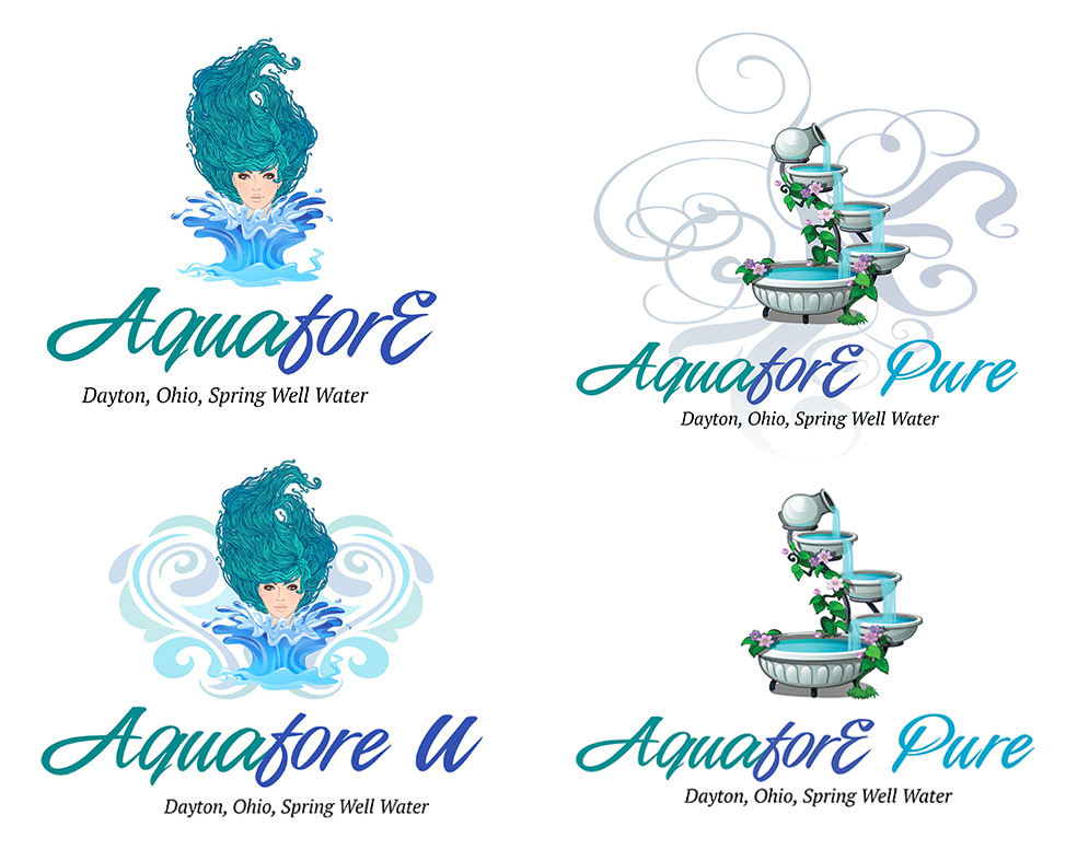
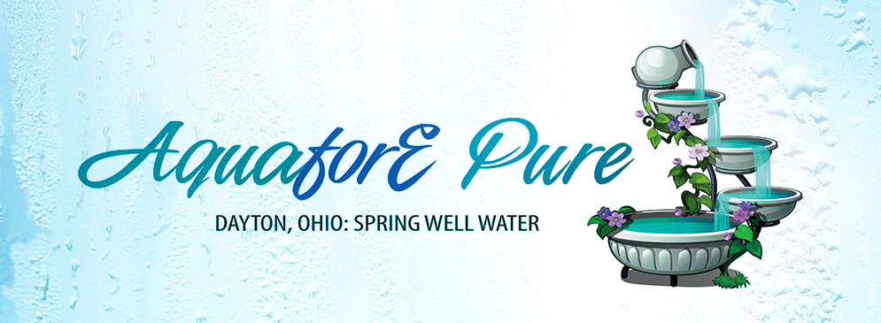
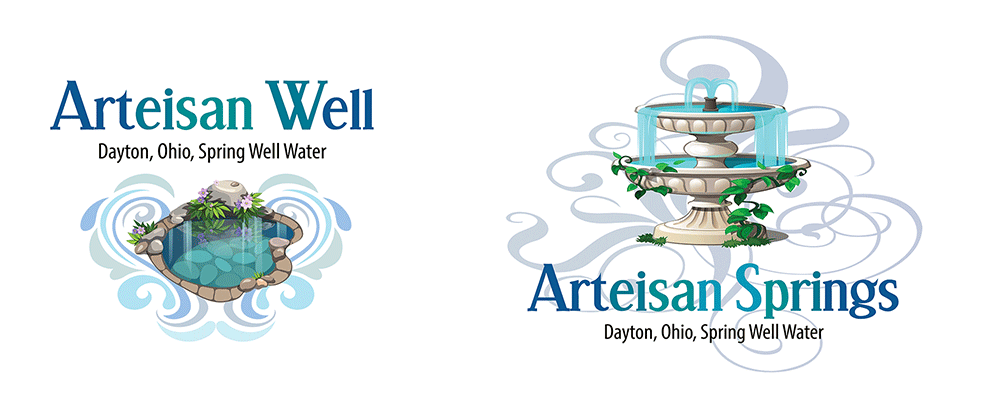
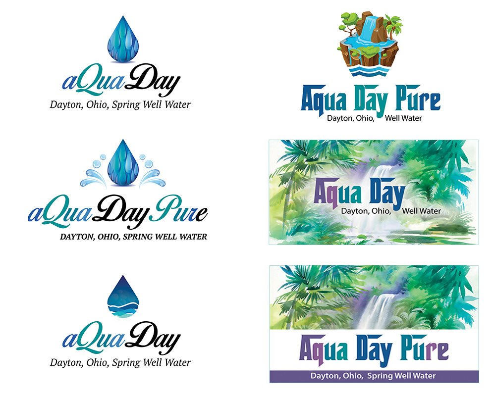
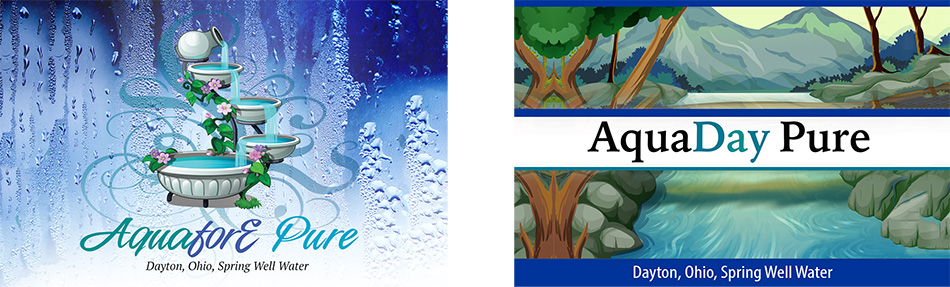
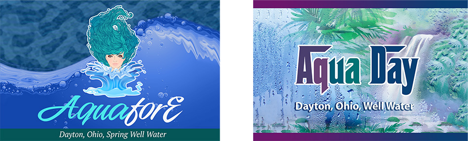
That early-stage freedom made the project as much about brand definition as graphic design. Naming explorations and typographic directions established different personalities for the product, while fully developed label concepts tested how each idea could translate into a credible premium-water experience.
Dayton Water Company
art direction, visual design, Brand Naming, Brand Identity, Label Design, and Production.
Define and position a premium artesian water brand from the naming stage through shelf-ready label concepts.
Brand Naming, Visual Identity, Typography Exploration, Label Design, Packaging Concepts, Flat Artwork, Bottle Mockups.
Premium water is a visually sophisticated category where packaging has to communicate quality before the bottle is opened. Natural-source positioning, purity, mineral content, aspiration, and shelf presence all informed the creative direction.
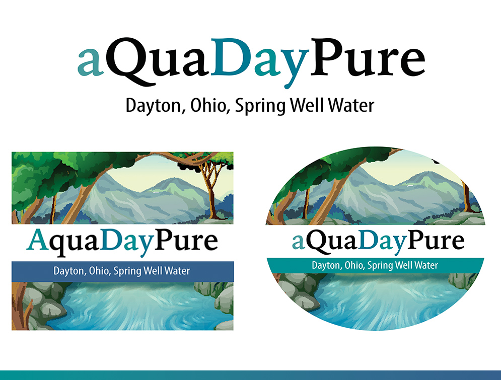
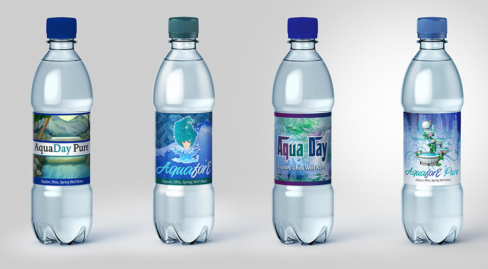
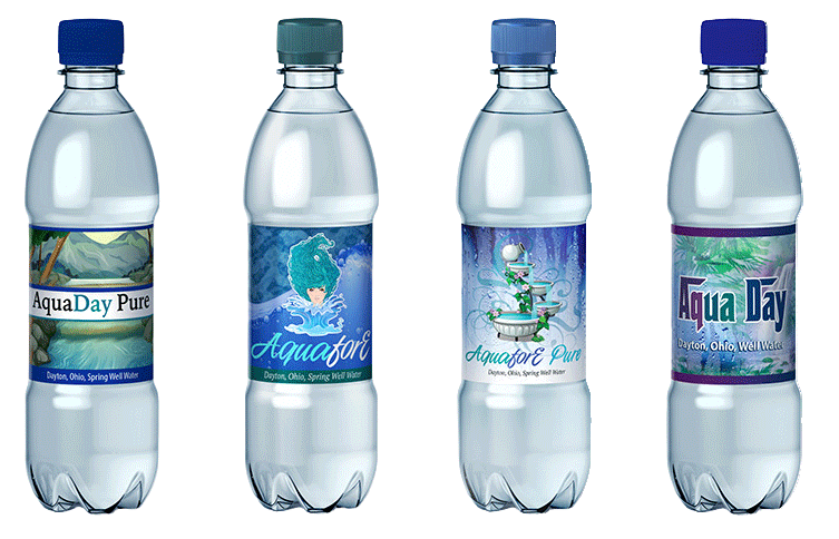
The work moved from name development into typography, imagery, color, and four fully realized label recommendations. Each direction was designed to feel distinct while supporting the same strategic goal: position an Ohio artesian product with enough polish and confidence to sit beside established premium brands.
Starting before the name was finalized allowed strategy and design to develop together. That made the label more than a decorative surface; it became the first complete expression of what the product could be.
Explore the progression from naming and typographic studies into multiple label directions, flat artwork, and final bottle mockups that test the brand in a real retail context.